
If we think of Russian design, one of the things that immediately come to mind is Soviet Brutalist architecture. Characterised by a massive and ‘blocky’ appearance, with a rigid geometric style and an extensive use of concrete, this style emerged in the 50s and became increasingly widespread across European communist countries such as the Soviet Union, Bulgaria, Yugoslavia, and Czechoslovakia in the following decade.
Despite being often criticised for looking unwelcoming, this style has continued to influence later designs and forms. Today, this style is often associated with high-tech architecture and has been given a new life through web design. Because of this, we decided to cherry-pick 13 edgy, inspiring Brutalist websites designed using the Cyrillic alphabet. Enjoy!
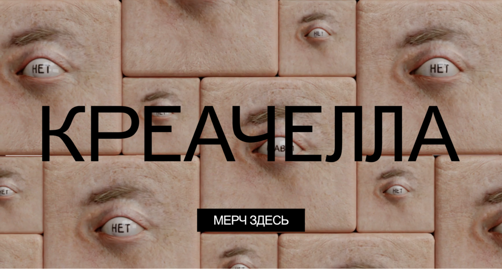
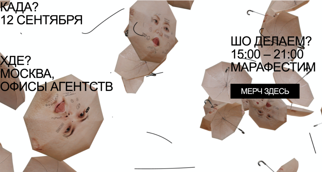
1. Креачелла (Creachella)
Creachella is not exactly a festival or a marathon, but more of a mix of the two, a “marafest” of independent creative agencies. What catches our eye when looking at webiste is the use of geometrical 3D figures or objects onto which body parts are applied like a texture. The unsetting feel these animated digital figures evoke are enhanced by the contrast with a white background and lines that seem hand written.
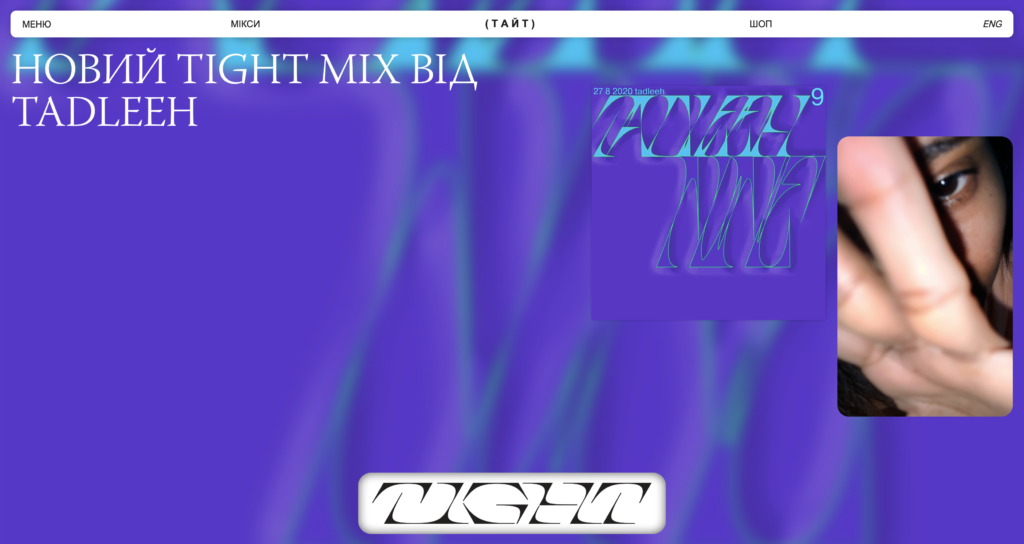
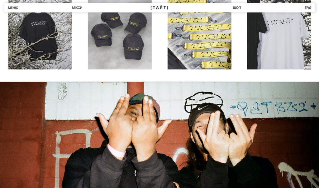
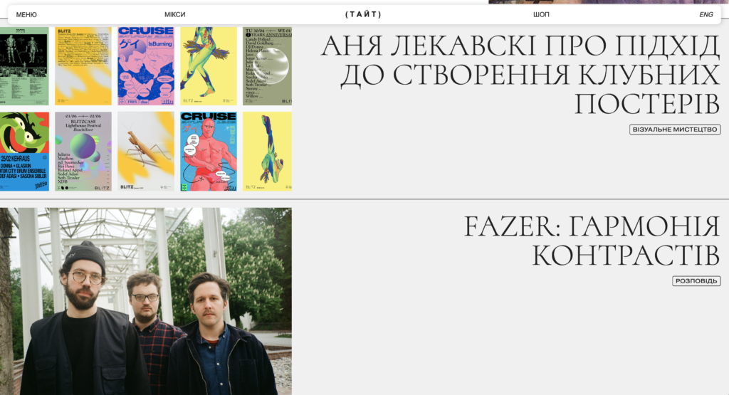
2.ТАЙТ (Tight)
TIGHT is a curated platform based in Kyiv for contemporary music and visual art, founded in 2018. The look of this website and the choice of font are in line with the trends of 2020, but what makes this website stand out is its content; here, users can find inspiration and references to Street Style and Subcultures, as well as articles addressing a plethora of topics, from illustration to music and interviews with international artists.
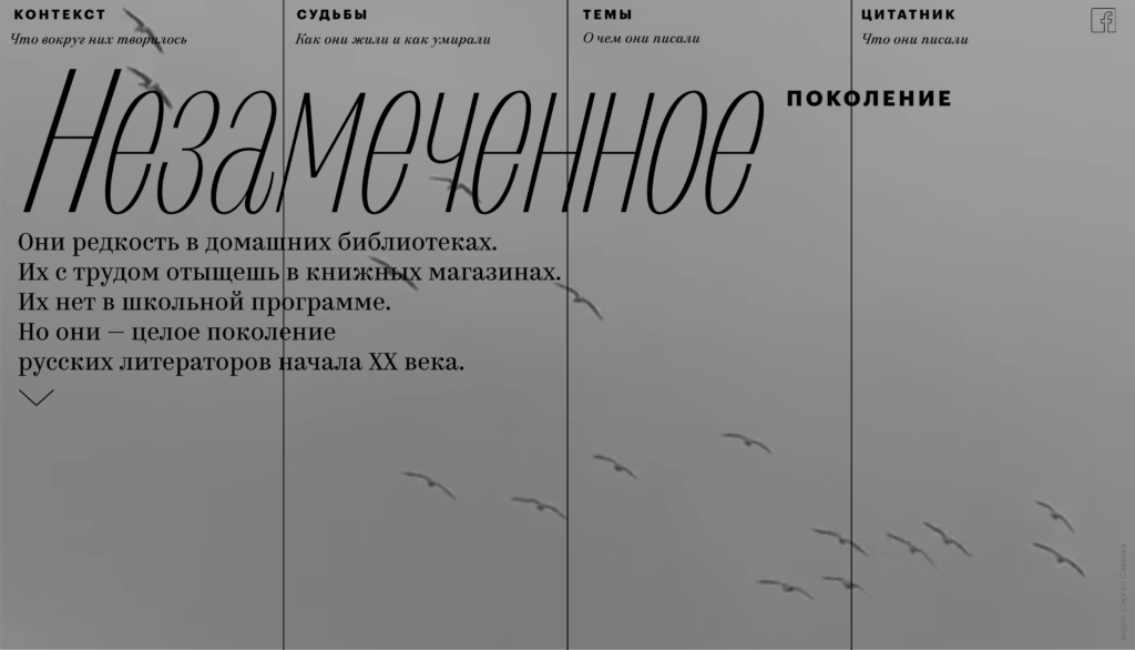
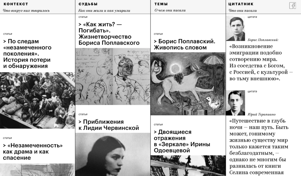
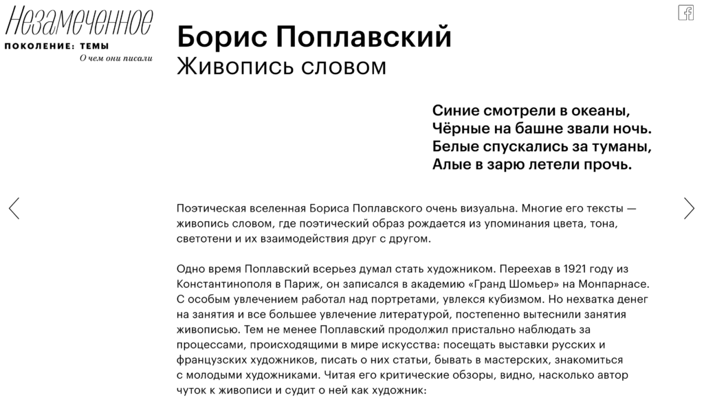
3. Незамеченное (Nezamechennye)
This Russian magazine is a project about the the first wave of immigrant writers, also called “unnoticed generation”. Minimalistic and simple animations, a black and white-only color palette, and delicate fonts convey a sense of melancholy that accompanies the reader whitout providing any distraction.
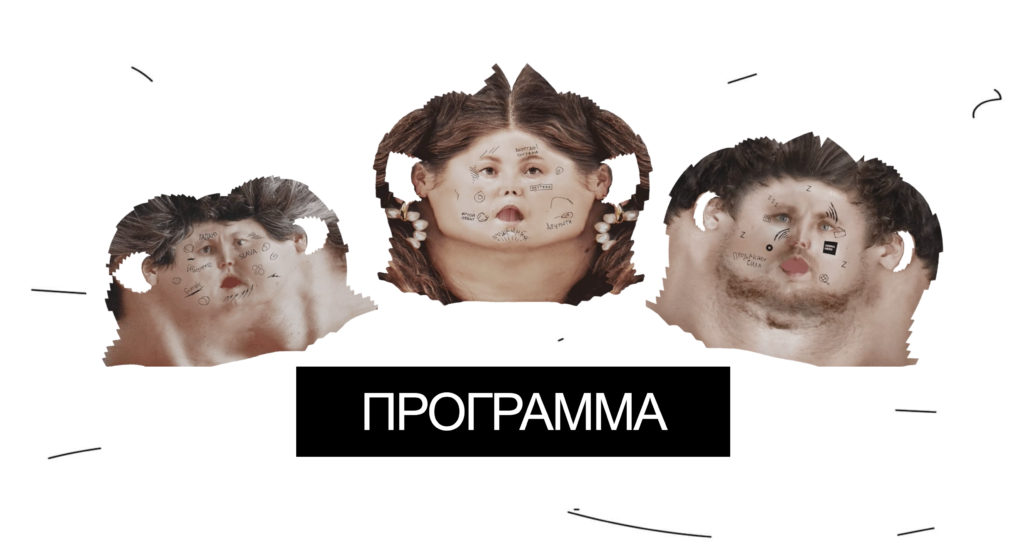
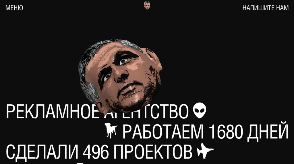
4. рекламное агентство ПИКЧЕР (Reklamnoye Agentstvo PIKCHER)
Pikcher is a Advertising and Creative Agency with a peculiar web design. When you open the page a big man’s head welcomes you. The head tilts following the cursor, and when you hover the cursor over the text, money, tattoos, face paint and other elements appear on the head’s face. Passed this entertaining yet confusing introduction, the website features large variable fonts and a series of colorful cartoonish illustrations that lead to the company’s past projects.
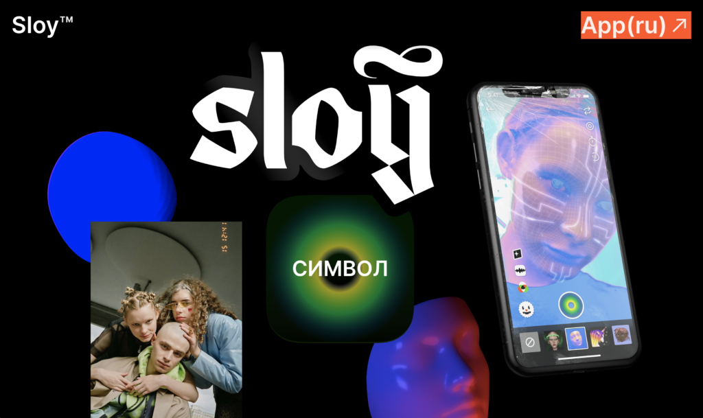
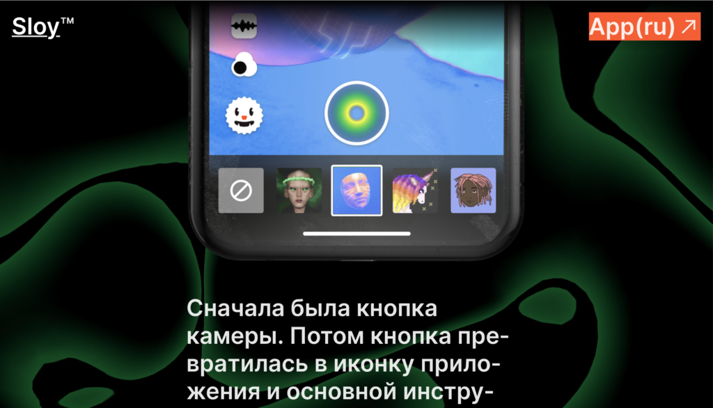
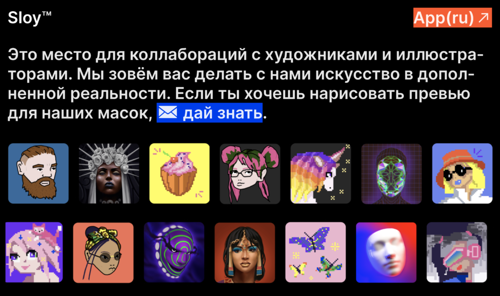
5. SLOY Design
SLOY is an AR video platform and community of fashion enthusiasts who share their style in short video format. This website gathers a series of assets designed for content creators and designers. Gradients, fluorescent tints, 3D elements, fluid animations, face filters, videos in mobile format, combined with a black background and white simple typefaces make this website “punchy” and full of personality.
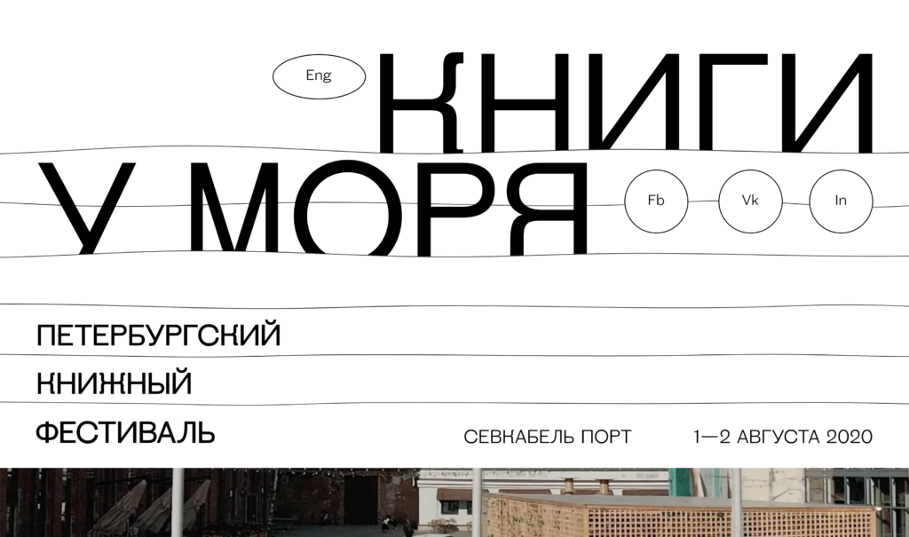
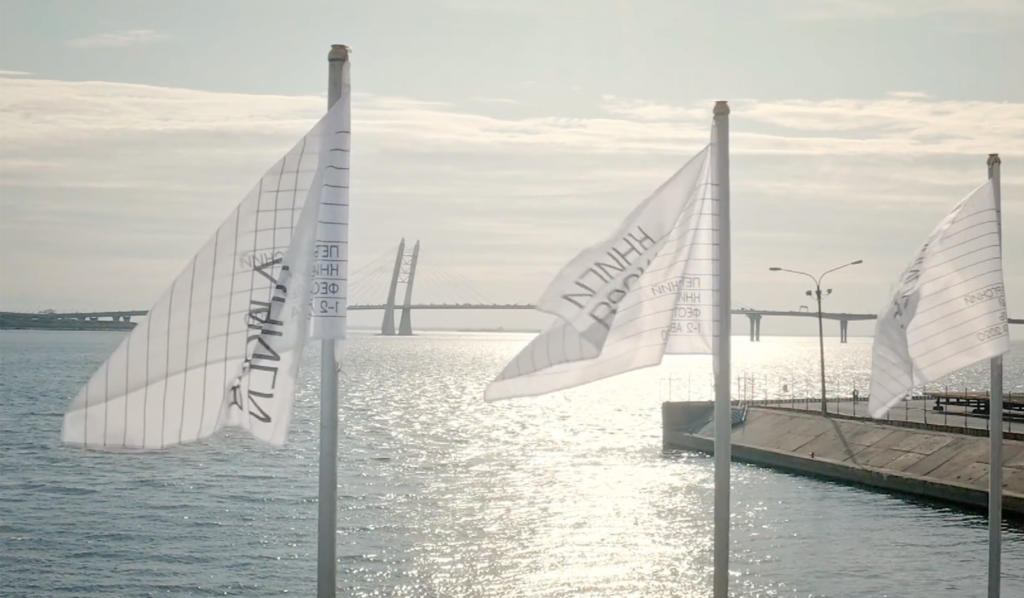
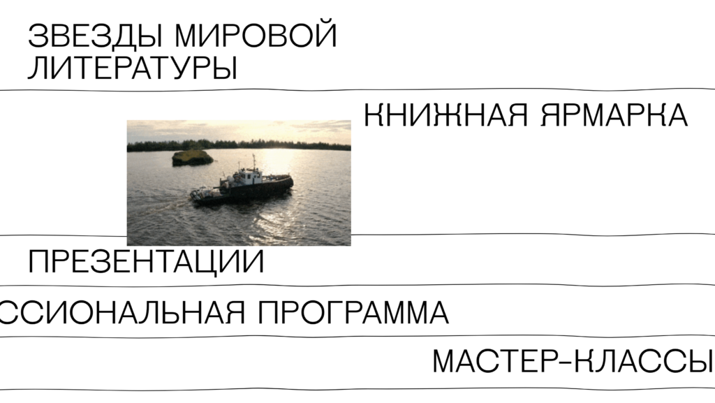
6. книги у моря (Knigi U Morya)
книги у моря, in English “Books By The Sea”, is a website dedicated to a book festival in St Petersburg. The website is cleverly designed, as the white background with black text and horizontal lines is a clear cross reference to books and notebooks. Not only this, but as the images in the website suggest, the heavy use of white mirrors the brightness of the sea, and the lines that cut the screen horizontally aren’t always perfectly straight, but resemble the waves of the sea.
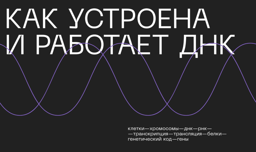
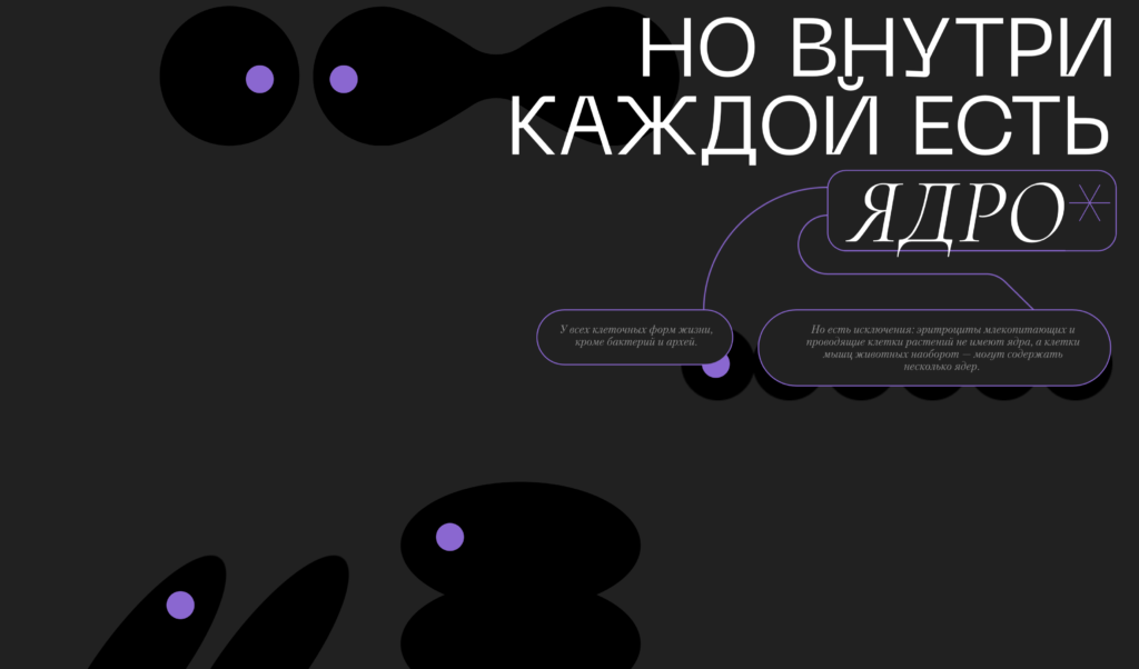
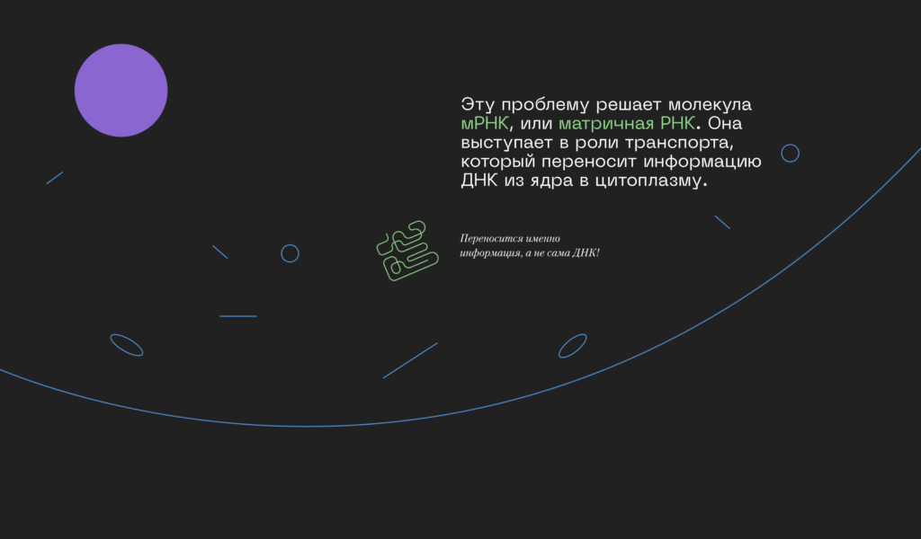
7. КАК УСТРОЕНА И РАБОТАЕТ ДНК (KAK USTROYENA I RABOTAYET DNK)
Navigating “How DNA Works” feels like an endless scrolling experience, which is exactly how we would feel if we stretched out the DNA contained in a human cell and went through it, centimetre by centimetre (for the record, a human cell’s DNA totals about 3 meters in length. — N.A. Campbell, et al. Biology: Concepts & Connections. California, 2009). This educational website’s sleek design displays few, minimalistic illustrations colored in pastel hues.
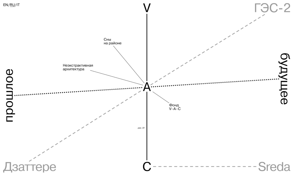
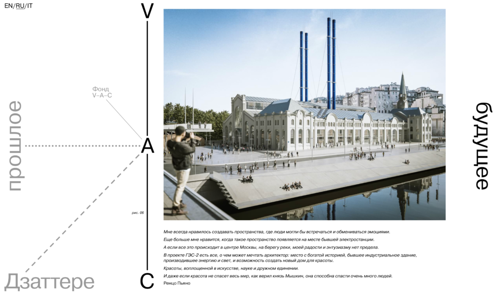
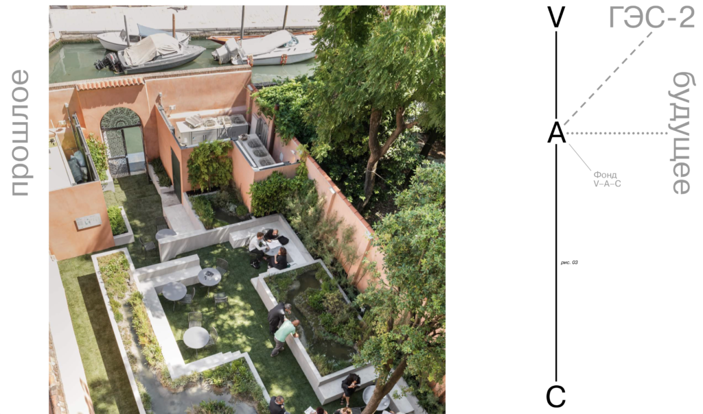
8. V-A-C org
Established in Moscow in 2009, V–A–C Foundation produces new culture working with local communities and artists. It’s a platform for open discussion aimed at redefining the contemporary landscape, constantly resetting the coordinates for dialogue within a new global geography. V-A-C’s focus on geography is represented on the website visually through an interactive illustration resembling a compass.
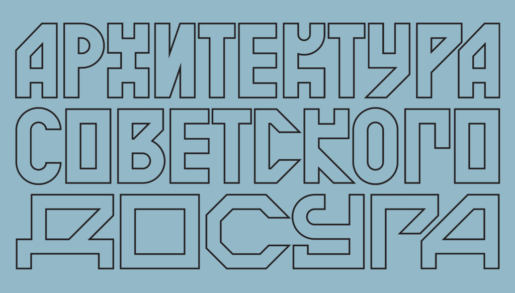
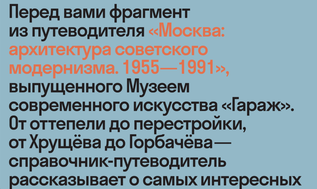
9. символы оттепели (Simvoly Ottepeli)
Moscow Modernism relies on colors and typography to impress the viewer. The website is a guide to Soviet Modernist Architecture (1955–1991) published by Garage Museum of Contemporary Art. A beautiful scroll transition transforms the initial black background into a more delicate, pastel blue canvas where a large, “blocky” takes up all the space on the screen. The typefaces used successfully evoke that Soviet Modernism feel we all know.
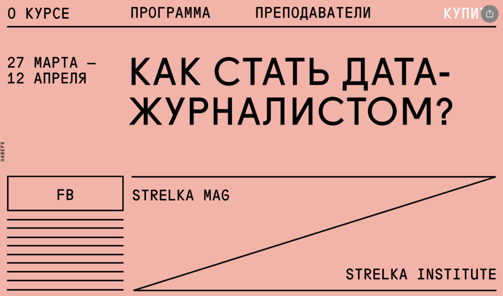
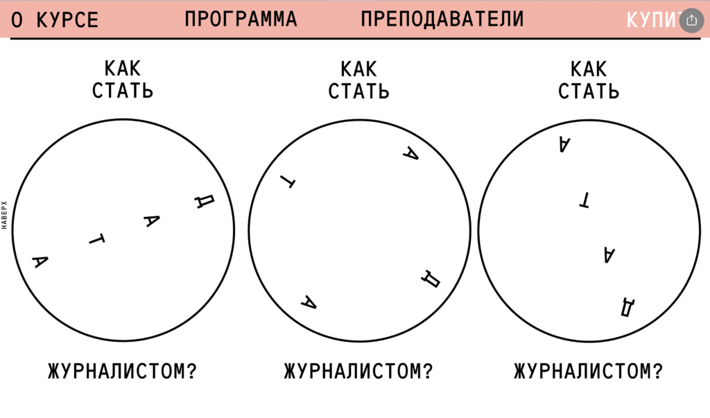
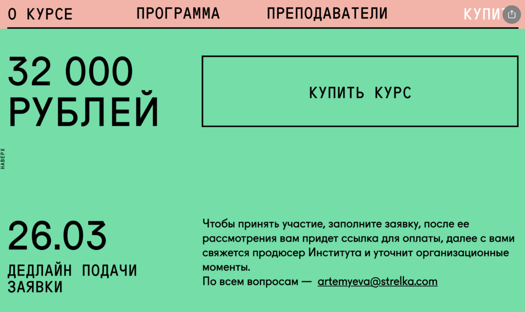
10. Как стать дата-журналистом Курс Strelka Mag (Kak stat’ data-zhurnalistom Kurs Strelka Mag)
This website is dedicated to a course on how to use big data in journalism. What stands out in this web design is the simplicity of its shapes and typefaces, the appreciation for white space and the use of few colors.
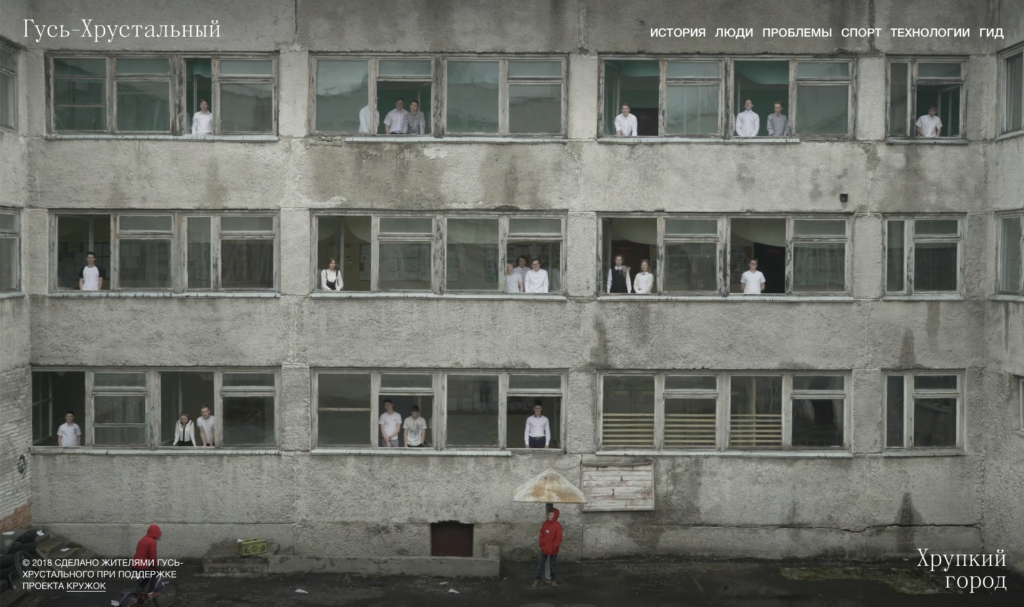
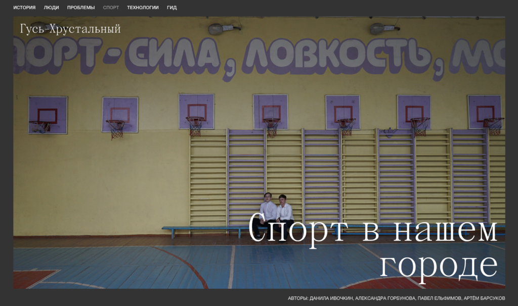
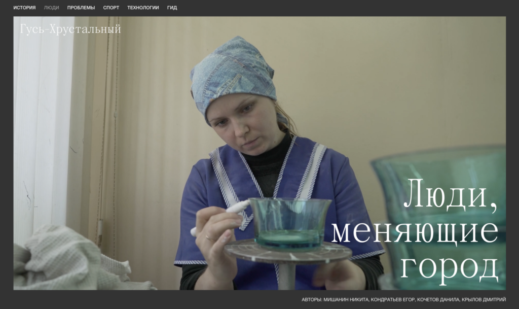
11. Хрустальный (Gus-Khrustalny)
Gus-Khrustalny is a Russian city located located on the Gus River. This website serves as an online guide to the city. Needless to say that the images featured on this website embody the stereotype of a Russian city. Despite the sense of roughness these images convey, the aesthetics of this website are almost hypnotising. The homepage shows a video of some kids throwing paper planes from the school windows. This video, despite being incredibly Brutalist, feels very subtle. Another interesting touch is the choice of words in the top-right menu: history, people, problems, sports, technology, guide.
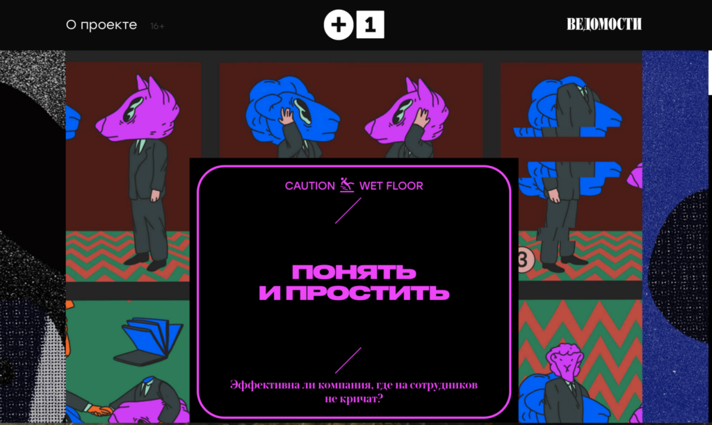
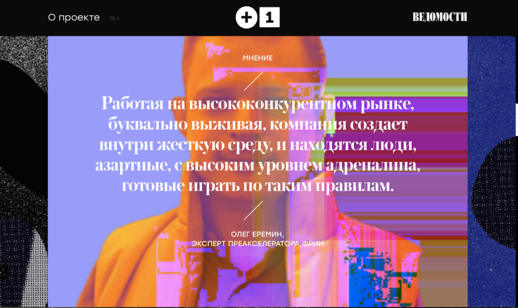
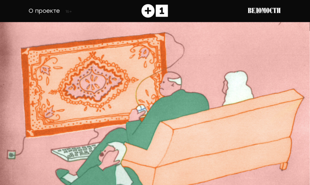
12. Понять и простить (Ponyat’ i prostit’)
Plus One is a communication project about leadership practices in the area of social and environmental responsibility. This company has created a platform for direct communication and exchange of resources between business, non-profit organisations, government and society. Unlike the previous website, this one utilises a bright color palette, and blends together illustrations, gradients, grainy background, glitches and more edgy visual elements. This design succeeds at proposing a daring visual style while remaining user friendly and and readable.
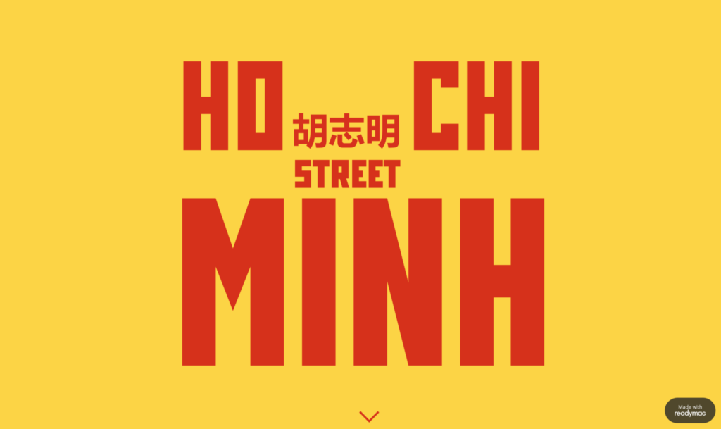
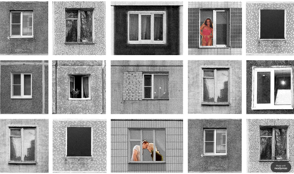
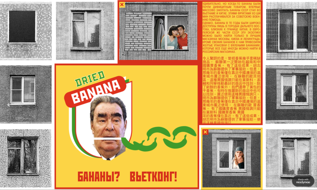
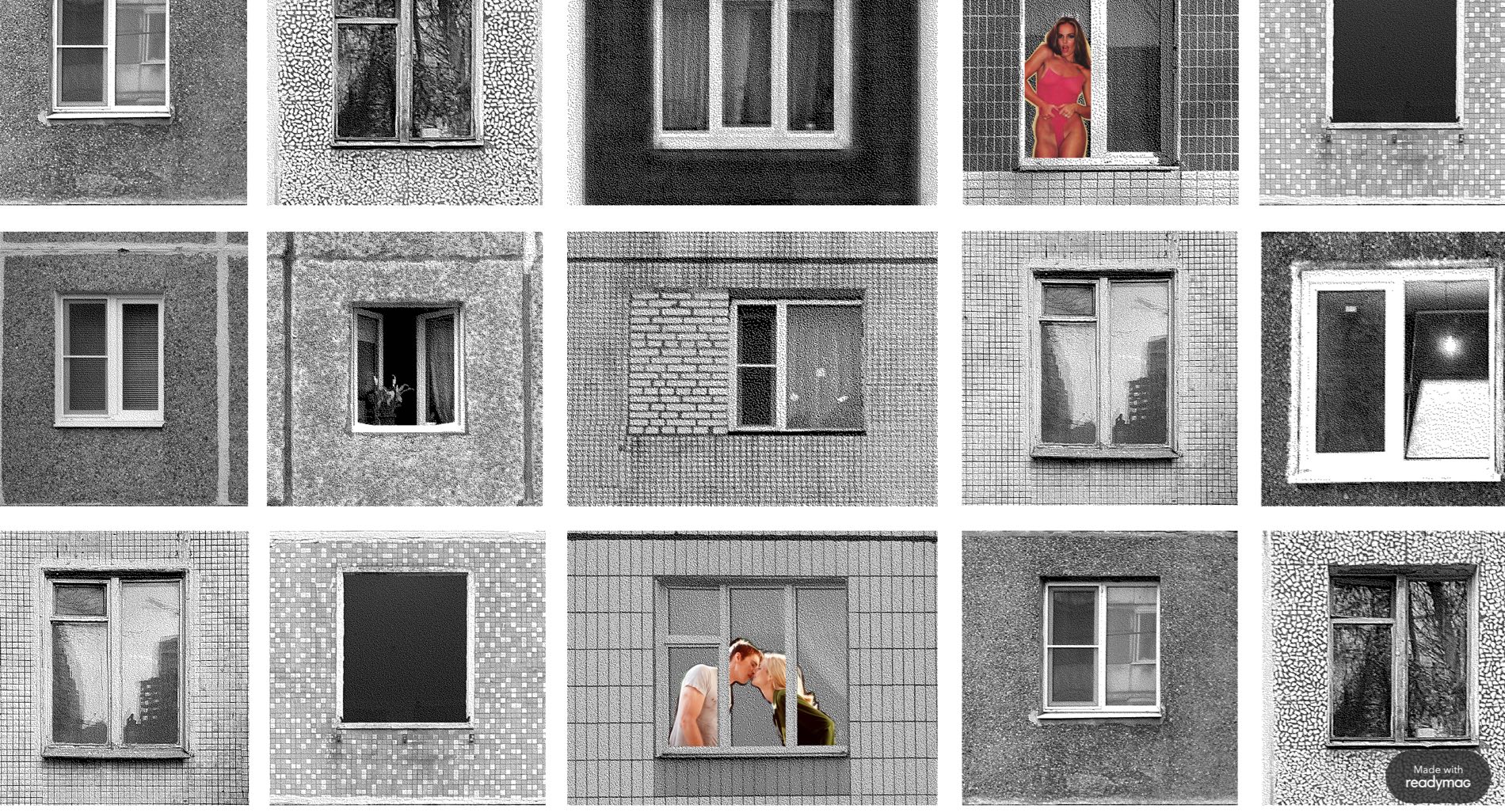
13. Ho Chi Minh
Ho Chi Minh is HSE art and design school project by student Anastasiya Buryakova. The website features a collection of phots of windows, in black and white, that gives the illusion of a tall Brutalist building made of different windows. By clicking on the people, animals or objects inside some of the windows, colorful pop ups with descriptive text, videos and illustrations appear, donating the website a new, different and interesting personality.