
Brutalist design is a great way to appeal the youngest and hippest audiences. Many brands use it to stand out, making sure their presence doesn’t go unnoticed. But does Brutalism have a future? Yes, we definitely think so!
Brutalist design is known for an exaggerated use of clashing colors, huge or hard to read types, and oversized images. In web design, it shows an overload of hover effects, animation, and micro-interactions. Its raison d’être is to shock and overwhelm, and therefore you need to abandon the established aesthetics norms to truly appreciate it. Its raw and unpolished style may not be perfectly functional in terms of usability… but it’s definitely daring and visually interesting!
Only a few months ago Brutalist Websites stated that “brutalist websites are dead”. The point they make is that once something becomes mainstream, it’s worth abandoning. But are they right? We don’t think so! In fact, Brutalism is growing fiercely and evolving into many different intriguing directions.
At Design Matters, we find the honesty and realism ingrained in Brutalist web design refreshing. We love designs that break all existing design rules! In fact, at Design Matters 18, we encouraged designers to be bold and rebellious, with a the theme called “Be a Design Rebel”.
We found three distinctive Brutalist designs that are doing incredibly well at captivating big crowds. Here they are!
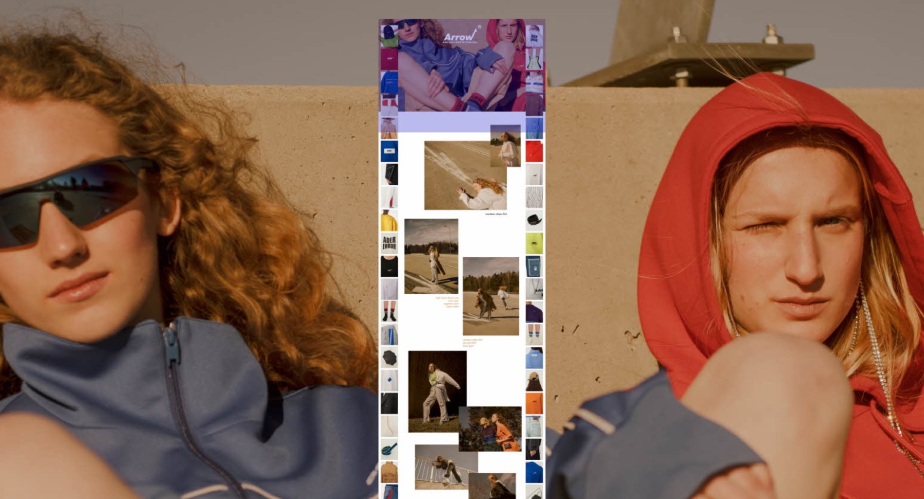
1- Ader Error webshop
Ader Error is an apparel brand from Seoul, South Korea, designing unisex clothes. The philosophy of this label is to represent the youth of South Korea and let people express themselves with no gender limitations.

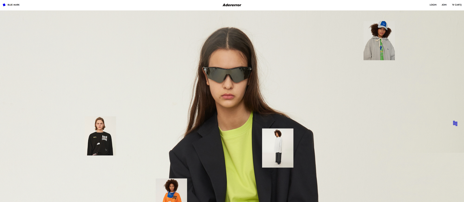
What makes this brand special is its unique style, reflected in its clothes, stores, and website. Ader Error shops resemble galleries and exhibition venues, but what we like the most about it is its Brutalist web design.
When you come to the website, a loud video starts to play, and the sound won’t stop playing. The first impression is overwhelming! Images resembling clipart are arranged in a chaotic way, to brutalize the look even more, and the product information is reduced to the bare minimum.
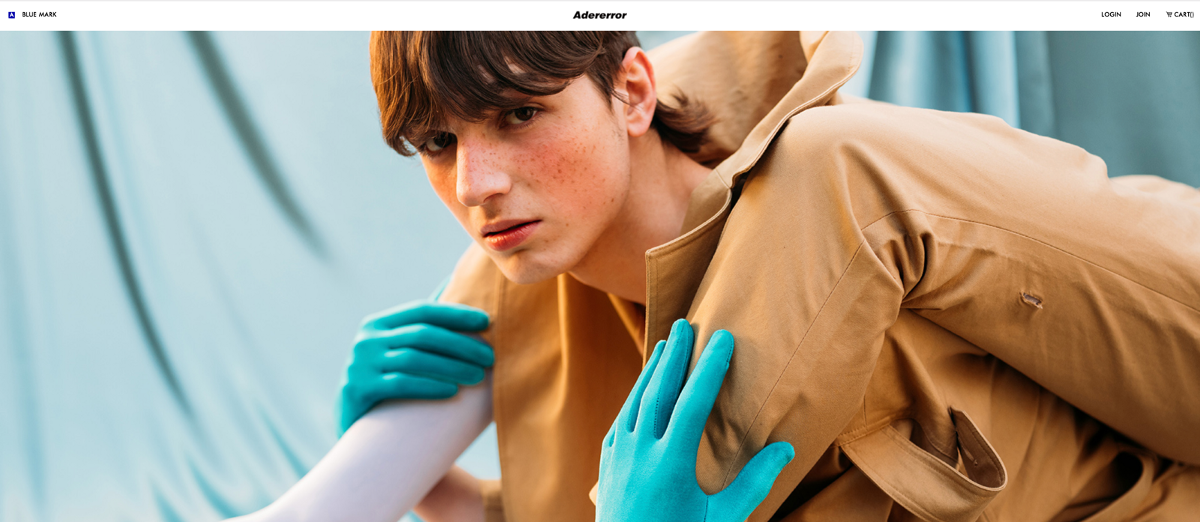
Breathe a sigh of relief! The combination of distorted sounds and disarrayed images is balanced by a simple color palette and a white background with fullwidth images. The result is a modern, cool, and casual way to present the brand.

2 – 032c
032c is a German magazine and a streetwear apparel brand. This magazine is published twice a year and covers themes related to contemporary culture, like art, fashion, and politics. But there’s more! It is also a website, which is even more awesome!
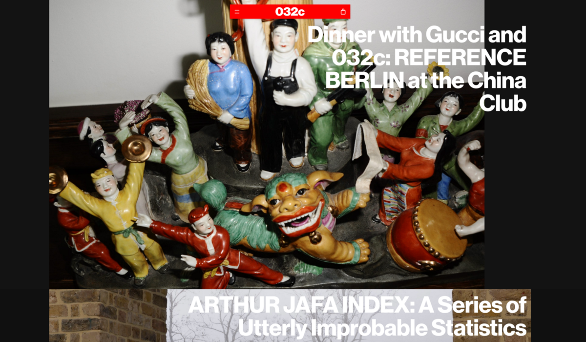
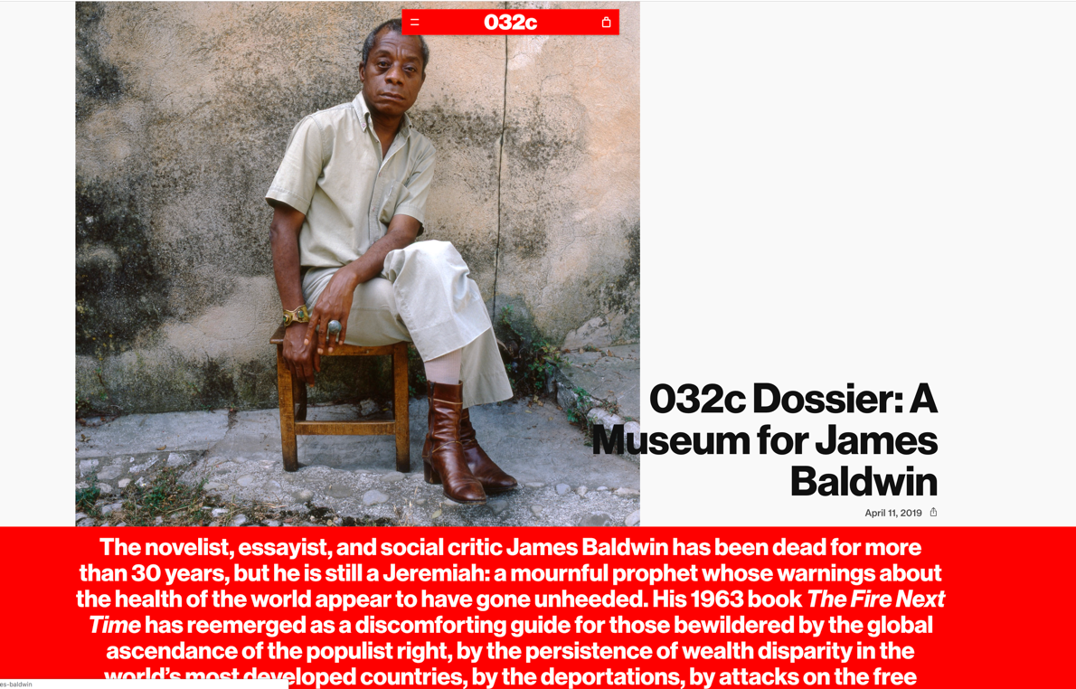
Founded in Berlin in 2001 by Joerg Koch, it takes its name from the Pantone code of the solid red used in the covers of their first three issues. Cool, right? An important part of its core mission is to celebrate pop culture, promoting amateur creatives and supporting accessibility. In addition, 032c is home to a Workshop used for research and production, but also for hosting exhibitions.

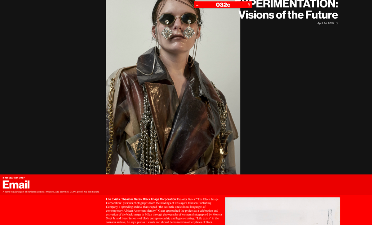
Let’s now take a look at the design of the website. The unusual drop-down menu in the middle of the page, the audacious choice of colors, and the use of different typefaces give 032c a daring and edgy appearance. Despite the strong industrial feeling that the website communicates, the webshop takes a more subtle direction where the products are displayed with no frills on a white background. Your shopping experience will be simple and direct. Guaranteed!
This is a great example of how it’s possible to balance a brutal UX experience with a simple, effective, and functional website structure. Unlike Ader Error — that is unconcerned about looking attractive — 032c’s design does not interfere with the browsing and shopping experience.

3 – Can Yang
Our third choice falls on a young graphic designer from Shenzen, China. Because Brutalism isn’t necessarily expressed only in web design, we decided to pick a Brutalist print designer too!
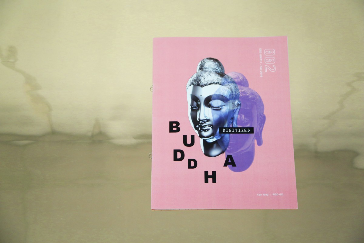
Can Yang marries philosophical concepts and images of the Chinese tradition with Western art and alternative culture. The backbone of her work is a conscientious balance between her roots and the experiences she absorbed while studying Design in the US.
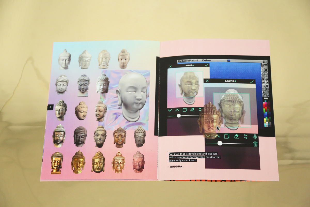
Her in-depth research and analysis of folklore and superstition are expressed in a playful way, with a powerful use of colors and a juxtaposition of elements of the Buddhist tradition with the retro design program Paint. She evokes the humble, lower-class culture with a nostalgic traditional feeling, while adopting Brutalism. Look at those distorted, scattered images and mixed materials!

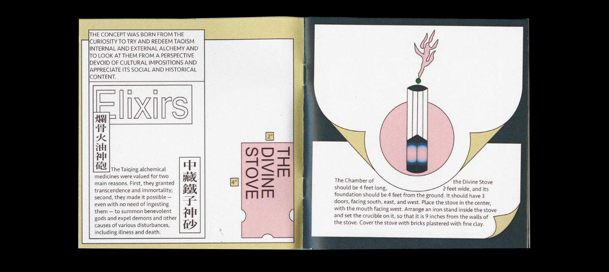
Her book White Tiger / Blue Dragon is about ancient alchemy and how to make elixirs, and the title is inspired by Chinese mythological creatures. In this book, concepts and styles that seem completely unrelated are blended together sapiently, while nuanced color palettes are combined with line drawings of glassware and distillation instruments. The illustrations are unpolished, and there is no distinct hierarchy in the way the content is presented.
Can Yang’s work is absolutely original, beautiful, and Brutal!