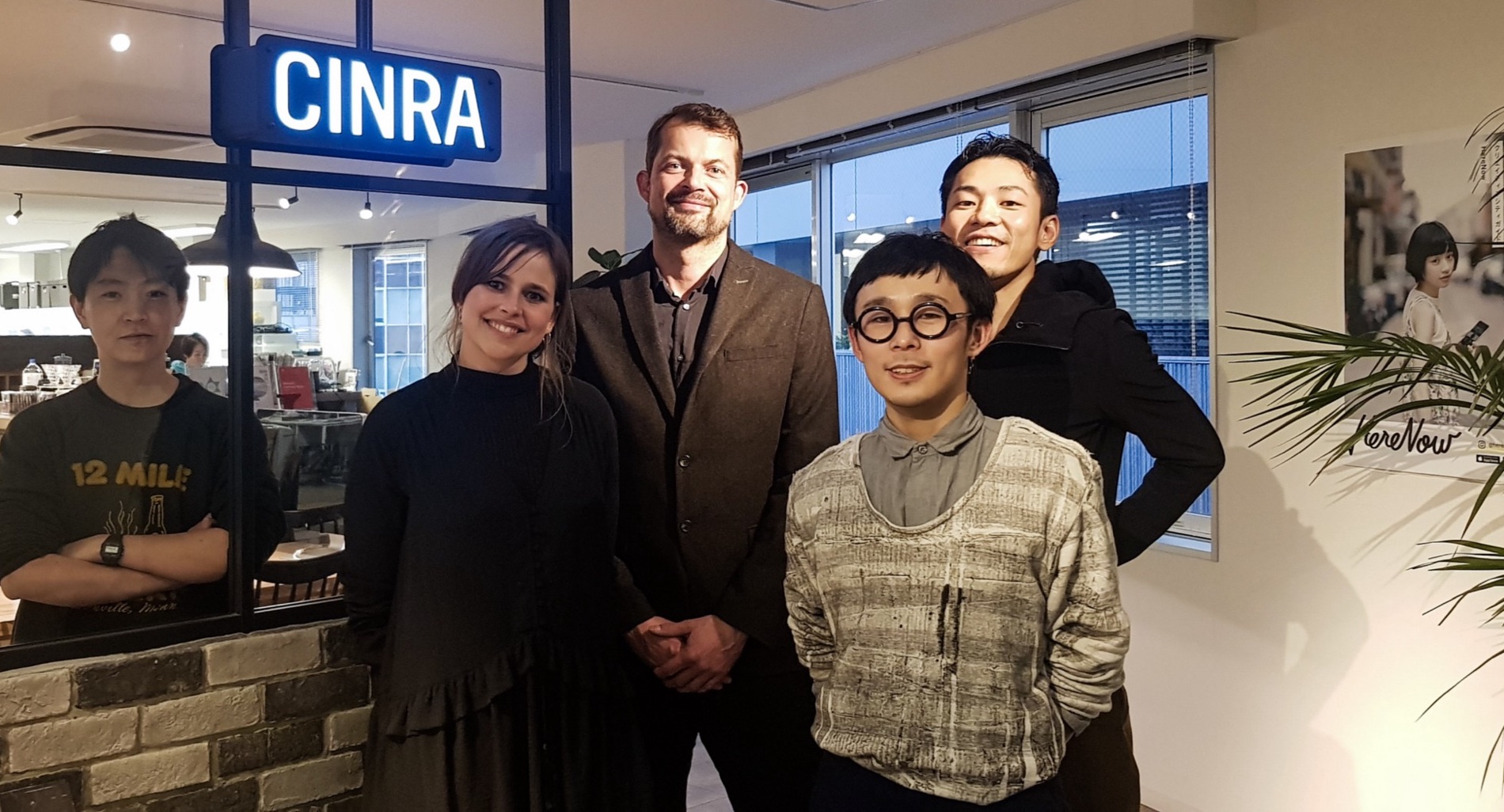
When it comes to navigating digital complexity and drawing inspiration from the traditional culture, the Japanese know exactly what they are doing. We wanted to discover what we, as Scandinavian designers, could learn from Japanese design and culture. So we, Julie and Michael from Design Matters, spent five days in Tokyo to find new perspectives on digital design.
Japan is known for its high-quality design tradition, especially in technology. But we found that digital and non-digital products are designed quite differently. If we think about Japanese non-digital design, for example interior design, we immediately picture a simple, refined, and minimalistic style. But when we approach the Japanese digital world, we find a completely different style. If we look at established Japanese websites, we are overwhelmed by the complexity and amount of information presented.
Japan is geographically, and culturally, far from Denmark and the West. It is a beautiful group of islands with a long history, rich with traditions and rituals. Japan has seen many invaders crossing its borders over the centuries, and earthquakes are a constant threat. This Country has endured long periods of isolation and has a very homogenous population, with only 7% of the population being foreigners.
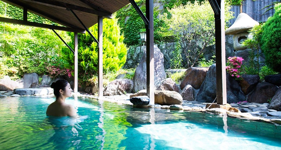
We were fascinated by many aspects of their culture, like temples, shrines, and the onsen (the traditional hot springs and indoor baths). We had no doubt that Japan was going to surprise us and open our eyes to something new.
Our time in Tokyo
Driven by our insatiable curiosity, we couldn’t wait to dive into digital design in Japan and find speakers for Design Matters. We were also eager to discover different cultural trends. So, we met with independent designers like Shun Ishikawa, and design companies like Dentsu, Think & Do, Tank, Re:public, Hatte, Concent, Spread, and Cinra.
What surprised us the most is that almost all designers seemed to agree that the real strength of Japanese design culture is not to be found in the digital space — yet. Because of that, they suggested we should rather explore the culture and the traditional design scene instead. And that’s what we did. Diving into this complex culture was a thrilling and culturally enriching experience, drizzled with occasional cultural shocks.
Our first cultural shock: Living with complexity
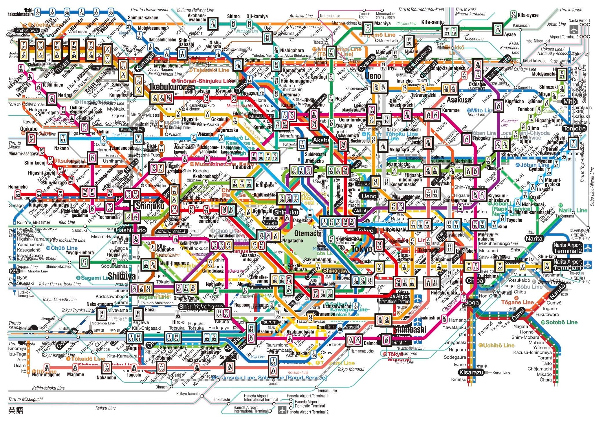
Japanese people are used to navigating highly complex and chaotic environments. Their cities have some of the highest densities in the world, and their stratified society is reflected in a language with a multitude of registers. The metro system is pretty intricate, their writing system consists of three alphabets (hiragana, katakana, romaji) and several thousands of kanjicharacters, and there are more than 50 different payment methods.
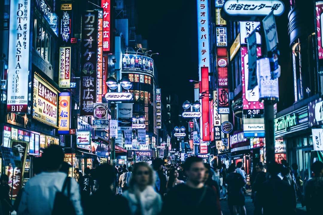
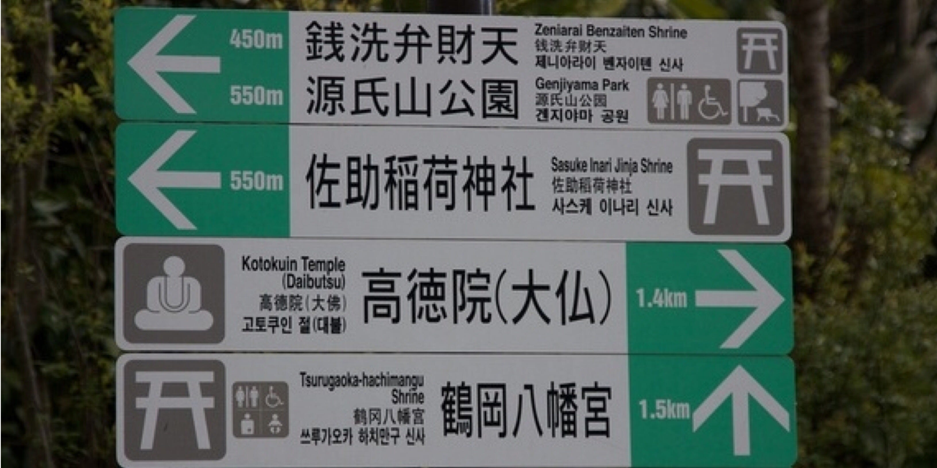
This complexity is also visual. Just by looking at the signs in the streets, we were impressed with the level of complexity they are exposed to. Coming from a minimalistic Danish design tradition, and being used to clean users’ interfaces, such as Google and Airbnb, that was quite of a shock to us. Complexity is so ingrained in their mentality that design is nothing but a tangible and visible way through which they express this complexity in their day-to-day life.
Opposites seem to coexist magically
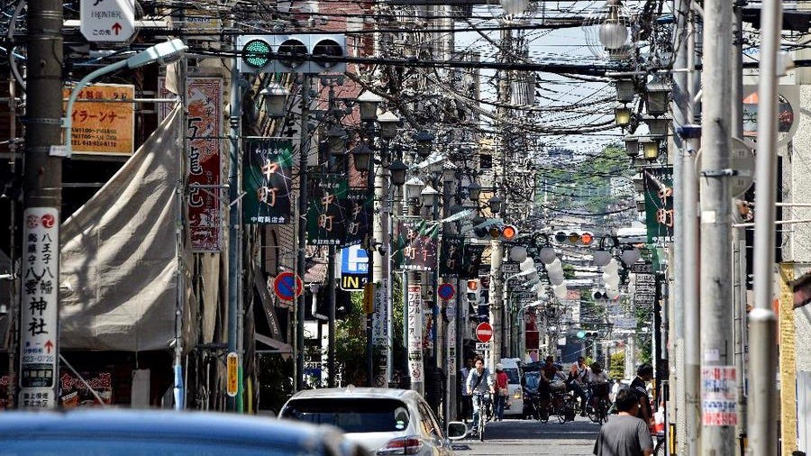
What we noticed is that the world the Japanese live in seems to have two opposite sides that somehow coexist. We found a contrast between extremely chaotic and peaceful environments. On one hand you have the quiet atmosphere of the onsen, and the tranquil and orderly zen gardens. On the other hand, you have cluttered office spaces, crowded cities with a jumble of neon lights, overlapping sounds, and tangled overhead power cables.
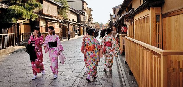
The way they balance extremes can also be seen in the coexistence of modernity and tradition. You can hop on the shinkansen, the bullet train that can reach 320 km/h, or you can sit on an electronic toilet that can wash your posterior or heat the seat. But you can also see people praying in the Shintoist shrines, or attending matsuri (traditional civil or religious festivals) while wearing yukata, traditional colourful robes.
So, Japan appeared to us as an incredible land of fascinating contradictions, where the new lives with the old, the innovative with the traditional, and the quirky with the more conservative.
Simplicity is seen as less trustworthy
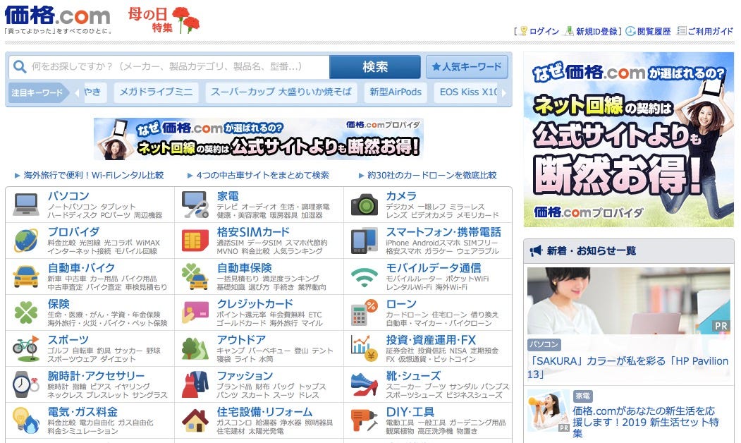
We discussed with the designers we met how users navigate digital complexity in Japan. Because the Japanese aren’t familiar with simple UI’s, websites appear cluttered and interfaces seem complex to us Westerners. What we perceive as an “information overload” is not really seen as a problem by Japanese users. The problem is that everyone is targeted within the same interface, with no differentiation based on the users’ needs.
Another interesting aspect is that Japanese people don’t value simplicity in digital products as much as people in the West do, because they perceive a simpler and more minimal UI as less trustworthy, and because an “emptier” design may seem to lack important information. The kanji, the characters used in their language, have an impact on their way of thinking. They are used to condensing a lot of information and complicated concepts into symbols, which they combine and put one next to the other, filling the available space.
Because kanji are so complex, and because changing a single stroke could completely alter the meaning of the character, Japanese people are trained to focus on small details. It is no surprise that browsing cluttered websites comes pretty natural to them. This made us question whether simplicity is always is the way to go in digital design. We asked ourselves what we could learn from Japanese digital products, where a huge amount of content is preferred over white space.
Japan should not copy the West
Being trained as designers in a small country like Denmark, we are used to looking outside the borders to get a more global perspective on the world. But one problem is that this global perspective comes mainly from California.
Shun Ishikawa has recently released a book called Hello design. In his book, he questions and reflects on the Japanese design culture, aiming at giving more creative confidence to the Japanese designers. Instead of simply creating designs that match world famous products, he states that all designers, not only the Japanese ones, should start digging into their own culture, religion and design tradition, to reinvent themselves as designers and create better products.
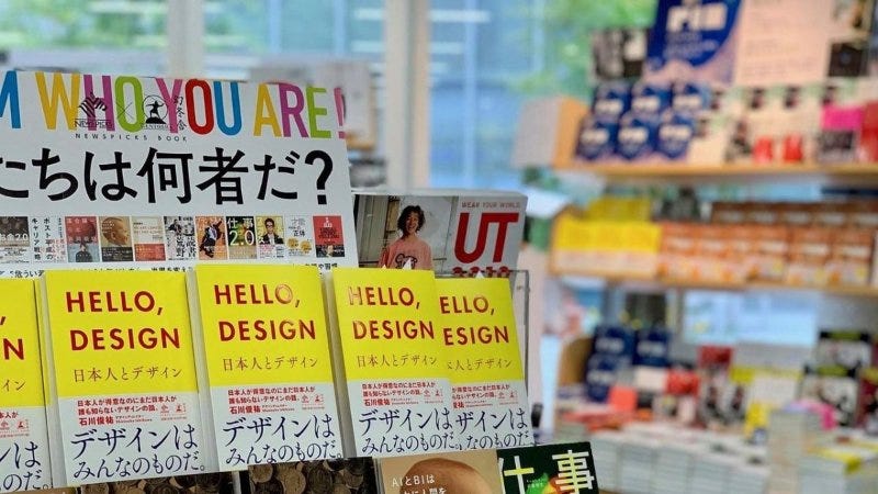
So, which aspects of the Japanese non-digital world can we bring into digital design? In Japan, there is an incredibly high level of service in restaurants and shops. For instance, since using umbrellas is very common, shops are equipped with stands and plastic bags, and even in the toilets there are specific hangers for umbrellas. This is real service design! And it’s everywhere, no matter where you go. Everything has a designated place. This attention for the quality of service and details, which is a big part of the Japanese tradition and already exists in non-digital design, could be brought into digital design too.

Emotional connection with the products
You’ve probably heard of Marie Kondo, the Japanese organising consultant who has become famous for inventing the KonMari method. This method consists of gathering together all of one’s belongings, one category at a time, and keeping only those that ‘spark joy’ (ときめく tokimeku in Japanese). Before saying goodbye to an object, one must also thank it. This method is partly inspired by the Shinto religion, in which cleaning and organising constitute a spiritual practice.
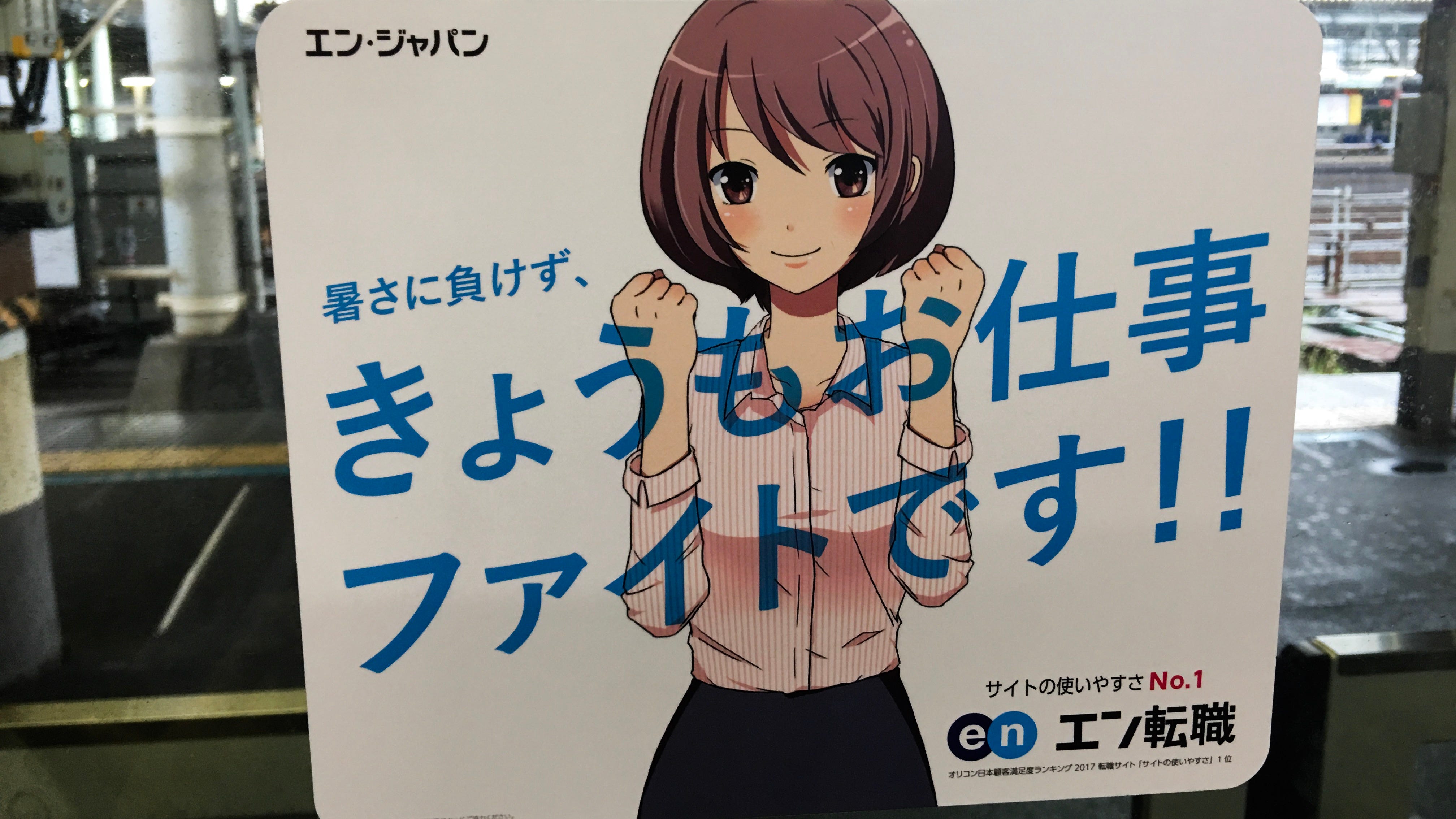
The deep emotional connection the Japanese have with objects is also seen in relation to digital products. In fact, Japanese users are among the most loyal, once they understand and appreciate a product. It is clear that emotions drive the visual culture in Japan. A striking example was the concept of kawaii — cute in Japanese. Kawaii visuals in Japan are used to set a mood and establish a unique relationship to the product.

Despite it looks strange to a Western eye, Manga and Anime and cute characters like Hello Kitty or the ones created by Hayao Miyazaki, are used everywhere, from digital job portals, to books, banks and means of transportation, and even in the modern feminist website She Is Here (https://sheishere.jp/).

In conclusion
For many decades Western designers have been designing for the Western culture. We take pride in making products that are simple and efficient.
On the contrary, Japanese designers don’t embrace simplicity in digital design, because complexity is strongly present and valued in their culture. They base their designs on traditions and their local community, rather than on global research.
With such great differences in digital design, using the same visual style for digital design in Japan and the West seems impossible. What we could learn from Japan is to take a better look into our own culture and tradition, to discover hidden patterns or needs, from which we can learn and improve.

