Cross-Cultural Design, by Senongo Akpem, is a useful and insightful guide for designers and whoever works digitally across cultures. This book guides you through a variety of design practices whilst providing practical examples and tips on how to design with more cultural awareness and in a more inclusive way. Moreover, it helps you reflect on your own biases and learn how cultures influence how societies work and how we think. Cross-Cultural Design gives you the tools to approach cross-cultural design projects in a new way, with a new perspective on what it means to be a designer in a globalised world.
Here, we gathered here the main takeaways from the book Cross-Cultural Design and interviewed the author, Senongo Akpem — a designer and creative director delivering human-centred design systems, brand strategy, and digital experiences.
The main take-aways from the book
We live in a globalised world
Cross-cultural design is a complex topic. Cultural misunderstandings can lead to discomfort, embarrassment, and even offense. Plus, there is also an effect on the company’s bottom line, in reduced sales and use of their digital products. This is why it’s important to define a design methodology that is culturally responsive and attuned to what global audiences need and want.
With more devices and more access points, billions of people are coming online, bringing with them all the behaviours and expectations inherent to their cultures. Despite this, one of the biggest mistakes seen in design today is the assumption that users all come from WEIRD (Westernised, Educated, Industrialised, Rich, Developed) cultures.
57% of all people in the world use the Internet which equals 4.3 billion Internet users globally. And 37% of all Internet users shop online.
Interfaces are cultural products
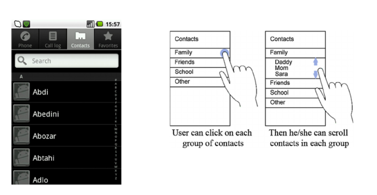
Digital interfaces are “cultural products” that that reproduce and amplify different parts of our cultures — both good and bad. The most well-designed interfaces reinforce the ways that people like to communicate with, and about, each other. Therefore, our interfaces should offer people the mental models they are familiar with; the more we can align our taxonomies and interface structures with our users’ expectations, the more effective our designs will be.

Culture also has a huge effect on what we consider aesthetically pleasing. Many Western designers point to concepts like rational type systems, clean lines, and mathematical layout grids as universally “good” design, without realising that many of those principles come from the German-born Bauhaus movement. Instead, we should look at what modern cross-cultural audiences find pleasing, which can be a challenge. So, what should we do? It’s useful to analyse cultural preferences across major visual design elements:
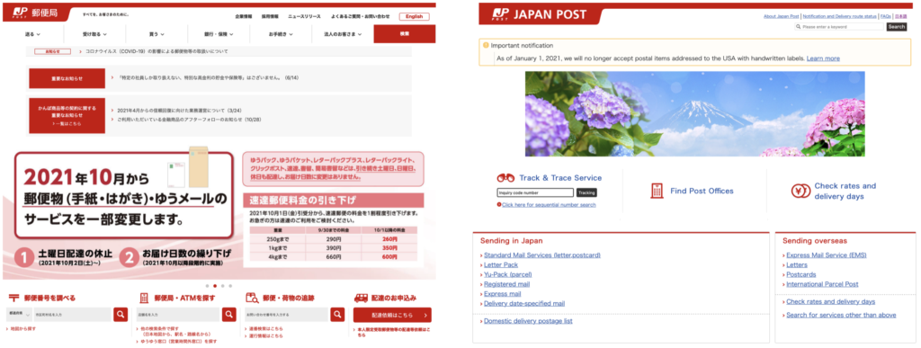
- Space —What information density feels most appropriate for your audience? For example, in Japan, web pages with high information density are often considered functional and aesthetic, but in the West it’s aesthetic to include ample negative space.
- Imagery — People love to see themselves reflected. So, make sure you learn if there is any taboo content to avoid. For instance, in Nigeria, using your left hand to give things to people is taboo; a photo of a customer using their left hand to give money to a shopkeeper would be a faux pas.
- Color — Be aware that color carries culturally symbolic meanings; Color can be associated with sacred rituals, political parties or other cultural touch points, such as national flags. For example, green is sacred for many in Indonesia, but in America it often signifies money.
- Type — The density of certain scripts such as Japanese, or the relative length of words in a language like German, means that your type scales, letter spacing, and line heights will need to be adjusted to achieve optimal aesthetics.

Identities are fluid and change over time
Designing for a global audience means that you need to take your users’ identities into account. Identities change over time, and culture — which defines those identities — shifts together with them. However, you should keep in mind that culture is not the only element that defines a person’s identity; a person can, in fact, have values or behaviours that do not necessarily align with their culture of provenience.

The main factors that influence users’ cultural identities are: Race (how you are seen by others, and it’s not a choice you make), Ethnicity (a set of cultural markers about individual history such as language, tradition, religion, and geographic region that you see as part of your identity), Gender (your innermost concept of self as male, female, a blend of both or neither), Social class, Age, Religion, Individual identity (your own complex, nuanced, situational, and ever shifting view of yourself is shared by no one else), and Algorithmic identity (when an individual identity moves online, it becomes filtered, categorised, and surveilled; this identity is assigned to you by means of algorithmic analysis of the data that an organisation like a web analytics company has amassed on you).
Cultural Dimensions can help us understand cultures better
Just as individuals have identities, so do nations and cultures. Cultural Anthropologist Geert Hofstede created in the early 80’s a list of cultural dimensions. These can help designers design for cross-cultural audiences:
- Power Distance — It refers to how less powerful members of a society both accept and expect that power is distributed unequally. In lower PD cultures, members of the society can openly question authority and the distribution of power, and see relationships between leaders and subordinates as more equal. → When designing, ask yourself; What visual markers of authority should I use?, What taxonomies will my audience recognise and accept?
- Individualism vs Collectivism — In individualistic societies, people believe in a strong right to privacy, limited use of state power, a strong free press, individual interests over group interests, and self-determination. At work, they value personal opinions, challenges, and material rewards more. In collectivistic societies, people believe that avoiding shame, saving face, and maintaining harmony within the group are the best ways to affect personal change. At work, they value training more and governments have tighter control of the press and the economy, and prioritise consensus over personal freedoms. → When designing, ask yourself; How do I show evidence of success in society?, What motivates my users to make decisions?
- Femininity versus Masculinity — (note that these terms are based on traditional gender normativity). The “masculine” dimension defines a society that prefers assertiveness, achievement, heroism, and toughness. Gender roles are strictly maintained, and there is little sympathy for those who are deemed weak or overly caring. “Feminine” societies prefer cooperation, modesty, and quality of life. The vulnerable are cared for, and there is less competition for resources and rewards. Gender roles are not rigidly enforced. → When designing, ask yourself; What voice and tone are appropriate for my audience?, Are competition and comparison a core part of the user experience?
- Uncertainty Avoidance — It measures a society’s tolerance for ambiguity and the unexpected. A high degree of UA means that people expect clarity in communication, and are more direct and active in getting their point across. Differences are seen as threats. In low degree of UA cultures, people are more accepting of differences, and show less anxiety around new or unexpected things. → When designing, ask yourself; Does my interface encourage browsing and wandering, or targeted search and drill-downs?

- Long- vs Short-term Orientation — LTO societies see more value in looking toward the future; members of these societies are pragmatic, appreciate adaptability and focus on gaining useful skills over time, saving for the future — patiently adapting to market and cultural changes. STO cultures see more value in looking to the past and present; people in these societies prefer problem-solving for immediate results, and see rules and traditions as their primary sources of information. → When designing, ask yourself; Does my content prioritise short- or long-term engagement?, How does my content and visual identity treat family?
- Indulgence versus Restraint — An indulgent society allows its members relative freedom to enjoy life, participate in recreation and leisure, and pursue individual satisfaction. Restrained cultures control how their members satisfy their needs and wants; there are strict social, sexual, and disciplinary rules. Money is saved, not spent. → When designing, ask yourself; Is happiness part of your digital experience? Are vices hinted at, ignored, or commented on openly?
Even if this model offers a good basis for understanding the influence of national culture on self-representation, it focuses overwhelmingly on nations, and not individuals. Also, it makes it easy to blame bad design decisions on users’ cultural orientations. So, designers should be aware of this and design a methodology that prevents stereotyping.
There are tactics for good cross-cultural research
- Cultural Probes — They are ways to engage audiences and provoke open-ended, and multi-sensory feedback. Written, drawn, and photographed responses can shed light on users’ lives, thinking, and motivations, and reduce reliance on interviews. It’s basically a low-tech, tactile method of learning from unfamiliar cultures and languages.
- Local facilitators — When a facilitator and a participant share a cultural background, the participants run more effective tests; users speak aloud more and are more likely to vocalise issues they find. This goes against the Western European model that advises that in usability-testing facilitators must remain neutral at all times, speaking and interacting with participants as little as possible.
- The Bollywood technique — In some collectivism-minded cultures, it might be difficult to get honest feedback about something. So, the best way to get honest opinions is to “create some drama”, giving people permission to participate in a fantasy, in a hypothetical narrative, like a Bollywood movie, where they can think outside their usual, collectivist social norms without feeling judged.
- Possession Personas— The things we surround ourselves with, our belongings and possessions, form a huge part of our lives. So, studying how people’s adaptations and ornamentation for their devices can give us a lot of information about the user experience.

How to design culturally responsive experiences
Avoid “Stereotypography”
Culture and identity influence our perception of type. And designers should make typographic choices that help create rich and better cross-cultural experiences. In the West, one of the most recognisable graphic markers for things African, tribal, or uncivilized — they are not the same thing — is the typeface Neuland (used in movie posters like Tarzan and Jurassic Park). But this typeface carries heavy connotations and stereotypes of cheapness, ugliness, tribalism, and roughness. Another example is the “wonton” or “chop-suey” fonts, whose visual style is supposed to express “Asianness” or suggest Chinese calligraphy. These are examples of Stereotypography. To avoid it, be suspicious of any typeface that looks like a culture or country, and instead search for type designers who are from the culture you are designing for.

Design with multiple script systems and pay attention to visual density
When your design work requires more than one script, you need extra typographic sensitivity. Find weights and sizes that give you a similar feel and give the page the right balance. Also, remember that different cultures have different levels of visual density; CJK (Chinese- Japanese-Korean) alphabets have more complex characters, with shapes that are generally squarer than Latin letterforms. So, a slightly larger font size and line height for CJK characters can make the difference.
Use icons and symbols clearly
We all use icons and symbols, but the problem is that they can often be just as abstract as the language they seek to augment or replace. Symbols are in fact interpreted differently across cultures. What to do to overcome the risk of misunderstandings or miscommunication?
- Pair icons with text describing the content or the action intended
- Make icons visually consistent — Icons should have the same style and colors, and have the same line weight
- Keep the meaning the same across your design system — Don’t reuse icons in different contexts, if possible
- Do some ethnographic research and don’t use icons or references that are culturally confusing or dangerous — e.g. family can translate both to a small nuclear family with two parents and one child and to a large extended family spanning three generations.
Localising is important
As the world becomes more globalised, designers need to adjust content and design strategy to accommodate new languages, nationalities, and cultures. So, what things do we need to consider when localising our design systems and digital experiences?
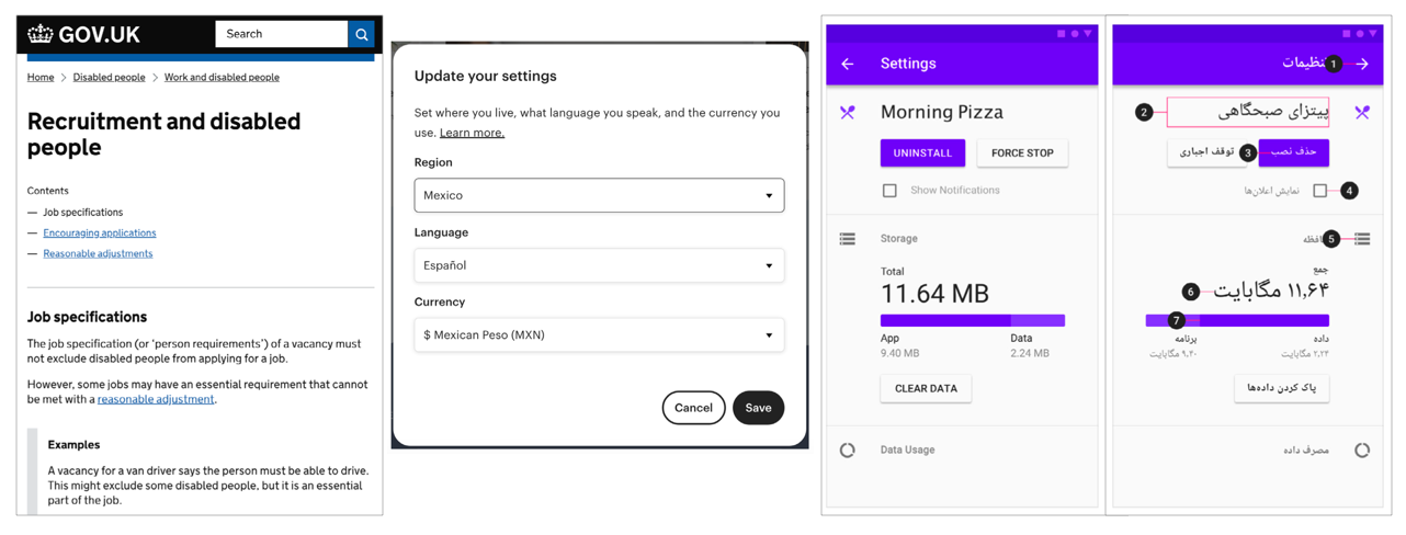
- Formatting — pay attention to name order, special letters, address and date formatting, currency presentation, and inauspicious numbers (shi 四 is considered an unlucky number in Japan and China, since it has the same sound as the word for death)
- Directionality — when dealing with right-to-left (RTL) languages like Arabic, consider “mirroring” certain UI elements: text should read from right to left, checkboxes should appear to the right of their label, progress bars should fill from right to left, navigation buttons and icons that indicate time, motion, or direction should be reversed (with the exception for video UI)
- Translation — If you can’t afford full professional translation services, consider simplified translated content of the most important parts of your digital product.
- Designing for second-language speakers — billions of non-native English speakers visit sites, consume content, and communicate in their second (or third or fourth) language; use clear language, well structured content, and expose content structure and navigation. It’s useful to tell users how long it will take to go through a page or give them a breakdown of the contents of the page upfront before they begin reading

Of the top million sites on the web, 54% are in English, but native English speakers make up only 25.2% of the people online. Over 19% of people online are native Chinese speakers, but only 1.6% of the top million sites are in Chinese.
Interview questions
We live in a globalised world where more and more people get access to the Internet every day. Therefore, designers are more often asked to design for larger and culturally diverse audiences. What is the difference between Internationalisation and Localisation?
In my book Cross-Cultural Design, I break it down in this way: internationalization is about making sure your product can go anywhere; localization is about preparing it to go somewhere.
When it comes to internationalization, this means designing or updating your websites and products so that they don’t contain any cultural-specific attributes. Internationalization (which is sometimes referred to as i18n) does not mean stripping digital experiences of any life or personality, but it does mean making the code, design, and content as flexible as possible so everything can function well across various cultures.
On the other hand, localization is the process of modifying or adapting your product to fit the requirements of a particular locale. This means things like translating the user interface, documentation, packaging, customizing features, and testing the translated product to ensure that it works as well as your core product.
What advice would you give to designers who are embarking on cross-cultural design for the first time?
Read. A lot. Cross-cultural design is not a new field, or a new idea. In the 70s and 80s during the first waves of modern globalization, a lot of business people wrote about cross-cultural issues in business. Though perhaps some of the references are dated now (many of the companies likely no longer exist!), these books are still a great place to start with a business management frame.
Besides reading, be curious about the ways other cultures do it, and use media and cultural institutions to find out more! For instance: what are the top 5 websites in Bolivia, or Papua New Guinea, outside of the usual suspects like Facebook? How about the top 5 TV or news shows? Top 5 artists or singers? From there, start to build lines of inquiry into how design works for them. How is content structured, the interfaces designed, branding used, and so on?
Sabrina Weschler at Dropbox also has some great tips on getting started with Cross-Cultural Design that you can check out.
What are the biggest mistakes that should be avoided?
This is a good question, and probably the easiest to answer. Bias. It’s present in everything we do, even when we don’t know (or acknowledge) it. In the essay Non-Assumptive Research, Dorothy Deasy said:
“Assumptions disturb truth by distorting the questions, the answers, the findings and the analysis. Learning how to identify and segregate them is critical to successful research.”
Whenever you do cross-cultural research and design, it’s inevitable that you look at things using your own cultural framework. The biggest mistake that designers make is not countering this effectively.
Deasy explains that we should start by stating our assumptions. Write them down, so you have a physical record. We’ve all been on projects where a HiPPO (highest paid person in the office) says “we know that X”. Sidestep that by taking those assumptions and changing them into open research questions. So instead of [claiming], “We know that users go to their account page first,” we can say, “where do you go first?”
That turns it away from an assumptive statement, or what you know. This reframing turns our project away from our biases, and instead prepares for what our users actually need. The open question (who, what, why, where, how, when) forces us to accept a variety of different answers, rather than a statement that closes off any further research.
In your book, you discuss the importance of conducting user research. What are the main challenges in conducting user research cross-culturally?
Outside of our own biases, language can be a big barrier, but there are of course ways around this. If you are moving into a new cultural market, hiring local designers and UX professionals to conduct research and develop localized interfaces is a must. They will capture and synthesize insights that you may not have, or understand.
Mustafa Kurtuldu shared a great anecdote with me while I was writing Cross-Cultural Design, about how Amazon found in usability studies when expanding into the Indian marketing, that many users assumed the search icon was a ping-pong paddle. The product team mitigated that by adding text descriptions, but it’s a great example of how even innocuous choices can affect the perception of our products in other cultures. In order to make our products effectively localized, we need to be aware of these kinds of cultural cues and then design solutions that account for them.
In your book, you also talk about “stereotypography” — discussed above. Are there any other ways in which damaging stereotypes are reflected in design and interfaces? If yes, what are they?
The ways we use (and misuse) photography is another really damaging part of design. For many readers, even the mention of the word “Africa” brings up a very specific set of images in their minds. Those same stereotypes show up in image searches in Google and other services like Getty and Unsplash. When we use those in our moodboards, our wite headers, and social collateral, we reinforce what are damaging and almost always incorrect stereotypes about entire continents, peoples, and languages.
In the field of AI, we also see this happen, where the humans constructing references for computers to work off of (it’s really not artificial intelligence at all, is it?) introduce all kinds of biases that then get encoded into the algorythm’s outputs.
Is there any anecdote that you’d like to share in regards to your experience as an intercultural designer?
Some years ago, I was looking through a large Sketch icon set. I’m talking about those files with hundreds of vector icons, all grouped according to theme. In the ‘Sports’ section of the file, I noticed an icon of a hijab, with another hijab upside down next to it. Weird, right? And I kept coming back to it, trying to understand what it was doing there.
A few years later, it clicked. It wasn’t a hijab at all. It was a pair of scuba flippers! I grew up in Northern Nigeria, and so I automatically associate that particular shape with the style of head covering that’s common there.

I still come back to this anecdote — because it’s so simple yet so telling. I have more of those, as I’m sure many other designers do too.


