As a product designer by profession, I’ve mainly dedicated my time to crafting Musixmatch’s product experiences and interfaces. However, within my responsibilities lies a passion I am fortunate enough to explore— illustration. Musixmatch’s Connected blog provides the perfect canvas to represent my creativity and dive into the world of visual storytelling.
Exploring this passion is pure joy, and I’m excited to share the behind-the-scenes journey of creating illustrations for our blog.
Taking flight: the aerospace theme
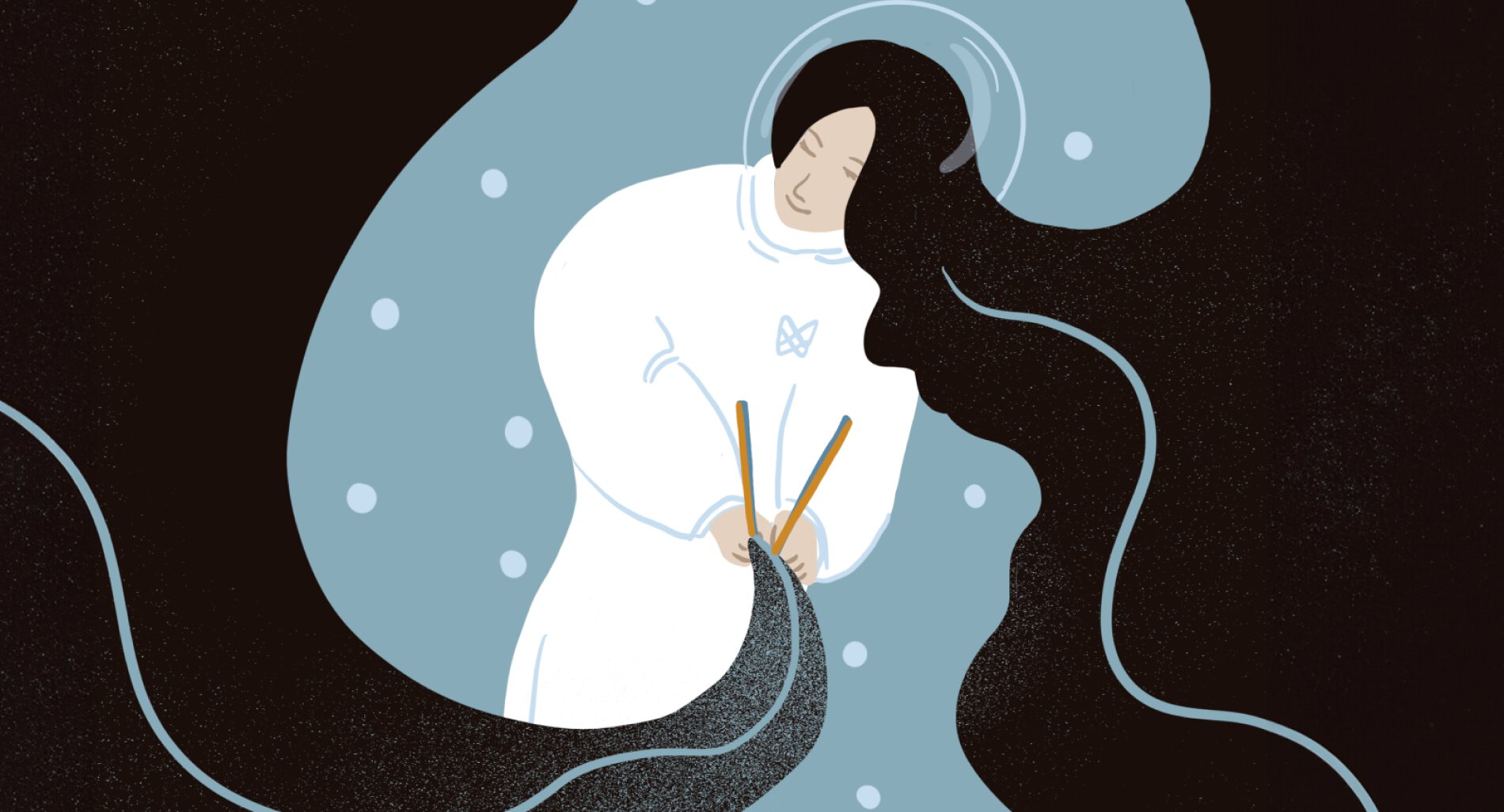
We chose the aerospace theme as we want to be perceived as the Musixmatch planet within the community. Like in aerospace, music transcends boundaries and takes us to new heights. The theme symbolizes our ambition to explore territories and connect through the universal language of music.
Crafting the Illustrations: a step-by-step odyssey
1. Reading the article
Before diving into the illustration process, I engage myself in the article. Understanding the narrative and message helps shape the visual story accompanying the written content crafted by Tim, Mauro, Laurell, and the team.
2. Choosing the color Scheme
Selecting the right color palette is crucial but fun! The right color sets the tone, evokes emotions, and ensures harmony with the overall aesthetics of the blog. Each edition of Connected comes to life with carefully curated colors that resonate with the theme. Thanks to our design team, which allows us to explore various directions, the sky is unlimited!
3. Adding the team’s Ideas
Collaboration makes the work personal and original. I incorporate insights and ideas from the Community and content team, ensuring the illustrations seamlessly align with the blog’s voice and resonate with our community.

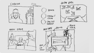
4. Making rough sketches
Embracing the mess and imperfection is the key. Why do many people love neatness when they start a blank page? Making a messy sketch allows me to make mistakes, brainstorm and be more creative. This process is usually fast when you have clear ideas from steps 1 to 3.
5. Drawing with Procreate
Equipped with my iPad and Procreate, I bring the illustrations to life. The digital canvas allows for precision, experimentation, and the flexibility to explore various styles, ensuring the visual narrative is as captivating as the written one.
Outlining the stories of Curators
While illustrating our curators, I start with their photograph; I trace the structure of their appearance and add the rest of the visual elements that complement the story
While we’d love to show our community beautiful faces, we respect their privacy and embrace inclusivity. Using illustrations to portray our curators helps us achieve both values and allows me to illustrate our curators beyond realistic photography.

Adapting across platforms
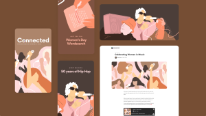
The journey continues after the completion of the illustration. Each illustration is adapted for various platforms, ensuring consistency across the Connected blog on browsers, email newsletters, and Instagram stories.
Conclusion: illustration as a reflective journey
For me, illustration is not an expressional artistic work but the result of the journey inside people and objects, seeing through their eyes and conveying their unique perspectives through artworks. It is a profound reflection of my thoughts on the individuals, stories, and messages that become Musixmatch’s Connected blog.
So, next time you read the stories on the blog, I invite you to join this cosmic adventure with me and explore the universe of music and the connection between us together 🙂
***
Niche will give a talk at the Design Matters 24 conference, in Copenhagen and online on Oct 23-25, 2024. Get your tickets at designmatters.io or visit DesignMattersPlus.io after the conference to enjoy their recorded talk.


