
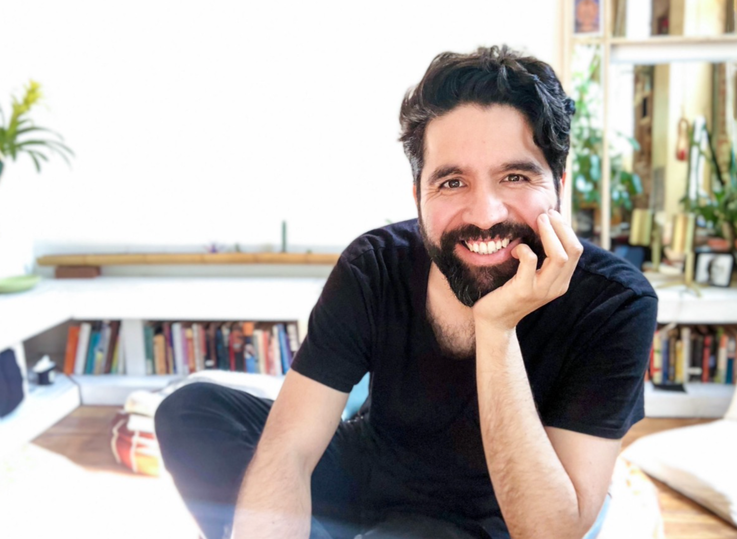
Pablo Stanley, originally from Mexico, is Design Lead at Invision and co-founder of Carbon Health, a tech-enabled healthcare provider created to make healthcare simpler. His silly comics andcolorful illustrations, combined with the series of YouTube design tutorials called Sketch Together, make him a uniquely talented designer. Pablo is also know for hosting a design podcast in Spanish and for being the founder of Latinx Who Design, a living directory of talented Latinxs in the design industry.
With Pablo, we learned more about Latinx design and, more specifically, the design scene in Mexico. We also explored how he designs for important matters such as accessibility and inclusiveness while maintaining a humorous and light approach.
You know both the US design scene and the Latinx one. How can you describe the Latinx design community?
It’s hard to generalise Latinx, it encompasses a lot of different Countries, a lot of different cultures. Even the ways in which they use the language — Spanish— is different, and some people in the community even speak Portuguese. But what I can tell you is that there is a lot of talent there.
I can talk about Mexico, in particular Baja California, since it’s the one I know best. Mexico City is one of the most beautiful cities in the world — it’s so rich in culture and art that it’s impossible not to get inspired by being there. People are caring and have a big heart. The visual style is “out there”, creative and colourful. It isn’t necessarily that different, but it has a few singularities.
How does the Mexican design scene compare to the American one?
I recently came back to Mexico after spending 17 years in the United States. I’m now talking to some people in the design community here, and I feel that it’s hard to present the American design world or the UX design world to people here. They seem really limited and stuck in the past, they still think only in prints and posters or ads in magazines and newspapers. They should think more digitally in my opinion. I can also see this mindset to be applied to schools; they separate Arts from digital design. Branding and Marketing is also separated from digital design. But today everything is digital! I think these subjects should be taught together, to prepare people for the design they will find in the real world, which is surely going to have a digital presence. Sadly, I see that very few schools have updated their syllabus to teach their students about usability, user experience, UI’s, etc, because they see that as something that is not part of their job.
These students have all the skills needed, they understand visuals, digital language, composition, and they understand how to communicate a message. The skills they have translate very well to digital products. I have seen people take that jump from advertising into digital product design. This one of the challenges I see, specifically in Baja California. However, I can see that the design scene is pretty advanced in Mexico City; they have many studios that have an agency working digitally with e-commerce and digital design. So, some agencies seem to have adapted, but students coming out of school don’t seem to be prepared adequately, which I think is sad.
You are surely loved for your daring and funny artwork, and your name is well known in the design community. How do you navigate the balance between being funny and sending across a powerful message to your audience, so that people can take you seriously?
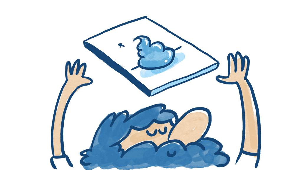
I don’t know. I can say that in my comics — some are serious, and some are totally sarcastic — you can see that I am joking. Sometimes I say when a message is serious. But generally, I leave it to the audience to decide what tone my messages have. I try to be clear, but I think the audience is really smart, I trust the audience. But even in jokes, there is usually a serious meaning behind them. I use comedy to talk about something I really believe in. Comedy is just a tool to talk about something very serious but in a way that translates better to other people.
You have portrayed in the past what your colour blindness means to you, and you used it both as a way to be funny and to represent people who might be struggling with the same ability to distinguish color. Do you think that any of the specific tools you have used around you colour blindness is transferable to other people who may not struggle with it?
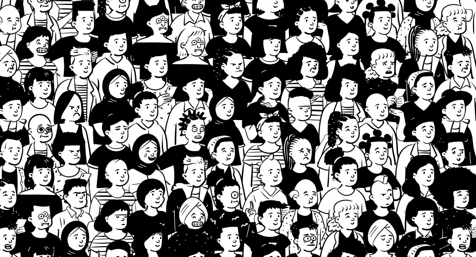
I think that whenever you are designing specifically for accessibility, you are not just designing for a specific group, you are making something better for everyone. Every time you make a change that makes something clearer for a group with a specific ability, there is a high chance that you are making it clearer not only for them but for everyone else too. A person who is colour blind is going to struggle to connect a piece of data in a pie chart that has different colours. So, for example, something people do to change the UI in a way that colour blind people can understand too, is to use patterns; polka dots, horizontal or vertical lines, etc. This actually helps others, too.
Changing the UI can improve the experience for everyone, not only for people with colorblindness, but also for people with different cognitive abilities, or for those who may not understand icons, or who need a more accessible language. So whenever I see someone create a tool to help someone with different abilities or with accessibility in mind, they are making a design that is better for everyone.
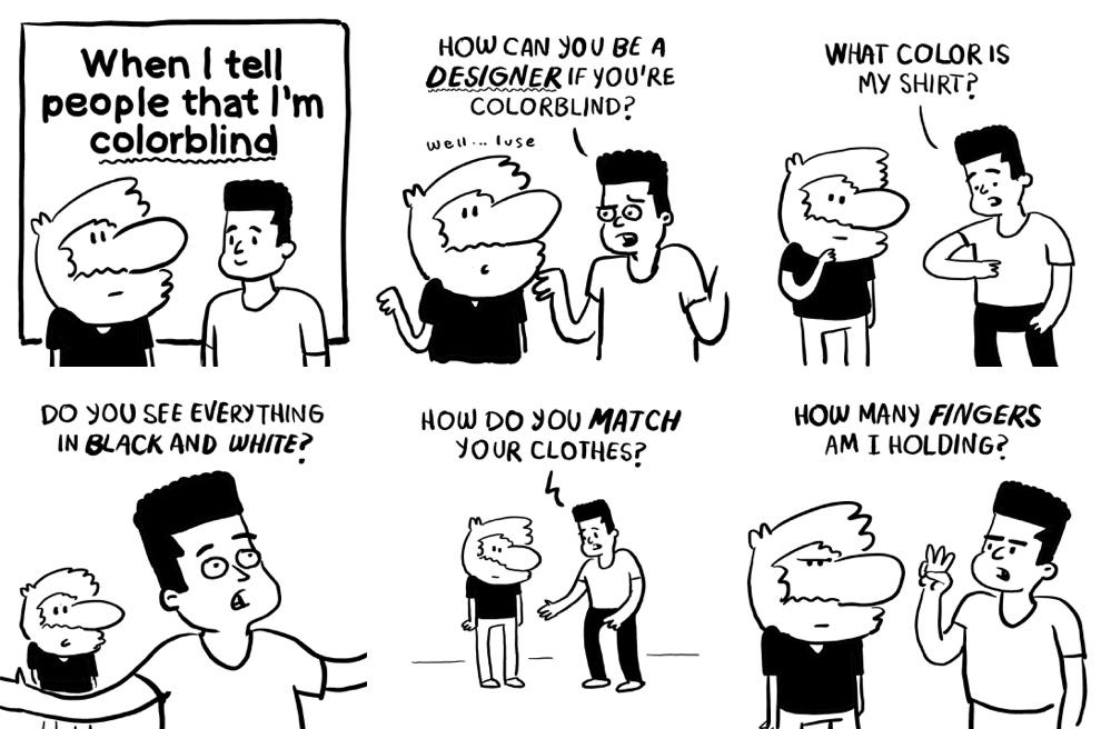
What you are saying about the patterns is really interesting — some tools simulate what people with a specific type of colorblindness see and allow the user to adjust the color palette. The problem is that there are many types of colorblindness. The colors one color blind person sees might be different from the ones a person with another type of colorblindness sees. Patterns solve this issue.
The solution is not to rely on color alone! If it is a pie chart then try to use patterns, or layers. If the data refers to a state of being, like “positive” and “negative”, or “yes” and “no”, usually the colors that are used are green and red, which for me are really difficult to distinguish. Why not use a label instead! Why not just say “success” and “fail”, or “yes” and “no”! Again, this isn’t only going to help me and people who have this kind of ability, but everyone.
Discussing accessibility in design is an inspiration to everyone and anyone who may not fit into the societal norm of what is defined. Not fitting into norms could be a way of looking for opportunities, don’t you think?
It’s challenging for a designer who is trying to design something; you as designer only have your point of view and you have to push yourself to see how others see the world too. It’s easier for our brains to remain within the boundaries of what we know. We have to be conscious of that and acknowledge that I have a bias. That’s where research and interviews come in handy — you realise other points of view. You can’t know everything, and you have to understand that you are not going to have all of the answers and understand how everyone functions, but what you can do is to improve and use tools to understand others and other things. It’s normal for us, humans, to be limited, and for our brains to get lazy and not wanting to do any extra work. So, we have to tell our brains “yeah brain, I know you are lazy but let’s make it better for all of us!”.
There is more from Pablo! Did you miss the first part of the interview? Click here! *link to article part 1*