SPONSORED CONTENT
Article by Pieter Omvlee, Co-Founder & CEO at Sketch
Sketch has evolved a lot in the last decade. When we first launched in 2010, our editing tools were fairly basic, and focused on vector shapes and UI tools. Over the years, we’ve added hundreds of new features — from small improvements to major releases that change the way people work in Sketch.
But how do we approach these releases? And how does that approach represent who we are as a team, and as a company? To find out, we wanted to take you through the process involved in our most recent major feature release.
The challenges of real-time collaboration
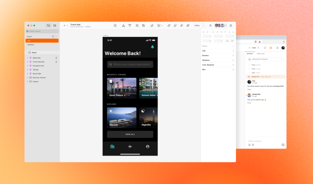
Earlier this year, we added real-time collaboration to our native Mac app. As a feature, it’s more commonly seen in web apps — primarily because the data is stored in a central location, rather than locally on people’s own computers. But being browser-based doesn’t magically make real-time collaboration more or less feasible than in a native app. As long as there’s a server-side source of truth, a native Mac app should be able to build real-time collaboration just as well — and that’s what we set out to prove.
It was probably the largest and most challenging feature we’ve ever built — not because our app is native, but because Sketch hadn’t originally been built with this feature in mind. It took the team well over a year to create and adjust countless seemingly-unrelated features. But at every step, we made sure our approach reflected our goals and values while delivering something great for our users.
Peace of mind
Before we start mocking up UIs and designs, we always have to answer some important questions: why are we building this feature, and what problems do we want to solve? In the case of real-time collaboration, the obvious answer — to allow more than one person to edit a document at the same time — didn’t suffice. For us, there’s a more subtle, and perhaps more important goal that we focussed on a lot; peace of mind.
How so? Well, a design team works best together when all their design files are stored in a single place — a shared source of truth that everybody understands. In Sketch, this is your team’s Workspace. It’s a single place to store your documents, add comments, inspect designs and play back prototypes. But editing documents in this single Workspace is only useful if you know that you won’t accidentally overwrite someone else’s work.
Version control
Development teams have long since solved this problem using version control systems such as Git. There, branching and merging are the primary ways to coordinate changes — and we’ve seen Abstract try to implement the same workflow for designers.
We had many user requests for this workflow, and tested it internally, but it never felt quite right. It was cumbersome and unnatural; design as a process is not as structured as development. Really, we just wanted to be able to jump into a document and edit it, without adding any steps or distracting from the design process.
This quickly became our first goal — creating peace of mind that your work wouldn’t be overwritten, and that you could just open a document and start editing. Most of the time, you’d probably be ‘collaborating’ alone in a document. But if someone else already happened to be there, or opened the document on their Mac while you were working, then great! Now you’re collaborating together, seamlessly. To quote Apple, ‘it just works.’
Privacy is a feature
At Sketch we have always tried to respect the privacy of our users. You do important work in Sketch, and frankly that’s none of our business. That’s why we’ve never tracked what customers do in the app — not for our own gains, nor to offer tracking tools to your manager. This is a belief that permeates our entire company, and is something we practice across our entire team.
So when it came to building real-time collaboration, we faced a new challenge. How do we preserve that right to privacy, but build a feature that, at its most basic level, needs to let two people work in the same document at the same time and see each other’s cursors and changes on the Canvas?
The answer was simple — we throw away all cursor and selection data as soon as we’ve distributed it back to your peers, and all selection data the moment the document changes are incorporated into the final document. That way, neither us nor your manager can pull up a report that shows how long you’ve been working, for example.
What is design?
Okay, so that’s a big question. But as designers we have a tendency to start with a beautiful mockup that helps us talk about the goals of the feature to other stakeholders.
With real-time collaboration, though, our first challenge was primarily technical. We didn’t build Sketch with this feature in mind, so we had to rewrite a lot of subsystems to make it work. And until we knew we could do it technically, making mockups of people’s cursors floating in your document wasn’t very helpful.
But even if that hadn’t been the case, we’ve always been hesitant to invest too much in design up front. We’ve found that design rarely survives contact with reality, and it often makes you feel more entrenched in your own ideas.
Instead, we promote rapid iteration as much as we can. A developer might hack something together based on just a quick chat with a designer, to get a feel of both how it feels, and the technical challenges involved.
The best work happens when design and development happen in tandem — when one informs the other, and ideas are continuously bounced between various teams. And for real-time collaboration, designers and engineers were involved at every stage. From the core technology decisions and how, or if, data was stored, to how people’s selections and cursors were displayed in the document.
Of pebbles and hills
One analogy that we use internally is that developing a new feature should be like a bunch of pebbles rolling down a hill. They each roll fast, but none alone is too impactful, and any one can be stopped or corrected if needed.
With a big design up front, the situation is more like a boulder rolling downhill — people get invested in the feature, and the time already spent will make it almost impossible to stop, even if the boulder’s taken a wrong turn somewhere.
Many of you — us included — have probably shipped features like that in the past, and we’ve seen them land with a thud at the bottom of the hill (and a collective shrug from users). Looking back, we kind of knew it would happen. But the boulder started rolling and nobody was strong or brave enough to stop it.
Hands-on
This is also why we always encourage our own designers to use features or hardcoded tests that we would never ship to customers in a million years.
For example, with real-time collaboration we knew that keeping the document state consistent across clients was the hardest technical challenge. We had to prove to ourselves that the technology would work on a fundamental level — if we couldn’t pull that off, everything else was irrelevant. So in our very first internal builds, real-time collaboration had no UI at all. You couldn’t tell if you were alone in a document or not, and changes from your peers just appeared, as if by magic. You wouldn’t see people’s avatars or even see their cursor.

Honestly? It was really weird. We knew that we needed presence information before we started, but seeing collaboration working without it made that case even stronger. It was a good reminder you can theorize in advance, but nothing beats actually having a working product in your hands.
From there, the working product can inform the next steps to take. You may have already planned for them, but more often than not you hit on something you hadn’t thought of. When cursors from other people (initially, as random colored dots) started appearing in our internal builds, we knew we had magic on our hands.
Research and dogfooding
Once we had a flow in place, it was time to test it with people outside of Sketch. Our Research team runs dozens of tests for features like his, making detailed notes on challenges, stumbling points, and misunderstandings. Sometimes, they reveal that our assumptions about user behavior aren’t quite right. For real-time collaboration, there were a few important insights that helped us make the whole experience even more seamless.
At the same time, we battle-tested real-time collaboration in formal and less formal ways. Dogfooding is a big part of our development process at Sketch — as a design-focused team, we are quite literally our own target customers. So we always test new features ourselves as much as possible, long before they land in our users’ hands. And while that usually means doing daily work in test builds, it doesn’t always have to be so serious.
Part of our end-of-year event was a collaborative movie-title guessing game designed to involve 100 people in a single document. I can’t say it worked flawlessly, but it gave us a lot of good data to work from. When we repeated the exercise a few months later, the system didn’t break a sweat. It was a huge moment for the whole team.
As I mentioned in my opening, real-time collaboration was probably the largest and most challenging feature we’ve ever built. But we’re incredibly proud that it’s now in the hands of our users, and we really think it feels amazing to collaborate together in Sketch in real-time. We hope you love it as much as we do.


