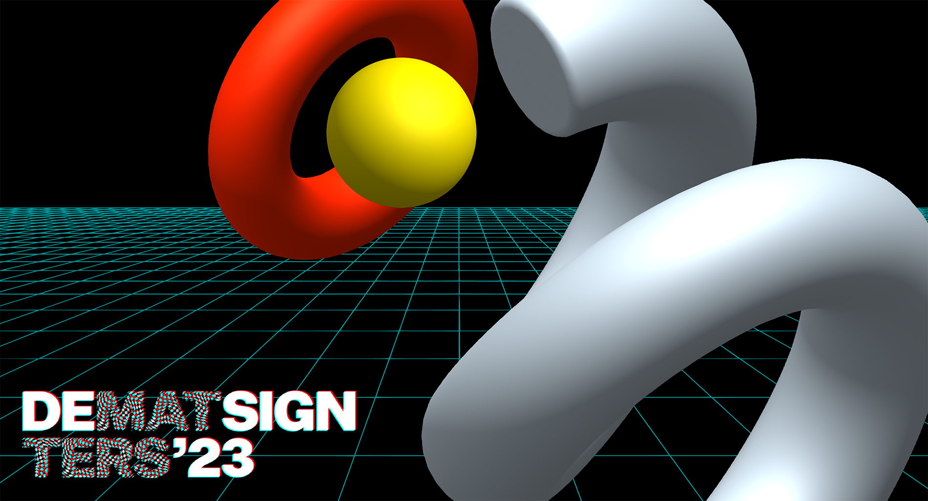

We enjoy smooth transitions as much as we like to take sharp turns. And the visual identity for Design Matters 2023 is a bit of both. Whilst it follows up on its predecessor in terms of background – still a dark one -, it totally disregards the organic mood created by a grainy texture, pastel colors, and nature-inspired raw patterns. Defined by 3D abstract elements, hypnotizing colors, and digital glitches, the new visual identity feels less human and more machine-like, moving away from Earth to ascend into outer space.
Added dimension, space donuts, apocalyptic curly fries, and more
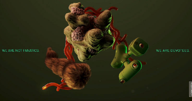
In 2023, we are embracing three-dimensional graphics. They are weird and eccentric, resembling planets, exploded stars, screws, nuts and springs from an abandoned spaceship or a robotic pastry – you’ll be the judge. It’s abstract, after all. Going into this direction was somewhat scary, since it’s as obscure as the depths of the Universe. But it was either now or never.
In addition to the 3D elements, patterns also make a reappearance in the form of digital noise, perspective lines, or other distorted geometric groupings. The spotlight shifted dramatically from nature and rawness to audaciousness and temerity.
Since 2021, it has been all about using grids – so about being sharp and raw. We felt it was getting old, so we decided to rub down the 90 degree angles on buttons, link highlights, and photography. To continue dissolving the strict order we had before, we swapped the ‘well-behaved’ solid lines outlining content boxes with more lightweight dashed ones.

We. Want. It. Darker.
We fell in love with dark gray backgrounds a while back, but we reached the point where that wasn’t enough to keep us satisfied. That’s why, for 2023, we decided to move down the hue bar completely, ‘till all zeros line up in the hex code. The decision was mostly based on our need to be dramatic, sophisticated, and a little enigmatic, perhaps? Black is an enigma in itself. It’s an achromatic color, which makes us question whether it can be labeled as a ‘color’ at all. And it totally aligns with the mystical cosmic direction we want to go in. We chose to pair black with another achromatic color, white, which creates a powerful contrast that is difficult to beat.
Unlike in the previous visual identity, this time we are introducing incomparably more vivid and expressive colors into the mix, including, among others, bright yellow and saturated, almost reddish, orange. In addition to the psychological meanings they carry, these colors are also known for being “warning colors” that give a sense of urgency and alertness. It goes without saying that caution was used when adding them to our new web design. But because they feel so energetic, we didn’t want to pass on the opportunity to harness their boldness to our advantage.

Grain is out. Glitch is in.
The grainy texture we used in 2022 was like scattering sparkly sprinkles on top of a cupcake; it was an element we used to spice up the design but also to highlight the organic theme we were aiming for.
But new identity calls for novelty. We replaced the old grain with a digital glitch effect! This feature pays tribute to the early days of technology, when a palm of steel and a couple of well-performed pats on your TV was all it took for a movie night to go undisturbed.
If the winner was the glitch, the runner-up in the competition for the best concept-driven effect was the 3D photography filter. Which creates the illusion of adding depth to a flat image, in a truly immersive way.
Design Matters made a new amiga
She’s cool, she’s flamboyant, she’s otherworldly… and she’s a font. More specifically, At Amiga is a color font designed by one and only Pedro Arilla – co-founder of Arillatype.Studio®. Besides his reputation as a gifted type designer, he also has a history as a speaker at one of the Design Matters conferences. He wowed us with his stage presence at the 2022’s edition of the Copenhagen conference, where he spoke about emojis and different font formats, with infectious energy and passion (watch the talk here). During his presentation, he briefly introduced the audience to At Amiga, defined as “a homage to early computing, retro video gaming, fantasy tales, and space operas”.
After the first review of the visual ideas for the new identity, we thought we were almost there. Almost. We could not shake the feeling of missing something that would make the design edgier, perhaps even push it over the edge. Suddenly, we thought of At Amiga. We knew she could make the difference. Standing at the crossroads between the past and the future, with its raw pixelated look, yet elegantly rounded, this font fitted perfectly into our science fiction fantasy world.
Out of generosity and driven by our determination to do what we’ve never done before, Pedro went the extra mile and did us the courtesy of developing At Amiga as a color VARIABLE font. We couldn’t be more grateful! It allowed us to manipulate the font with the help of code to create glitch animations.
The font, paired up nicely with the ones we had already selected, delivers a lot more character to the overall design, complementing the simpler and more legible glyphs of the other typefaces we decided on: Jura and Syncopate.
Syncopate (bottom left); Jura (bottom right)
No gravity and a walk down memory lane
Our new visual concept stems from our long-lasting fascination with technology and the rush we get from chasing after the evolution of digital design and the future of our planet. While evoking a strongly futuristic feel, this design also keeps a foot in the past, with digital glitches that are reminiscent of the old days and At Amiga’s retro video-game aesthetics.
A whiff of nostalgia and a pinch of cosmic audacity; that’s Design Matters 23.
Inspiration