
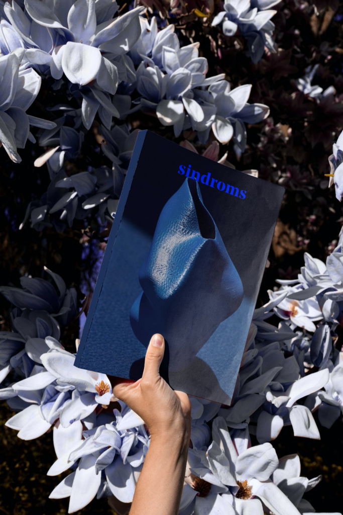
Every color has the ability to trigger different reactions in us and put us into different moods or states of mind when we are exposed to it for long — ultimately influencing the way we feel, the things we buy, and our behavior. Exploring the relationship between color and emotions is what Sindroms is all about.
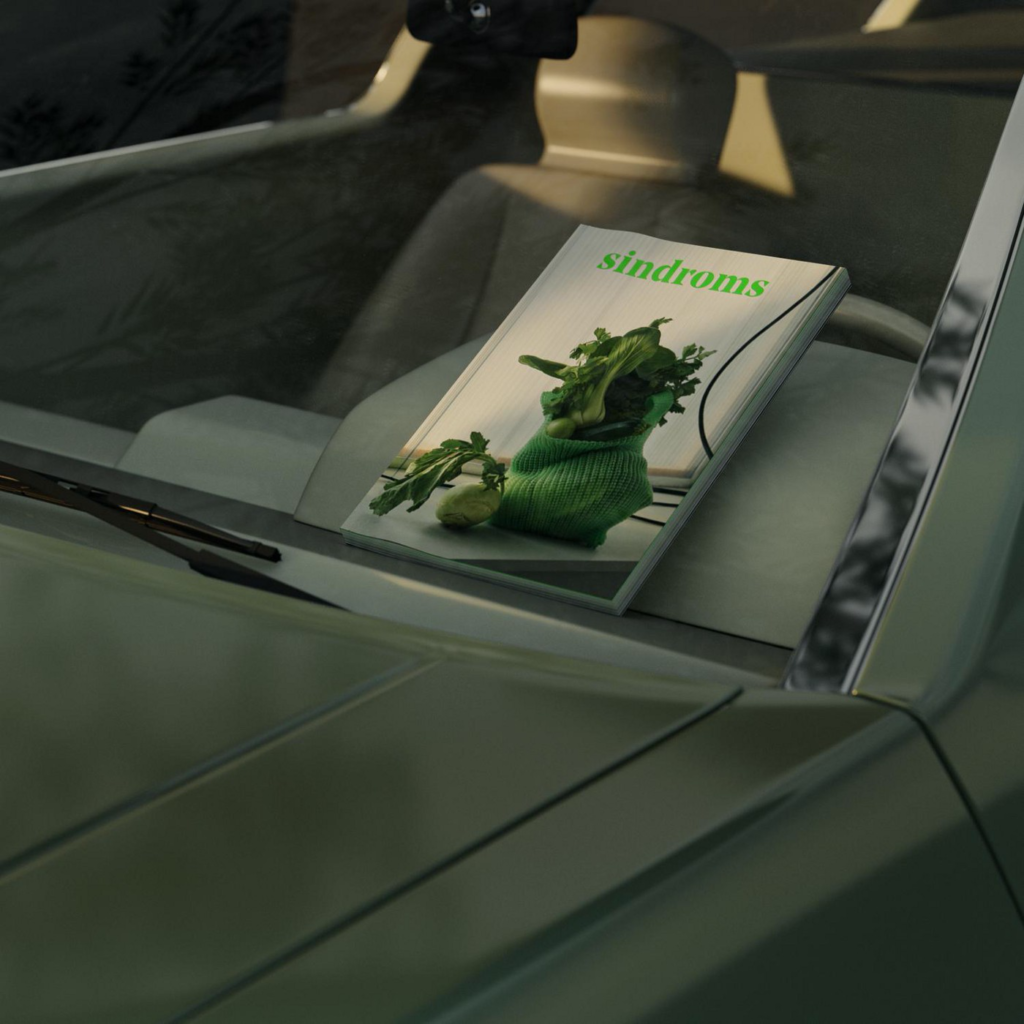
Sindroms is a small studio based in Copenhagen creating monochrome experiential products and events. The studio started in 2017 with the publication of Sindroms Magazine, an annual print publication sold worldwide that explores a single color in each of its editions. For the magazine, the studio works on one color for a whole year — exploring the different feelings and emotions associated with that color as well as its ties to the arts & culture. Sindroms isn’t just a magazine, though. The studio also develops special monochrome boxes containing a variety of design products, and organises a series of monochrome events, exhibitions, and food experiences.
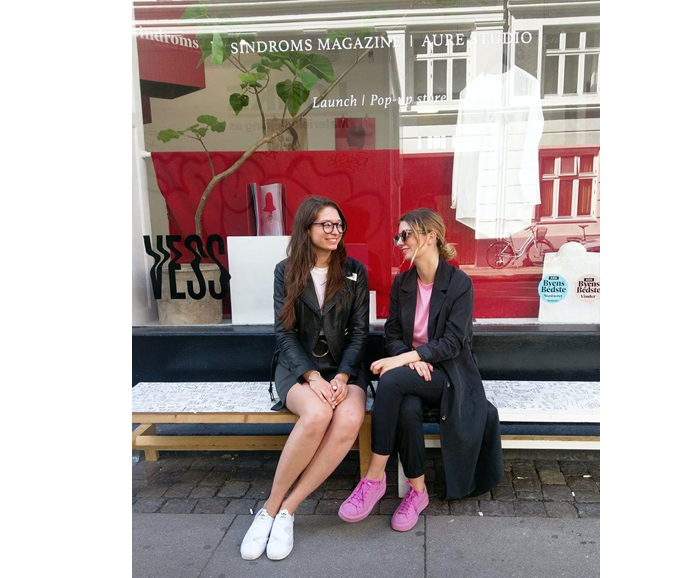
Sindroms is led by co-founder & Creative Director Miruna Sorescu and co-founder & Commercial Director Ana Teodorel. The two have different backgrounds, with Miruna’s expertise rooted in design and Ana’s in business and communications. Their shared creative interests allowed them to merge their different skills into Sindroms. We had a chat with them to learn more about the studio, the magazine, and their monochrome work.
Sindroms will participate at Design Matters 21, to give a taste of their unique monochrome experiences. The conference will be held in Copenhagen and online on Sep 29–30, 2021. Get your ticket now!
Where does the name Sindroms come from?
We wanted the name to work interchangeably with our issues (as we name them Red Sindrom, Blue Sindrom, Pink Sindrom, etc) and to radiate the intensity of our monochromatic universe. Working with a single color at a time and organising things by color can feel almost obsessive, exactly like a syndrome we suffer from each time — that’s what inspired us.
When and why did you decide to start Sindroms?
The idea of Sindroms started around 2014, and it took us a while — until 2017 — to define our concept, navigate the publishing industry, gather a team, and bring a first issue to life. The idea sparked out of a need; moving to Copenhagen in 2013 came as a bit of a cultural shock. Romania, where we come from, has a very colorful culture, and while Copenhagen has started to embrace color in the past few years, back then it was still the classic, toned-down Scandi palette to be predominant. While we quickly embraced black as the dominant color in our wardrobes, we were missing color in our lives in Denmark. It was when Miruna started using color more in her design projects at University, at first involuntarily, and then purposefully, that we became intrigued by it as a design tool. Creating a printed magazine was also a personal dream of ours, so deciding to work with color was an obvious choice. This offered us so much to explore both visually and editorially.
What does color mean to Sindroms?
With color interpretation being so subjective, color, to us, is a reflection of people’s inner universes. More often than not, there is an emotional reaction and certain memories triggered by a specific color. While this might be unique for different people, some color interpretations still have a collective perception — for instance, in our latest Blue issue, we found that different creatives with very different backgrounds, almost all named ‘Sunday’, when asked what the color blue makes them think of.
Based on the experiences we each have as individuals, there are different color associations we consciously or unconsciously store as memories. We connect bright colors to specific moments in our lives. There are also plenty of cultural interpretations of what a specific color translates. It is definitely a complex, yet intriguing, thing to observe and work with.
You design sensorial experiences through color, such as monochrome food experiences, right?
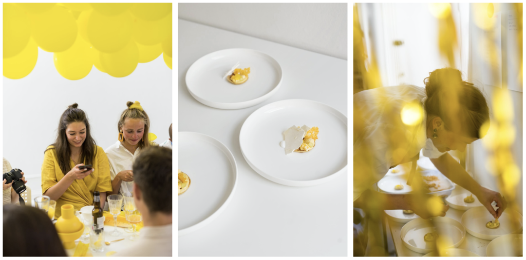
Yes, we designed a monochrome yellow dinner, working with the concept of ‘tasting yellow’. We invited guests to dine in a yellow environment, where each of the five courses was a conceptualisation of a different shade of yellow.
What other experiences do you design?
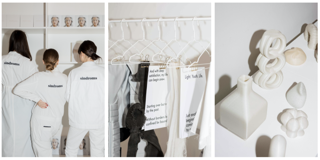
So far, we’ve designed a monochrome experience for each of the release events of our magazine, and they all varied depending on the concept of each issue. Our White issue explored the creative process, so we staged the launch event as a white pop-up exhibition, where people could come and see drafts of work featured in the magazine, and observe the creative process behind the issue — e.g. props from photoshoots, article drafts that didn’t make it, writers notes, sketches, etc.
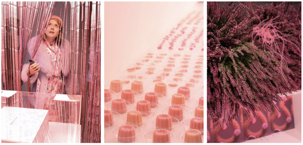
For our Pink release, we worked with the five senses; our guests had the chance to explore the color pink through their senses and observe how they each interpret the concept of a color. They could ‘taste pink’ at our snack bar or ‘touch pink’ through different sensorial installations. It was the first time we had worked with all five senses, and we found it incredibly fascinating. We were also planning to work with this at a much larger scale for 3 Days of Design 2020, in Copenhagen, but the event got cancelled due to the pandemic. We were working on a huge experience for the Dawn at Nomad Workspace exhibition; we were planning to transform the entire Nomad building in Copenhagen into an experiential exhibition that we called Sensory Hotel. The plan was to make every room monochromatic and give a conceptual interpretation of the classic hotel environment —with the spa, the master suite, the pool area, the restaurant. We were collaborating with designers, artists, and brands to create a novel sensorial design experience.
Do you dream of organising larger immersive color experiences in the future? If yes, what?
We definitely do! It’s a dream to bring to life a project of the scale of the Nomad exhibition that got cancelled, and to work with color and the senses at that large of a set-up. Up there on our dream list would also be designing a restaurant or a hotel from scratch, as a complete experience.
Our next project in this direction will be launching a design shop — Bibelou— where we’ll finally get to work with product design more, combining color with interesting materials. It will start as an online shop, but the goal is to get to an actual physical space where we can design a novel, sensorial art, and design the shopping experience.
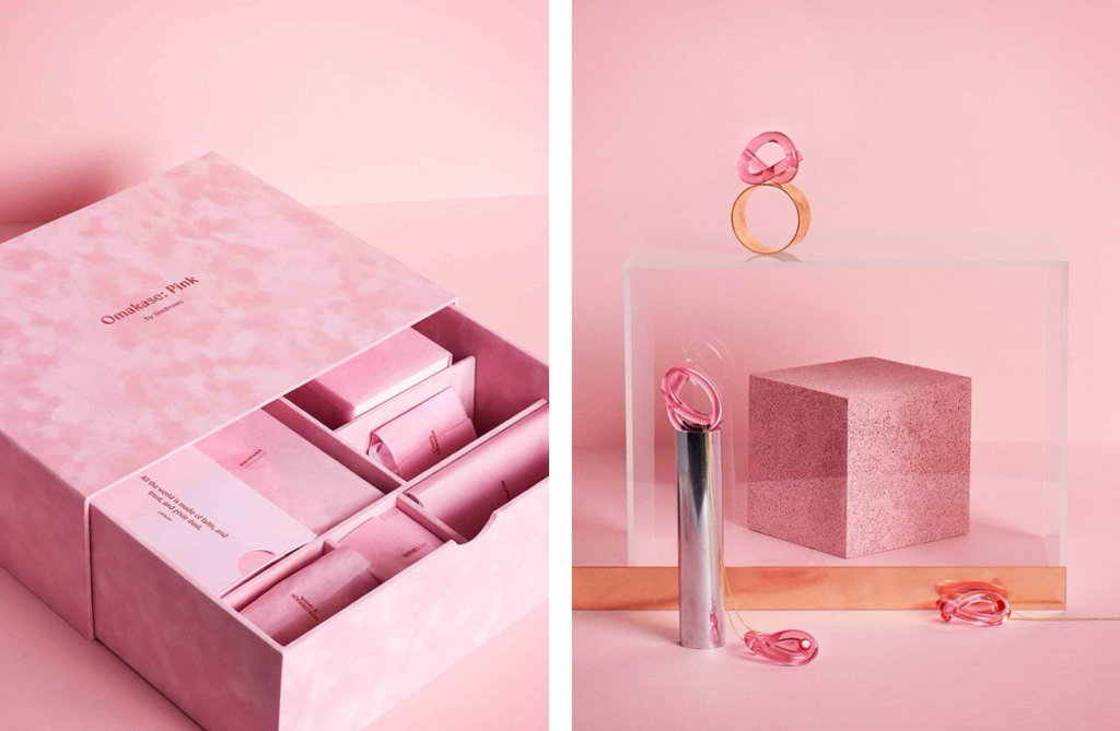
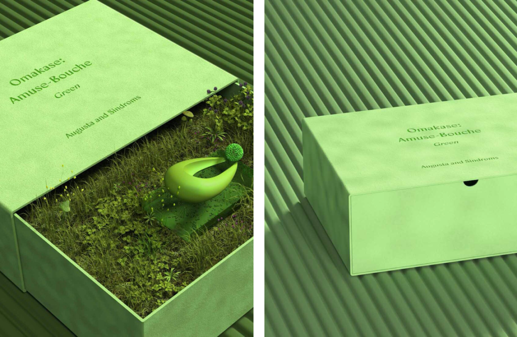
You also compose monochrome omakase design boxes. What is usually inside a box?
So far we have created 2 omakase boxes, which have been quite different. The concept of omakase is rooted in the Japanese concept of trusting the chef to select your meal. With a literal translation of ‘I leave it up to you’, ordering omakase is a trust exercise — putting yourself in the hands of an expert and trusting you will be served the best.
Our Omakase: Pink box contained a collection of seven pink design objects/products. A few were from renowned brands we love, such as Normann Copenhagen, and others were unique and created specifically for the box by some of the designers and artists we collaborated with before for the magazine, such as Wang & Soderstrom or Amina Horozic. Our second box was a surprise culinary treat. For our Omakase: Amuse-Bouche box, which was available during the launch of our Green issue only, we worked with chef Augusta Sorensen who created a haute-couture piece of green candy.
You explore the realm of emotions and senses through the colors you work with. Do you also tap into other topics, such as social and political matters?
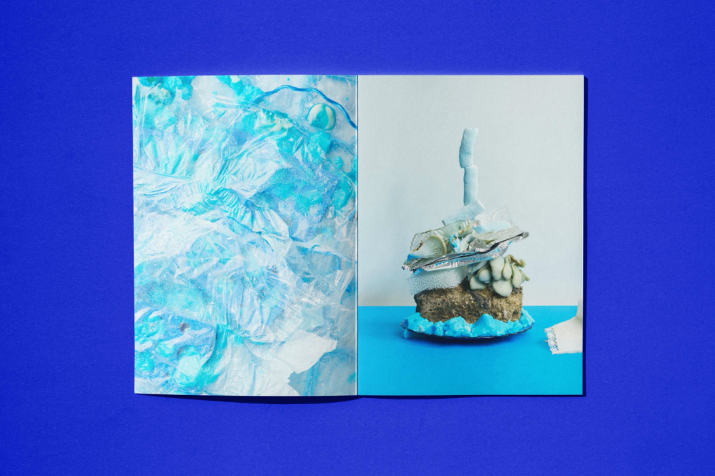
The topics we cover are extremely different and are all dictated by the color we work with and the themes we explore — which are often tied to human emotions. We don’t consider Sindroms to be a design magazine, even though our visual explorations are within design, art, and fashion, and our audience is made out of mostly creatives. The topics we cover are closely tied to our feelings and emotions, but there is almost always a cultural and social undertone. To put this into context, in our upcoming Blue issue, we explore our journey of ‘going through the blues’; within this theme we explore, for example, the cultural stigma around men crying, the historical and social context on why sadness and depression have been deemed ‘wrong’ and how that affects us, and we try to shine a positive light on therapy by looking at what a therapy session is really like.
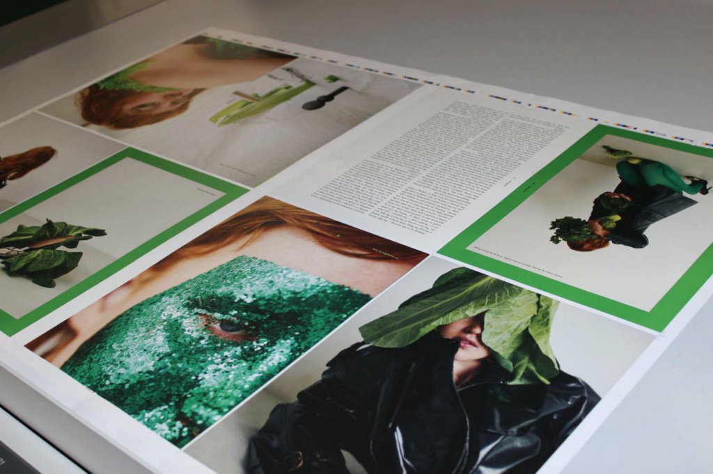
The Green issue was published in 2020, in the first year of the pandemic. You then renamed it Evergreen. Can you tell us more about this?
We had already started working on the Green issue before the pandemic completely disrupted our ways of living. It felt like great timing to explore green — a color that breathes life — considering the moment in time our world found itself. As we went through the pandemic, the color only felt more relevant. Times like these call for industries to rethink processes and values, and for us to rethink our approach to consumerism, everyday lifestyle, and contribution to society. The world slowed down for a bit, taking a step back to think of new behaviours we should aim towards. So, we decided that the Green issue would instead be called Evergreen and focus on life in the context of timelessness. We used the opportunity to reflect on how the pandemic has affected us, influenced us, inspired us. We explored what prosperity means now, how we can manage to continue growing, reinvent ourselves, change our ways. We looked at evergreen design, and why the human-nature relationship is vital, evergreen wisdom that’s been passed down through generations.
What are the core concepts of the other previous issues?
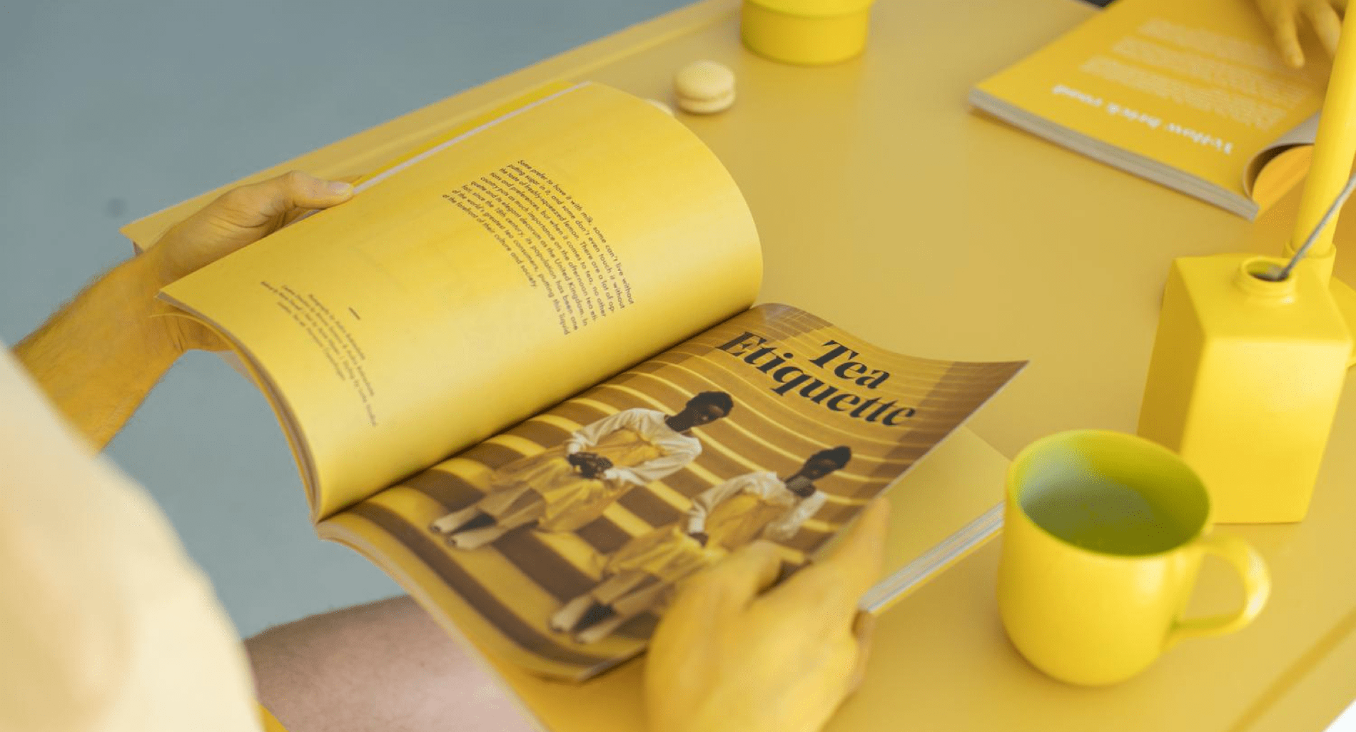
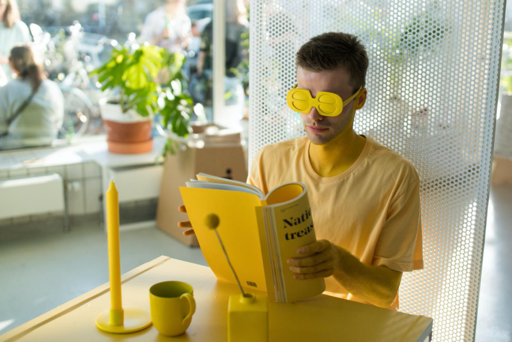
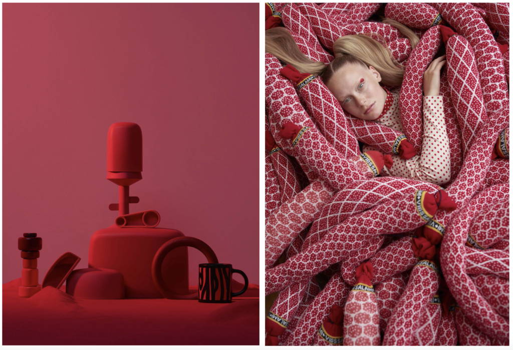
Our first issue explored a very powerful color — Red — and the issue mostly focused on the strong, contrast-filled emotions of love and passion, together with anger and fury. The Yellow issue had a similar approach, investigating happiness and optimism, as well anxiety and jealousy. The White issue was dedicated to the concept of a blank canvas, and explored our entire creative process, from the creative block to perfectionism. Pink was a more soft and delicate exploration, and looked at youth, naivety, euphoria and intimacy.
What is the upcoming Blue issue going to focus on?
After Evergreen, blue felt like the right color to work on, and we knew from the beginning we were going to want to explore ‘the blues’. It felt personal, and it felt necessary. We were coming out the other end, but not quite through yet, of a year-long lockdown, of missing family and friends, of cancelled projects and work gone to waste. It also felt like the right choice to our contributors, who had plenty to say about the blues after this period. It was on everyone’s minds. This issue ended up being quite personal, unfiltered, and subjective. We’re very grateful to the way our contributors chose to open up and share pieces of their own ‘blues’. It’s inspiring and comforting to see that we all experience similar things — we can say this is a very uplifting issue, even though it explores emotions such as sadness, nostalgia, melancholy, and grief.
The team behind Sindroms
The team behind Sindroms includes Miruna, Ana, and Kotryna Abaraviciute, who founded the magazine back in 2014. Kotryna has relocated back to her hometown Vilnius, Lithuania, but is still involved remotely. In the last couple of years, Federico Fossati has been helping with sales and partnerships.
Become a contributor
Sindroms would not be possible without its contributors. The studio works with dozens of freelance creatives based worldwide — photographers, writers, stylists, illustrators, etc — who bring more depth of perspective to the magazine. Sindroms uses its online communication platforms to identify talented creatives who resonate with them; most of them have joined the community of contributors by connecting online over this mutual interest in color. If Sindroms speaks to you, don’t hesitate to get in touch with them! Find them on Instagram @sindroms_.