British designer Laura Kalbag is the Co-founder of Small Technology Foundation, a small two-person-and-one-husky not-for-profit organization advocating for and building small technology designed to increase human welfare – not corporate profits. They also used to make Better Blocker, a web privacy tool for iPhone and iPad to protect users while browsing the web. Laura does everything from design and development to writing code and trying to make privacy- and rights-respecting technology accessible to a wide audience.
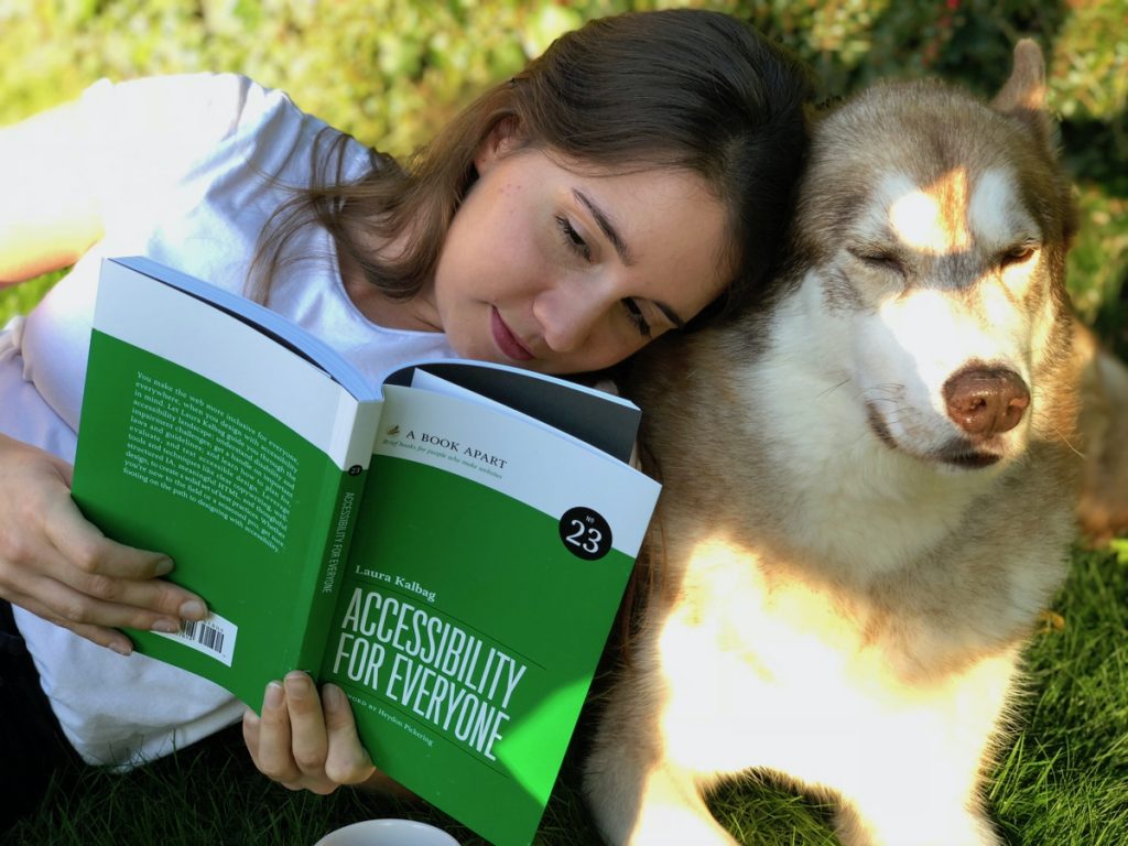
Additionally, she’s the author of the book Accessibility For Everyone – available in paperback and ebook – published by A Book Apart. In the book, Laura breaks down some of the most common myths about accessibility on the web and shows how designers can implement changes that have a huge impact on the users browsing the Web.
Using her book as a starting point for our interview, we met with Laura to learn more about how to design in a more accessible and inclusive way.
Laura Kalbag will give a talk at Design Matters 22 and dive deeper into this topic. Interested in reading her book? By buying a ticket to Design Matters 22 you will also get a FREE copy of her book Accessibility For Everyone. Get your ticket now at designmatters.io.
What would you say are the top 5 most important choices and features one should implement when designing a website that can be defined as accessible?
Choosing a top 5 of the most important aspects is tricky, so I’ve decided to focus on two mindset-related aspects and two more practical aspects.

1. Listen to disabled people.
We make websites accessible to provide equal access to disabled people, and so we need to involve disabled people in our work. It doesn’t matter if the WCAG (Web Content Accessibility Guidelines) instructs you to design a feature one way if your audience tells you that they need it to work differently. In today’s industry, we’re seeing more distance between the people who build the technology and those who use it, especially when relying on data rather than seeking real users’ feedback.
2. Choose to prioritise accessibility.
Accessibility shouldn’t be an add-on feature or a line item on your invoice. Making websites inclusive involves every person working on the project understanding the implications for accessibility in their space, and pursuing accessible solutions until the site is usable for its disabled audience. Accessibility should be part of the minimal viable product. It’s too difficult to make meaningful progress with the accessibility of our projects if we put the hard stuff off until after release or in a later version.
WebAIM has done an accessibility analysis of the top 1 million web pages for the last three years. While this analysis is automated and can’t reproduce the same experiences real users have online, a few noticeable statistics jump out at you. The three most common errors when analysing these sites against the WCAG are some of the most straightforward issues to fix:
3. Avoid low contrast text.
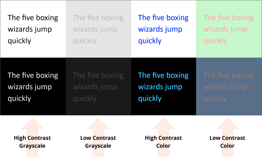
It can be difficult to read text with a low contrast colour against the background colour. For some reason, designers love light grey text on a white background. They think it looks “tidy”. But low contrast text is particularly tough to read for people who have difficulty with their eyesight and can also make a page inaccessible to folks using low-quality screens or devices in brightly-lit conditions.
4. Write alternative text for your images.
And write it well! So much of the content we share online is visual, and blind people can miss out on the shared experience if we don’t provide accessible alternative text for our images. Summarise the image’s content and give the reader some context as to why you chose to share it. You can even add alt text on social media these days, and it’s a great way to practice crafting helpful and insightful descriptions.
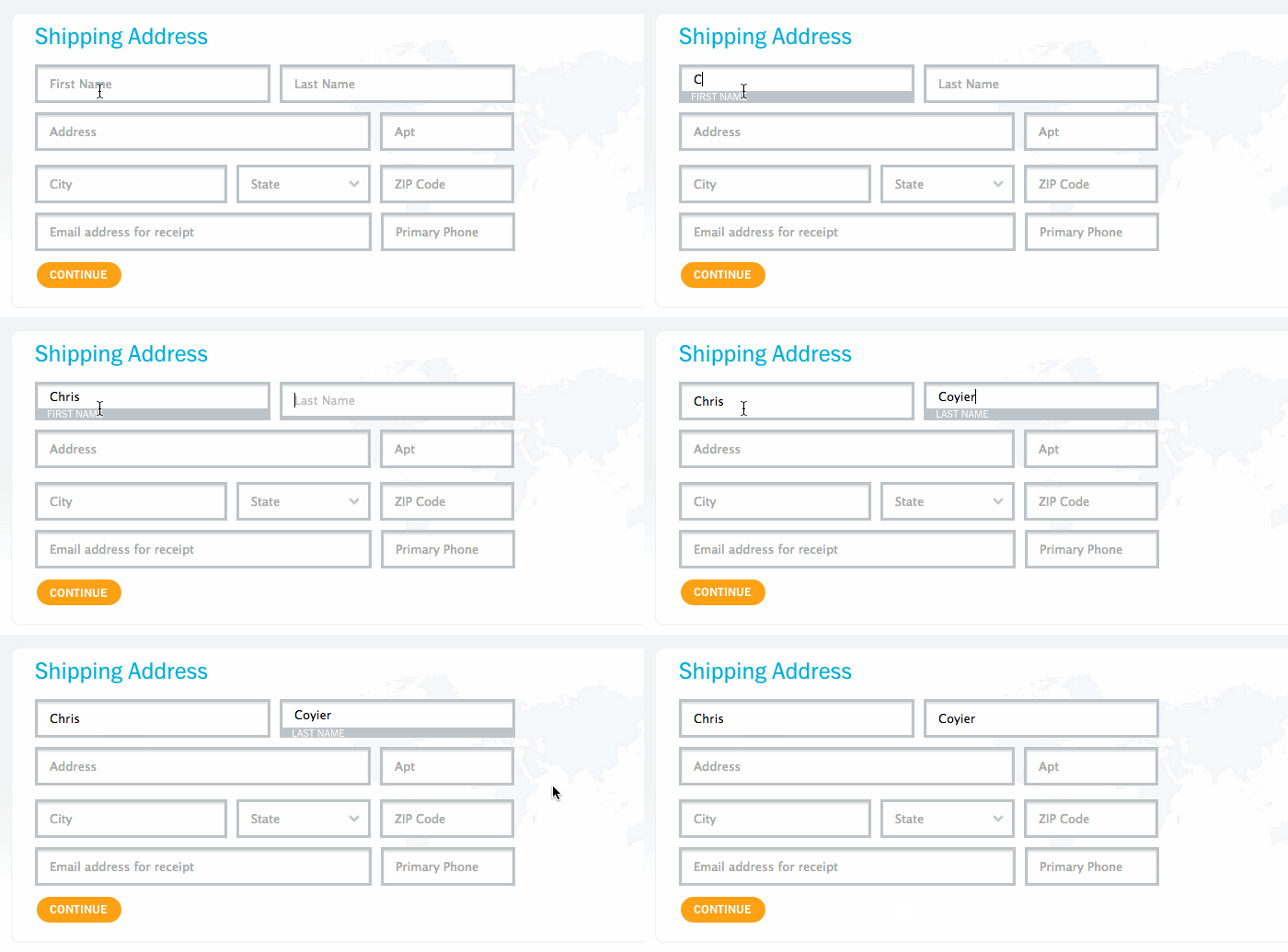
5. Always label your form input fields.
How do you know that a search box is a search box? Does it have a little magnifying glass icon? Is that enough to tell a user what to do with that search input? Labels don’t always have to be visible, particularly when the form’s location or button text gives the user a cue on how to interact. Though, it’s arguable that labelling these form fields could benefit users who have cognitive difficulties or are new to the web. But we do need to ensure that labels are visible programmatically to assistive technology so that users who can’t use the visual cues can still understand a form field’s function.
We know that sometimes what suits one person may not suit another, and the result is that some needs end up clashing with each other. Have you ever seen this in a design or experienced it yourself? How can a designer work around this?
Text size is a handy example in understanding that one size does not fit all. Long-sighted people usually find it easier to read smaller text that appears further away. Short-sighted people usually prefer larger text that looks closer to them. We can’t make text big and small simultaneously, but we can provide a default that benefits the most people, usually starting with large text size. And then give people the ability to adjust the text to suit their needs and ensure the interface still works once the text size changes.
What are the most common mistakes people make when they first try to design an accessible website or digital product?
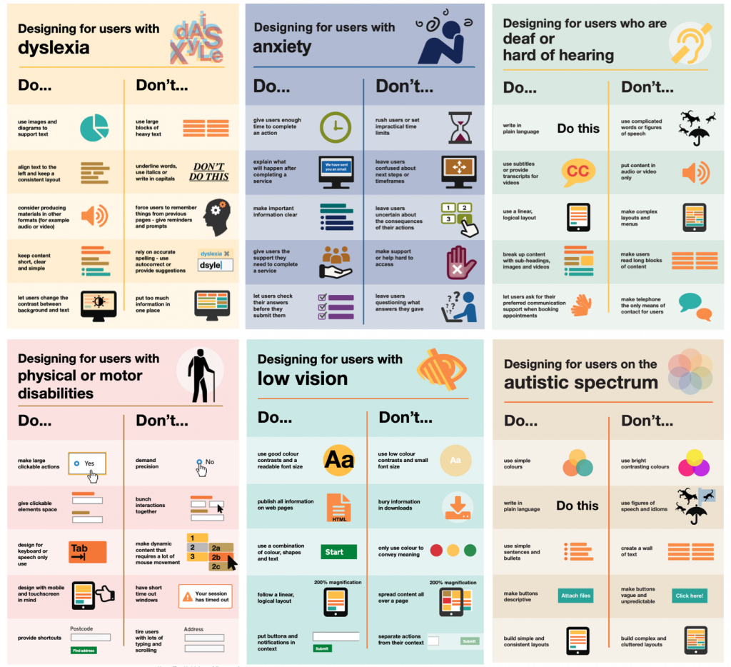
One of the most common mistakes I notice when designers start out in accessibility is the urge to create a unique solution to something they perceive as a problem to disabled people. Liz Jackson calls these creations disability dongles, “a well intended and elegant, yet useless solution to a problem we never knew we had.” Screen reader users don’t need an entirely custom voice interface. They just need the current interface to work for them. People navigating via a keyboard don’t need a whole library of keyboard shortcuts. They just want their existing keyboard shortcuts to work as they expect.
You also talk about colonial design in your book. You say it’s “believing we know what’s best for others, despite our differing needs” and that it “can also result in patronising and incorrect solutions”. What can designers do to avoid colonial design – other than doing research, interviewing, and testing a product?
I believe that disability dongles are a signifier of colonial design. These dongles are often embarrassing in how useless they are for disabled people. The designers obviously didn’t consult any disabled people during the design process. There are certain schools of design that put the designer on a pedestal, as though their knowledge of design makes them capable of solving any problem put in front of them. Unfortunately, this creates a culture of individuals who believe they have nothing to learn from others. They treat design as if they are conquering problems that other people were too ignorant or poor to solve, reminiscent of colonialism.
We design best for ourselves, as we understand our own needs and experiences unlike anybody else. One of the best ways to avoid incorrect and patronising design solutions is to include disabled designers on our teams. One of the reasons diverse teams are so important is that having a person with some insight into a community and its needs will often help you avoid obvious mistakes. Still, one person is not a representative of all the requirements and experiences of their communities. A person with cerebral palsy and a person wearing glasses may both identify as disabled, but that doesn’t mean they have much insight into the needs of the other. According to the WHO, around 15% of the world’s population has a disability. It would be ridiculous to assume that 15% of the world’s population has the same, or even similar, requirements. We should never design based on assumptions, and this is why interviews, research and testing are so valuable in creating genuinely functional design.
In your book you talk about accessible design vs universal design. How do they differ and what different purposes do they serve?
Much talk of the difference between accessible and universal design, or the difference between accessible and inclusive design, is about framing mindsets in terminology that helps people understand new concepts. I frequently change my mind about how I define these terms and how practical the comparisons are to others when we keep changing the definitions.
Ronald L. Mace, an architect and wheelchair user, coined the term universal design as an improvement upon accessibility, which was usually associated with adaptive and specialised solutions:
“Universal design is the design of products and environments to be usable by all people, to the greatest extent possible, without the need for adaptation or specialized design.”
We could consider inclusive design as a more modern term for universal design. I also think it’s worthwhile to use inclusive design to think about the other factors in our lives that affect our use and access to technology. Historically, the people creating technology have predominantly been wealthy non-marginalised people designing solutions to suit their needs. Truly inclusive design should consider the societal barriers faced by those marginalised because of where they live, their financial circumstances, nationality, education, native language, race, gender or disability.
You wrote there is a misconception that accessibility is best left to the experts. Are there any other misconceptions around accessibility?
One of the misconceptions around accessibility that really frustrates me is that accessibility is a benevolent activity for which disabled people should be grateful. Accessibility is about correcting inequities, the flaws in our existing design. Inclusive design is not charitable; it is our responsibility if we genuinely believe that we create products for everyone.
What accessibility resources and virtuous examples or products do you recommend looking into?
- The Disabled List
- Giving a damn about accessibility by Sheri Byrne-Haber
- Inclusive design for a digital world by Regine Gilbert
- Inclusive Components by Heydon Pickering
- Inclusive Design Principles
- The A11y Project, who also maintains an indispensable list of resources
- WCAG in plain language
- Conscious Style Guide
- And of course, my book, Accessibility for Everyone by Laura Kalbag. Which is also available as an audiobook on Audible.
Cover image from Giving a damn about accessibility by Sheri Byrne-Haber

