
Applying colours sapiently to a design work can truly elevate it from average. Colour is a powerful tool to stir up emotions, convey a message, and even move the masses; it gives a digital experience, product, or brand a distinctive and unique voice.
We will explore and dive into the power of colors in our hybrid conferenceDesign Matters 21, which will be held on September 29–30, 2021.
Designer George Hastings is the creator of Khroma, a fantastic website that allows you to discover, search, and save color combinations. George is a multi-disciplinary product designer living in New York and is currently leading design at Attune Insurance. After taking a look at Khroma, we discussed what designers can learn from Khroma and what possibilities AI might offer.
What is Khroma?
Khroma is an AI-based color tool built specifically for designers. With Khroma, you get to train an AI algorithm by choosing 50 colours that you like. These colours are then used to train a neural network that can recognise thousands of other similar colours. Based on your preferences, the model generates an endless combination of color palettes.
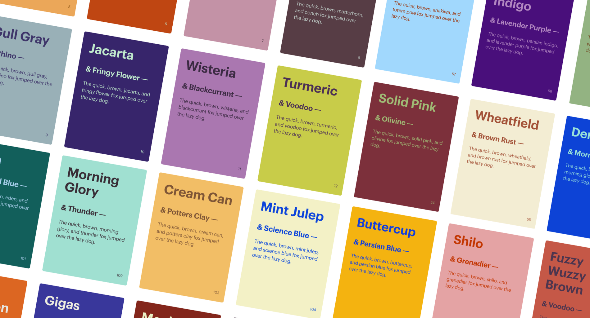
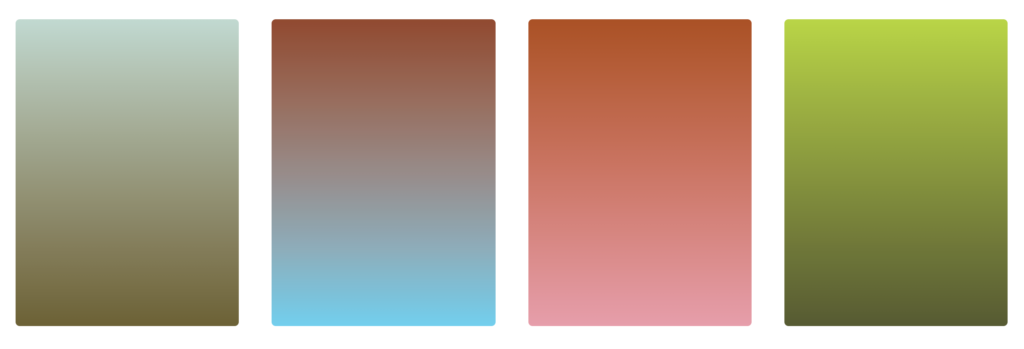
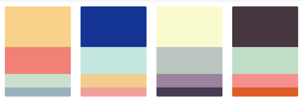
Khroma works with two colour combinations that are shown in different templates: Type, Poster, Gradient, and Image (you can upload your own image and test the colors on it). The template Palette, instead, works with four color combinations.
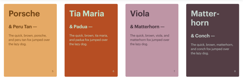
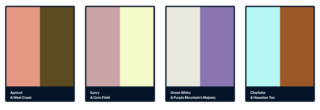

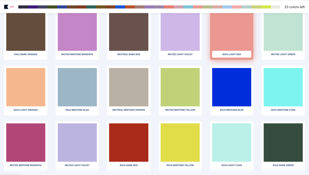
On the website, you can also save your favourite color combos and find, for each combo, an info panel showing details such as the name, hex and RGB values, and a WCAG accessibility ratio.

Why make Khroma?
Sometimes, coming up with the perfect color palette for a design project can be arduous, especially when the options are basically endless. An inspirational color tool is Color Claim, ideated by Tobias Van Schneider in 2012; it is a public collection of 102 handmade color combinations saved by the designer over the years, which shows colors in context with typography. George’s appreciation for Tobias’s idea pushed him to think of his own color tool. Color Claim’s limit is that it is a restricted collection of palettes crafted by hand, which made George wonder,
“Why painstakingly craft color palettes by hand when I can train an AI to learn how to infinitely replicate palettes I like? Could I train a neural network to predict whether or not I like a color?”
Starting from these fundamental questions, George decided to start experimenting and working to build Khroma.
How does Khroma work?
To start training your Khroma, go to khroma.co and click Generate. You’ll see an infinite scrolling wall of colour blocks. Scroll through and select 50 colors. When choosing the colors, going for variety is very important; if you never select light purple, for example, you will never see that color in the combos the algorithm will propose to you. However, you can always edit your picks and retrain your generator.
“I’ve found it rewarding to throw in some wildcards for my last five picks. These are colours that I don’t think I’d ever use on their own. Often I’ve been pleasantly surprised by what Khroma does with them. When next to other colours, they seem to fit perfectly in a way I wouldn’t have imagined.” — George Hastings
When you’re done choosing your colors, click on the Start Training button on the top right. Training should take about three minutes. When the training process finishes, you’ll be dropped into the Generator, where you’ll be presented with an infinitely scrolling grid of colour combos.
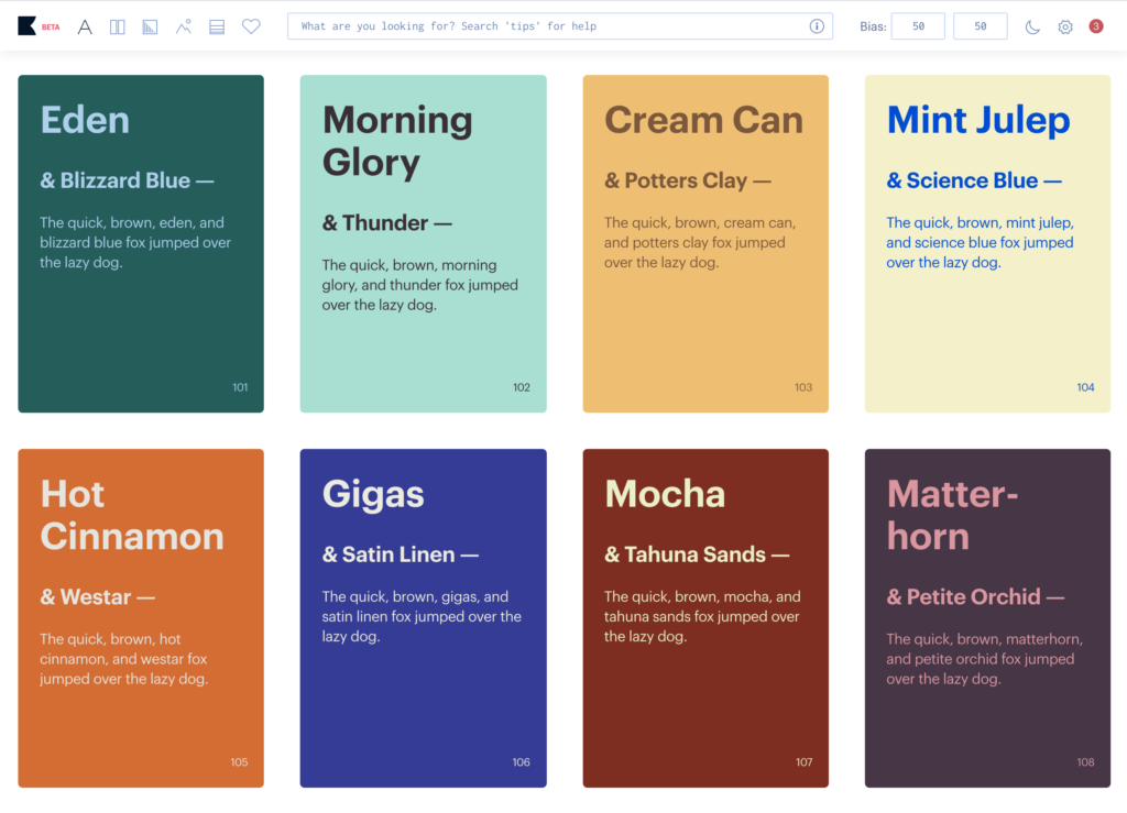
You can search for colors using different parameters: type, hue, name, Hexand RGB. Types include dark, light, pastel, pale, deep, muted, rich, bright and neon. Hues are warm, cool, red, orange, yellow, green, cyan, blue, violet, purple and magenta. There are 1,566 specific colours you can search for with names like ‘royal blue’ and ‘coffee’. Lastly, you can input Hex andRGB values.

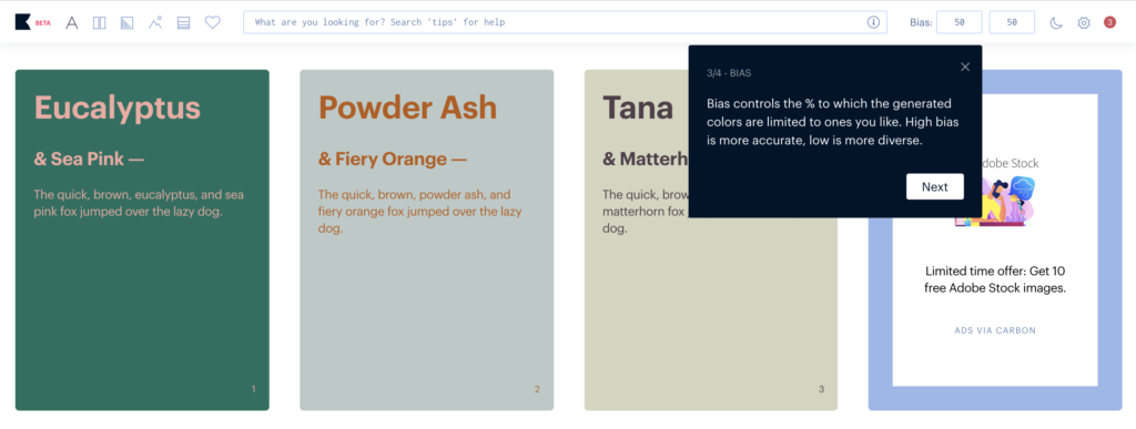
When you enter one term in the search bar, you’ll get results that match that parameter for the first color slot, while the second will be random. Each colour generated by Khroma runs through the algorithm and gets a percentage indicating how likely it believes that you will like the colour; if the bias level is high enough the colors will be presented to you in the results. Bias indicates the percentage the generator leans towards producing colors you like; lower bias produces a wider, but less accurate, range of colors, whereas higher bias produces a smaller, but more accurate, range of colors. The initial bias setting is 50 for each of the two colors (box in the top right of the screen), but you can adjust it to get more or less diverse results.
The model behind Khroma
George started with trying to train his model with every color space he could (rgb, hsv, hsl, lab, yuv). But one challenge he faced was figuring out how much and what kind of data to use; for instance, would people need to vote “yes” and “no”? There are approximately 16M rgb colors, so he had to calculate how many votes would be enough. Eventually, he found the solution; by choosing 50 well balanced colors (likes only), Khroma uses the deltaE color distance algorithm to extrapolate 9000 dislikes and likes at a 5:1 ratio, which then trains a local feed-forward neural network. The result is a training accuracy between 96–99%.
Khroma has also two other ML algorithms, one for matching two colors together and another for matching four together, which are both trained from a sample of 2000+ popular color palettes. The reason why they’re two distinct algorithms is because the two color one needs a minimum contrast restriction.
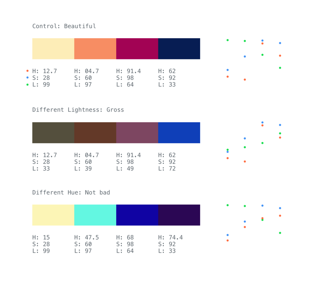
“Before figuring out how to construct the model, I took some time to try and understand what was going on under the hood of good looking palettes. I took this first palette and swapped out its lightness values for those from a different palette. Although they shared the same hue and saturation, the result was terrible. I tried the same but swapped out the hue, the results were much better. Inverse saturation/lightness seems to have a strong “goodness” correlation. Observations like these helped inform my model/data construction.” — George Hastings
Khroma’s UI/UX
Many palette generator sites feature a single palette with a refresh button or a hover and click to set interaction. But George decided to go with an infinite scroll UI, that feels like browsing Pinterest.
“I wanted something more about discovery, more like digging for gold. There are also plenty of sites with premade palettes too, but I, like others I hope, want to stumble across something ostensibly original”.
A UX challenge George encountered in designing Khroma was communicating the effect of the AI, since the neural network produces colors using probability. If the net thinks there’s a 79% chance the user will like “randomColor”, is that good enough? If it’s set to nothing less than 99.99% then there won’t be much variation outside of the original training set. If it allows colors in the 1–10% range then it would likely produce some color the user doesn’t like, but there would be a lot more variation. To overcome this, George added an adjustable bias per color, which allows the user control the strictness of the generator.
George on his learnings from working with AI
What can we learn from Khroma as designers?
Most importantly, I want designers to know that they can solve their own problems. I am a designer with self-taught coding skills, no formal training in machine learning, and put this site together over the course of a year in my free time to solve a problem I had. If you can find a compelling way to solve your own problem, chances are it will solve that problem for somebody else.
Did you learn anything specifically from working with colors and AI?
I learned quickly that there is a disconnect between how computers and humans see color. This is a problem that color spaces (HSL, RGB, YUV, etc.) attempt to tackle, and it’s a hard one: how to best model our natural perception of color, the natural light frequency spectrum, mathematically. None of these algorithms are perfect, and people are still trying to improve on them today. So I decided to take another route and use a neural network to represent the way thousands of human color palette makers see color. The downside, like all neural networks, is I can’t explain exactly how it works (it just does).
Anything else AI would be good for, as a design tool?
While many exciting innovations in generative AI happen seemingly all the time (styleGAN, superresolution, etc), they are all still just recognizing and recreating features in data (i.e. huge series of values between 0 and 1). You might remember the flashy marketing of the now defunct thegrid.io, an AI that designs websites in seconds. How can you boil down high quality web design into a series of decimals? This is called data normalization, and it can’t be done with broad abstract concepts. What AI can do is solve a very narrow problem using lots of normalized data. For instance, Khroma has one network to recognize if a series of RGB values look like a human-made palette. It has another than can recognize RGB values you like, and it uses the previous network to build an original palette. You can use multiple neural networks like this to “team up” and tackle a slightly broader problem. Keep adding networks to the model like this for different components and we may one day have an AI that creates beautiful websites.
Find more color inspiration on Khroma’s Instagram page, curated by designer Lucie Bajgart.