
SPONSORED CONTENT
Find the original post here.
Balsamiq is the maker of the industry-leading rapid wireframing software that combines the simplicity of paper sketching with the power of a digital tool so that teams can focus on what’s important. Balsamiq is a small and personable company that competes on usability and customer service. People at Balsamiq believe work should be fun, and that life is too short for bad software!
Zach Watson, Content Manager at Soundstripe, has written this article for Balsamiq.
The qualitative and quantitative data you gather from users and stakeholders plays a big part in guiding your design.
But at some point, you’ll have to rely on your creativity and make some decisions about how to lay out the user interface and express the user experience.
If this sounds daunting, never fear. Translating your research into visual form may require ingenuity, but there are still guidelines you can follow to make the process less ambiguous.
In this article we’re going to show you 3 steps for turning your user research into intuitive wireframes.
Steps for turning user research into wireframes
- Organize and sequence the workflow
- Assign functionality
- Create the layout and design the user experience
Organize and sequence the workflow
Before you focus on how each individual screen will look, you need to consider the entire workflow users will go through to complete their task. Therefore, uncovering your audience’s current workflow should be a primary goal of your initial research.
At DePalma, we find qualitative techniques work best in the beginning, because they help discover the challenges users are facing in their work and give you some ideas for designing a solution.
We typically use the following methods before wireframing.
User research methods
Ideally, this research will help you identify the following.
What we learn from user research
- The users’ goals and tasks for the application
- Users’ pain points, behaviors, and desires
- The current workflows people use to complete their tasks
- The main challenges that make completing those tasks difficult
Once you establish those parameters, you’ll have the research you need to create a simple, intuitive user interface in wireframe form.
After research, the next step is typically to establish an optimized workflow.
This is where observational methods like field studies come into play. By watching how people currently accomplish their tasks, you’ll be able to map each step they take to complete their work using their current system.
Here’s an example. We defined this workflow as part of our initial research for a redesign project.

Notice how many steps the users are required just to complete one task. This workflow needs some help.
Here’s how to create something better for your wireframes.
At each step in the process, catalog each data point your audience interacts with as they complete each task. Next, group each data point sequentially (when in the process it’s collected) and categorically (by type).
Once you have each datapoint mapped, you can recruit users to perform some card sorting to group types of information into overarching topics.
This will help you establish a taxonomy for your navigation and outline the information exchange that occurs as users journey through the workflow.
For example, if someone is working their way through a banking app, they’ll need to input various types of information at certain specific stages — home address information on one screen followed by financial information on another.
By mapping the workflow of users in this way, you’ll create a screen by screen sequence and identify which information needs to be available on each of your wireframes.
Here’s an optimized version of the workflow we proposed to our client using wireframes.
Users need to perform significantly fewer steps to complete the task, because the UI designs have been optimized to eliminate redundant steps and shorten the workflow.
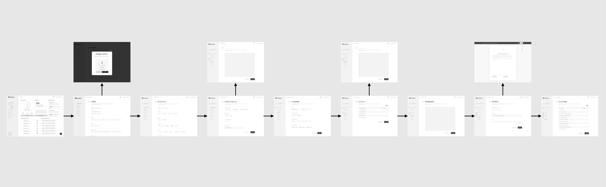
This process takes a bit of work, but it removes ambiguity from the wireframing process, and helps ensure that your wireframes — both individually and collectively — align with the goals of your audience.
Assign the functionality
Based on the results of the workflow exercise, your next step should be to think about what users need to do on each wireframe.
Ask yourself, “What is the primary action someone needs to take to progress to the next step of their workflow? What functions need to be available for the user at this stage?”
Read through your user interview notes and look for patterns in the answers. Does one problem or request appear over and over again?
If you conducted field research or used any other observational methods, use the data you collected to make sure each wireframe matches the context of your users’ daily activities.
This qualitative data will help you prioritize what needs to be included on each of your wireframes.
If you need more guidance on how to lay out your wireframes, you can always reference a design pattern to see what the best practices are. Design patterns will give you a reference point for your wireframe based on established conventions in web usability.
There are design patterns for everything from product pages to log-in screens.
Now, to give you some visual examples of the points we just covered, let’s take a closer look at some wireframes we created for a mobile shopping app.
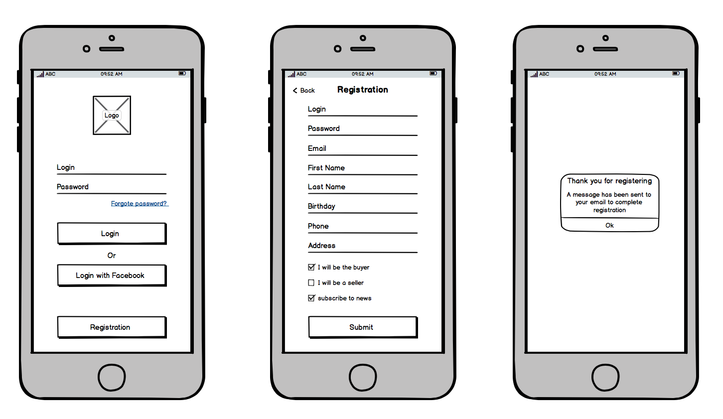
These wireframes outline the registration process for a new user. Notice how the main design elements of each screen center on functionality.
The first screen provides login options for new or returning users. The second prompts users to enter the necessary information to create a profile for either buying or selling on the application. The third offers directions for completing the registration process.
On each wireframe the next step is clear and focused, because the visuals emphasize the actions users can take in the app, which makes the entire design more intuitive.
Create the layout and user experience
Once you’ve figured out what users are going to do on each screen, it’s time to organize the user interface and the user experience.
Before we go any further, one quick note about detail. It’s important to remember that wireframes are only outlines for the final visual design. The visuals don’t have to be overly complex.
In fact, it’s better to keep them low-fidelity and simple, because the more detailed you make them, the more work you’ll have to do to iterate based on user feedback.
This is a principle any experienced UX agency will utilize, and it will serve you well, too. With that said, here are 3 important points to consider in the visual design of your wireframe:
1: What is the most important thing users need to accomplish on this screen?
You’ve already identified this in the previous step, and now it’s time to translate it to the interface. The key to making a task simple is to make each step obvious.
Every time users open a new screen, make sure the most important calls to action are in a prominent location. This reduces the amount of mental energy needed to locate how to move forward.

In this wireframe, our user is completing the registration process from the previous example. Because the app accommodates both buyers and sellers, it’s imperative every user chooses the right setting.
To that end, the wireframe draws all the attention to the binary choice the audience needs to make to achieve their goal: do you want to buy or do you want to sell?
The simplicity of this wireframe is what makes it effective. The design elements that allow the user to accomplish the next step are impossible to miss.
2: What do users expect to see when they arrive on the screen?
Confusion is the main culprit behind poor usability. Interface designs can be particularly confusing when one screen doesn’t have an obvious connection to the one that came before.
So, when designing your wireframe, ask yourself, “What does the user expect to see on this screen?”
Or another way to ask the question would be, “What did the users find confusing about this part of the process during my research?” Answering these questions will help you decide what elements need to occupy the most important spaces on the screen.
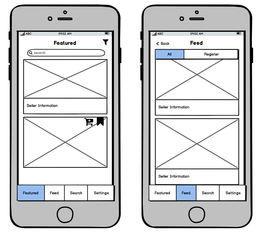
For these wireframes, our user has finalized their buying profile and been immediately directed to products that match their preferences.
Based on our research, we knew that after people completed a buyer profile, they wanted to start seeing products as soon as possible. In fact, after they finished registering, users expected to see products for sale. The audience had a pre-existing belief about how the app should function before we ever designed it. So we matched that expectation in the wireframes by placing those designs in the appropriate part of the workflow.
3: What content do users need to accomplish their goals?
It’s never too early to start thinking about content. In fact, you should work to uncover your audience’s content needs early in the research process.
So if you’re working with a content writer, try to get the copy from them as early as possible. That way, you’ll have an idea of how to set up your wireframes to accommodate the copy.
If you’re working solo, it’s still important to consider the various types of content users will need to complete their tasks and map out space for that content in your wireframes.
Here’s another example from our mobile shopping app:
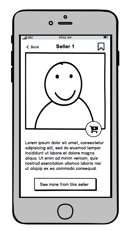
By clicking on the cart icon above a product in the previous screen, users can find out more information about who’s selling that product. Our research concluded that the audience needed this kind of content to help them make conclude whether a seller was a trustworthy merchant.
Whether it’s help content or just additional information, don’t forget to account for how your users will access the content they need to finish their tasks.
Conclusion
All in all, a wireframe is just a skeleton of the visual design. It maps where interface elements should live and how users should experience them. But it doesn’t need to be a finished masterpiece.
Your goal is to create an interface just detailed enough to prompt users and stakeholders to give you feedback on the functionality and user experience.
That way, nobody gets caught up on the finer points of the visual design, and you can quickly gather input and iterate as necessary.
Reference your research, work toward making your users’ goals simpler to achieve, and you’ll be well on your way to creating great wireframes.