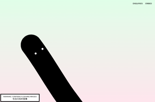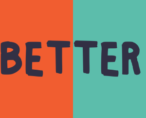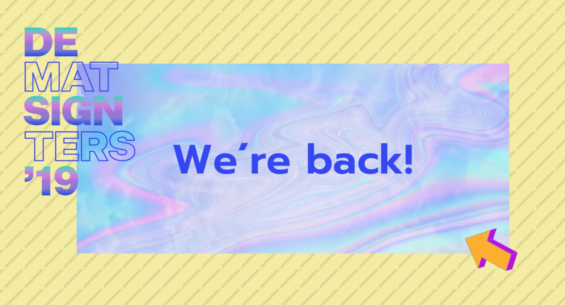

Design is the heart and soul of Design Matters. And this year, our heart beats for obnoxious bright colors, the 80s & 90s patterns, big creative typographies, and particle backgrounds. All in one big mix-match…or mismatch?
How did we end here?
When we don´t make Design Matters, we are designers with expertise in designing complex tools. Here we focus on efficiency, simplicity, and beauty. So, when doing Design Matters, we just want to do the opposite. It is our playground!
The participants at Design Matters are creative minds. They are curious and loves to be challenged. They look at design all day every day. So, we didn’t want to create just another polished conference website. Instead, our goal was to create a design that could stand out and hopefully make people reflect on design.
That’s our mission with Design Matters in general. We aim to make people think and talk about the role of design. And, when it comes to our own visual identity, it’s not any different. We hope that people see it and feel something. We don’t expect it to be pleasant and happy feelings.
That’s also the reason why we dare to make such a quirky design. Because it’s okay that it’s difficult to get.
Moving from whitespace to dreamy and undone
To begin with, we formulated the design principles for this year’s design: “No rules!” and “No whitespace!”
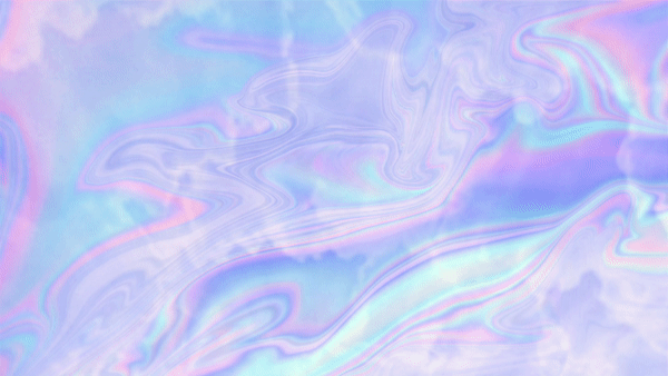
Last year, our identity was inspired by brutalism: White, sharp edges, strong colors and brutal button animations. Now we’ve changed the direction as we wanted to create a more dreamy universe. This year, the identity should come alive, be airy and breathe, but combined with a more obnoxious psychedelic side. Also, we wanted to create an overflow of various colors. The idea was to give ourselves more opportunities and flexibilities to experiment with, how we want to express ourselves.
The new identity looks undone because that’s what it is. Design Matters is organic, and not static, so parallel to the conference, the visual identity is evolving throughout the year. So, what we just released is a beta, which will evolve by being affected by all the stuff that’s not defined yet: The themes, new conference formats, festival-ish concepts, pre-events in Copenhagen, music and much more. This is the core of Design Matters. Just like every other designer, we have hundreds of idea, and we love to test and see if they fail or fly.
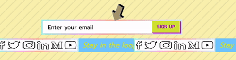
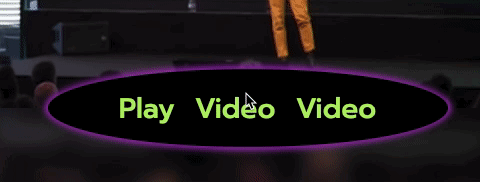
Design Matters is a team effort, so the whole team is investigated in the design process. One thing we all have in common is that we love to hack stuff. We hack each other’s work fields, ways of thinking and our own process. So, when I presented the first draft of the identity, the others immediately hacked it. For example, newest designer Ditte hacked the “Stay in the loop” to be this 90s inspired band and came up with the wired double button. And Julie took it even further, with a tribble button with an even more 90 inspired animation to it.
We didn’t’ design this to make something beautiful or ugly. We did it to make people take a stand and discuss what’s good design and what’s not. That’s also why we’re not afraid that people think our new identity is ugly. We are used to that. Our participants take a stand and have lots of opinions. And we love that!
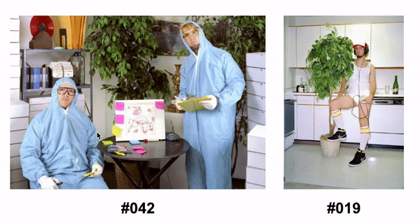
Inspiration…