
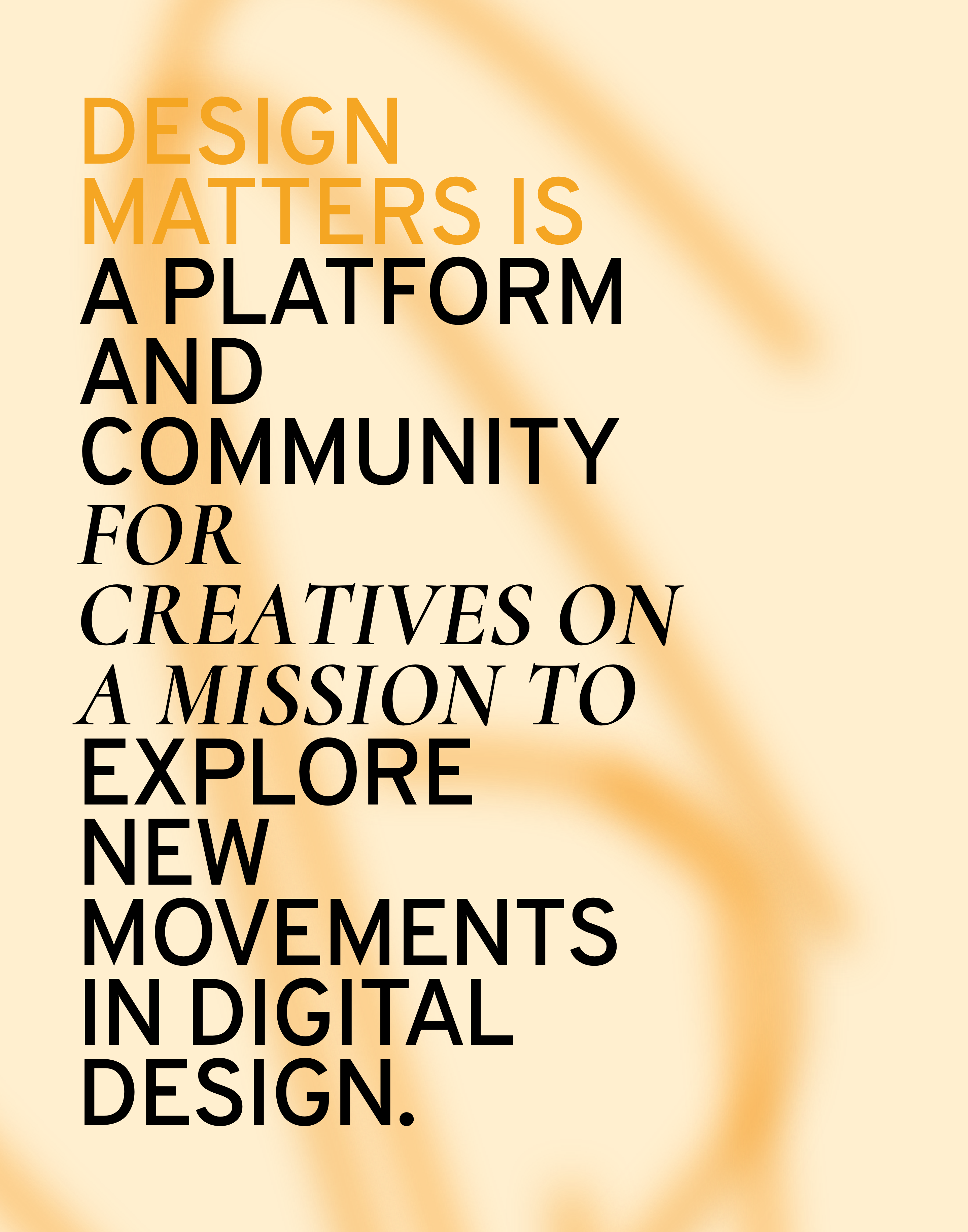
Edgy design runs in the veins of Design Matters just like provocative jokes run in Ricky Gervais’ veins.
Last year, our identity had its roots in the past. We took a look back at the 80’s and 90’s and brought back ultra-bright colors, retro patterns, and big, fat, skewed typography. All in one blazing combination.
But this time, we’re looking into the future.
Minimalism. But distorted and transformed.
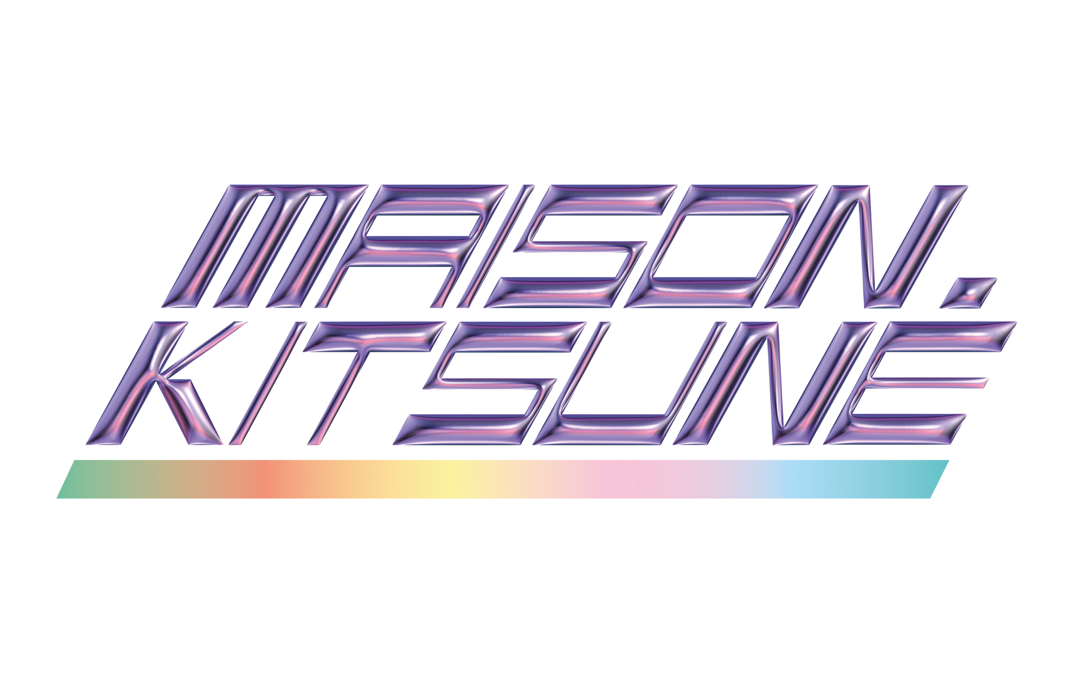
We decided to adopt a minimalistic design, and jazz it up with a few audacious tweaks. We added a pinch of brutalism, which we didn’t want to abandon completely. And a series of other elements that, at a first glance, appear totally disconnected, such as neon shades, graffiti art, asymmetrical and futuristic patterns, and mixed typography.
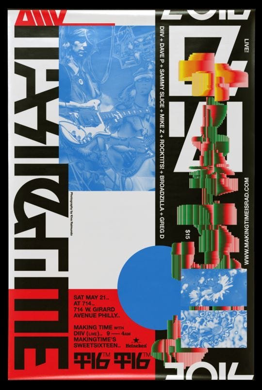
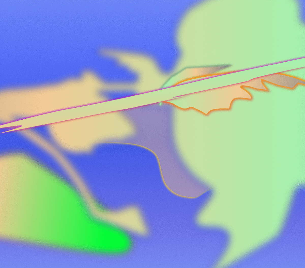
An urban touch with digital graffiti
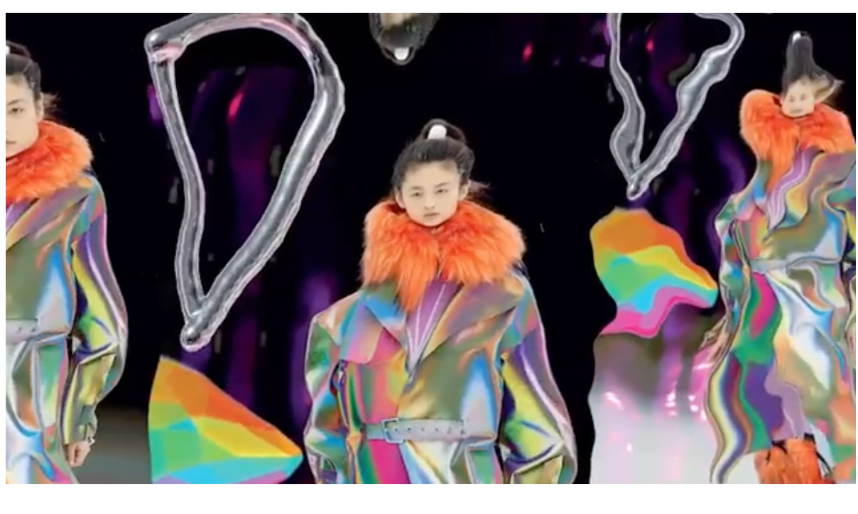
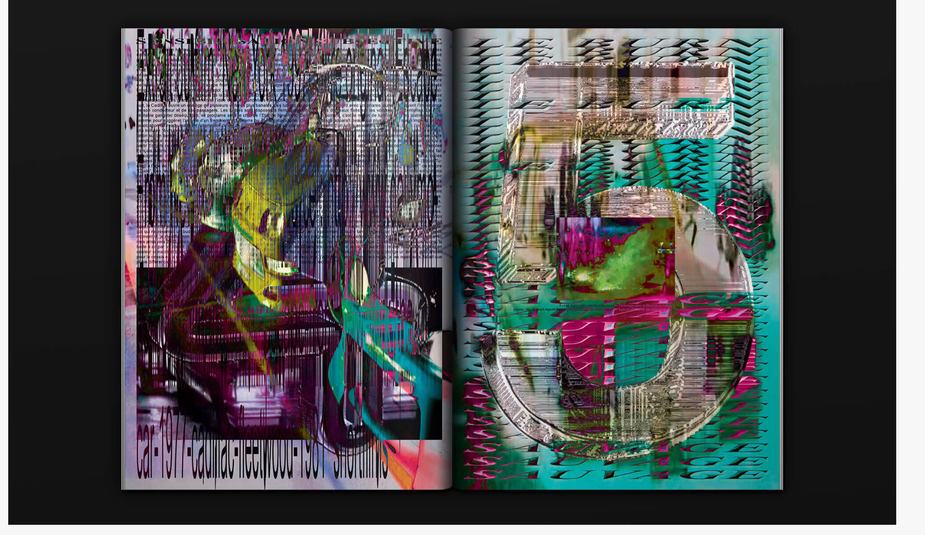
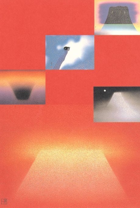
In order for our design not to become completely transcendental, we included elements that are normally associated with an urban, underground culture The use of neon colors and acid graphics, combined with indistinct shapes, creates a powerful psychedelic effect.
This seemingly trippy messiness, that coexists with a new form of minimalism, challenges the traditional notions of desirability and clarity in visual design.
This is why we define our new design as an excessive subspecies of minimalism. It was made with the idea that design can expand the possibilities of creators, rather than restrict them in a narrow direction, as Studio Brado wrote in one of their articles.
Why we went for minimalism
Traditionally, minimalism uses a limited number of colors — a lot of black and white — focusing the attention on a few key elements to transmit the core message. Negative space is maximized, making it the very backbone of the design. The combination of a limited color palette, negative space, and very few UI elements results in a simple interface with no unnecessary frills.
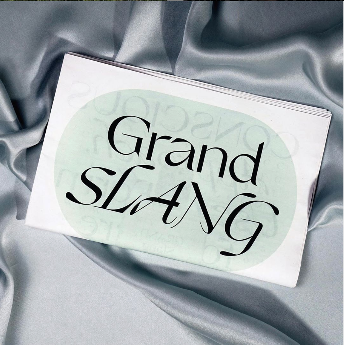
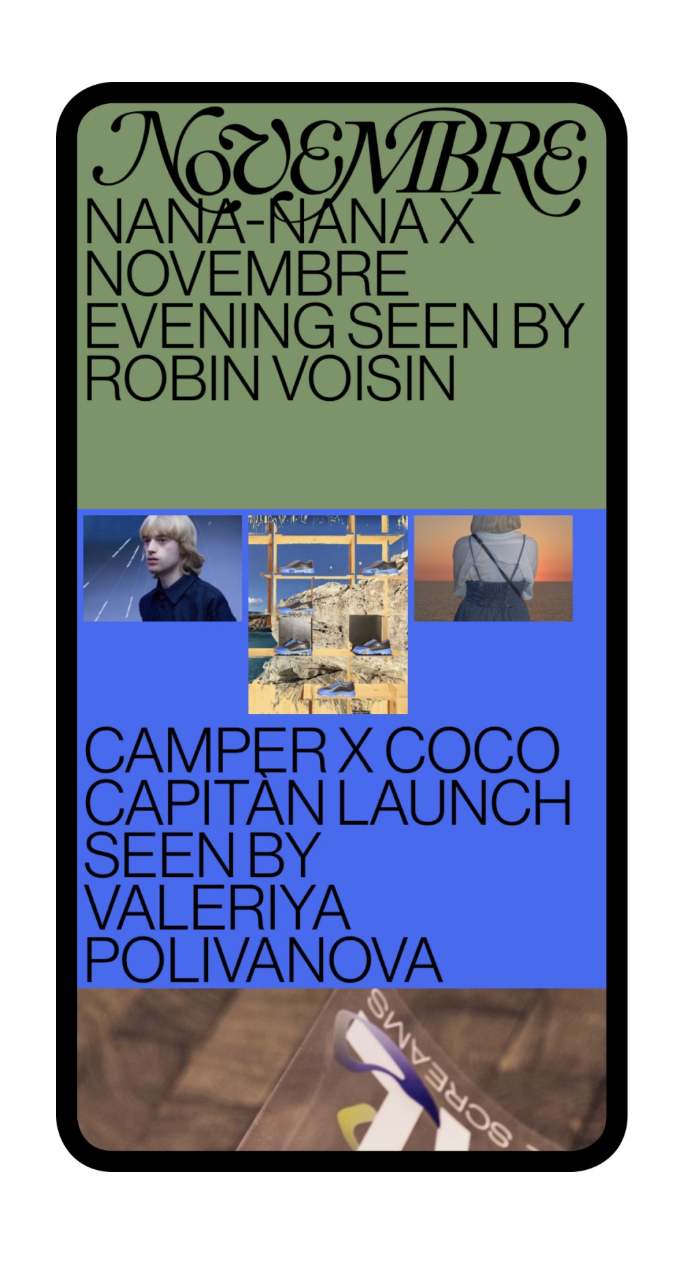
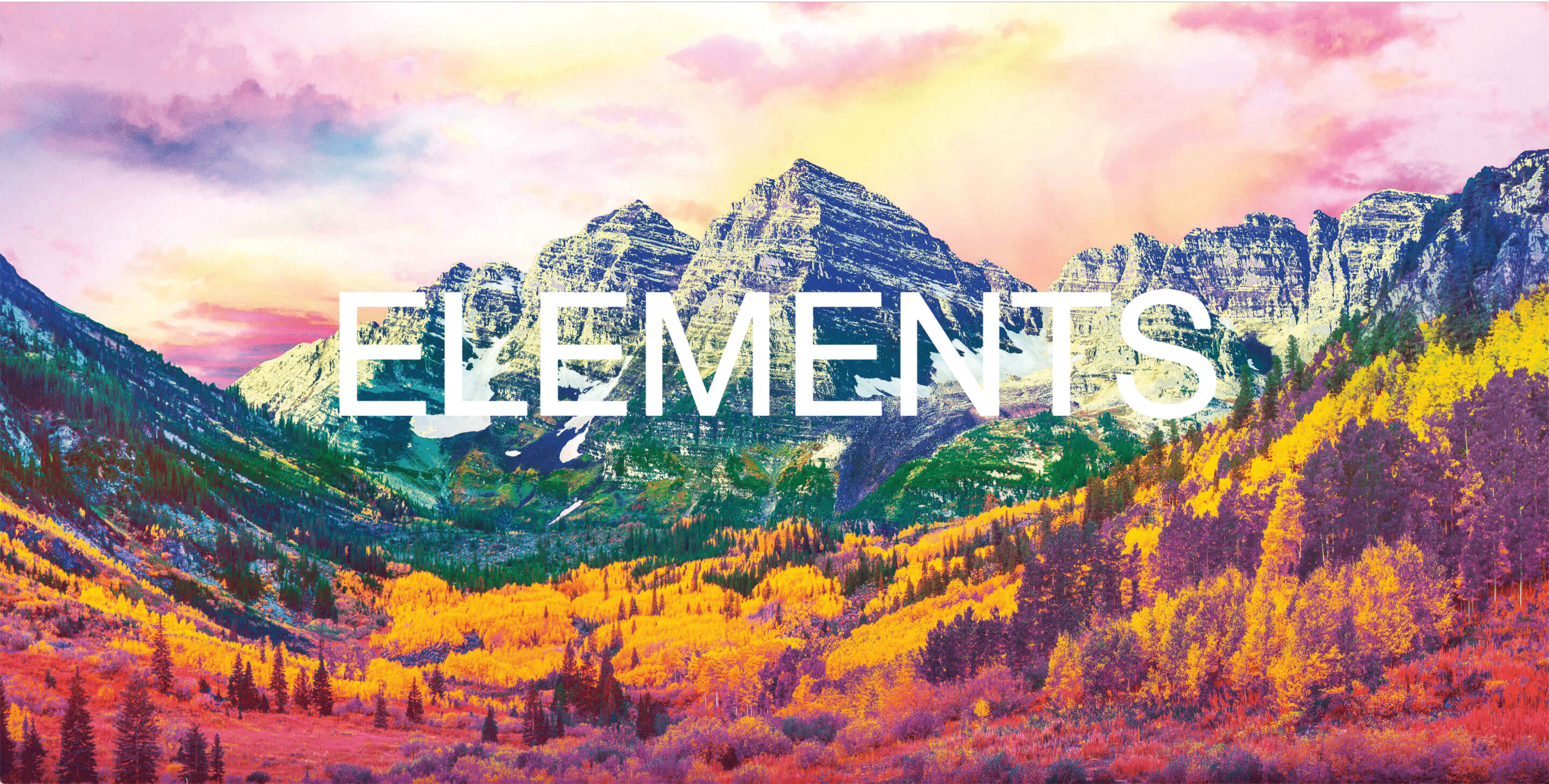
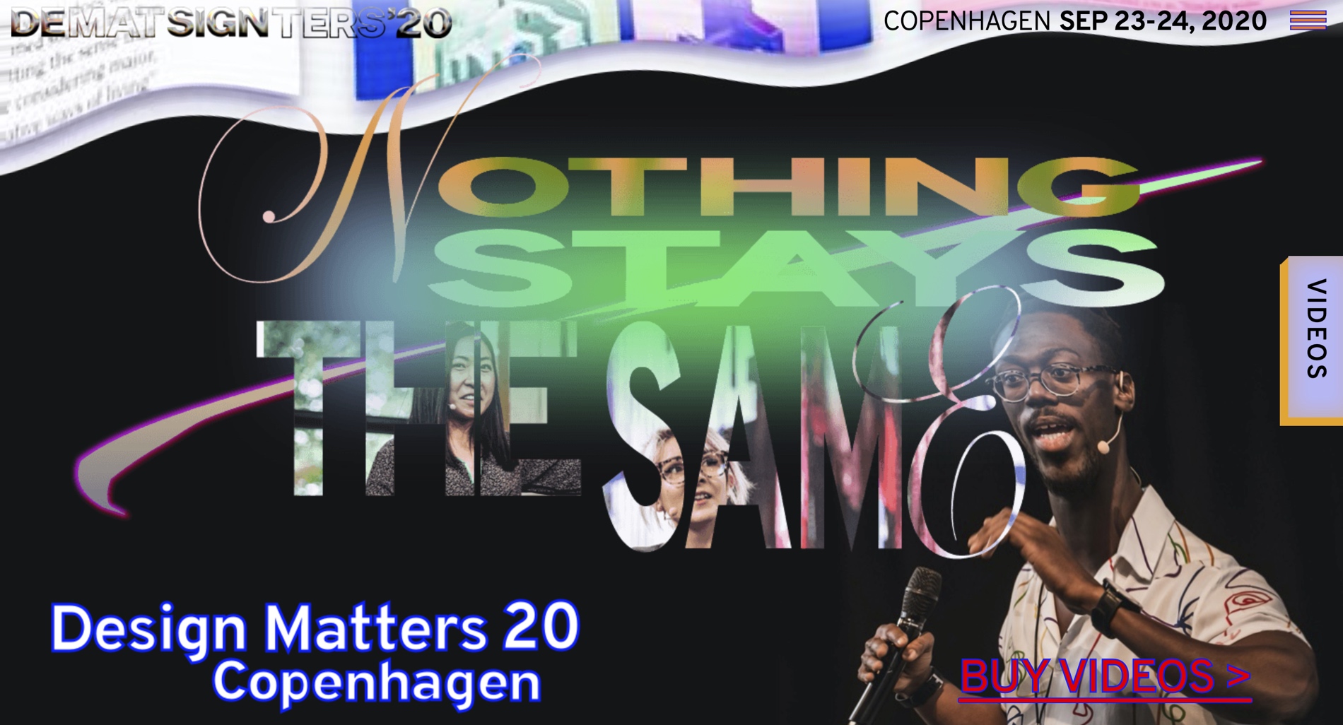
But today, we’re seeing a new minimalist design direction that uses more colors, shapes, and patterns, creating an uncanny, but fascinating contradiction, resembling a collage. Also, to compensate for having fewer visual elements, the new minimalist designs use dramatic or deformed typography to make interfaces feel more engaging and less bare.
A paradoxical futuristic design
This new style challenges the way our brain works. The human brain is built to recognize and create patterns. This is why we tend to like symmetrical and well-ordered visuals. In fact, when we are presented with asymmetrical patterns and deformed figures that are hard to understand, our brain repeatedly tries to decode the message. Visual deformation causes the user to stay on the design to try to figure it out.
Thus, we incorporated asymmetrical shapes, and irregular, distorted typography. Our use of pixelation, noise and grainy textures and extreme zoom-ins produces an aberrant effect that is also a paradoxical balance of futurism and minimalism. Finally, we juxtaposed softer, pastel hues with full black and neon elements. The result is a slightly puzzling, yet magical minimalist aesthetic.
Why did we do this?
Ditte Flintrup is our new Lead Designer at Design Matters, and she has brought a fresh perspective and a wave of inspiration to the team. Her style is influenced by brutalism, it’s raw and instinctive, blending together elements from different design movements, underground culture, and fashion.
But we also wanted to push boundaries! Our community is creative, curious, and forward-thinking, and we wish to propose provocative and unorthodox designs to them. We didn’t aim at creating the umpteenth polished and mainstream design, but rather, a unique design that shakes people’s conscience and makes them reflect and discuss. We want to trigger a reaction.
As written in ‘The Picture of Dorian Gray’, “there is only one thing in the world worse than being talked about, and that is not being talked about”.