
Tiziana Alocci is an award-winning data visualization designer and lecturer based in London, where she runs her studio playing with pixels, data, and sound. She has worked commercially for over a decade as an information designer, collaborating with creative agencies, brands, and art organizations. Her work spans from interactive data experiences to printed editorial data visualizations, with clients that include the BBC, the British Library, Corriere Della Sera, Wired UK, and the Open Data Institute (ODI).
In 2017, Tiziana co-founded Market Cafe Magazine, the world’s first independent magazine about data visualization. The publication, sold in over 20 independent bookstores globally, has featured some of the world’s leading figures in data and information design. In 2017 was recognized at the “Information Is Beautiful” Awards with a Gold Award. On top of this, Tiziana has been an Associate Lecturer at the University of the Arts London since 2018 and regularly speaks at prominent information design industry events internationally.
Looking at your work on your website, we see a few “data-driven album covers”. What are they and how do you create them? Can you please guide us through your process?
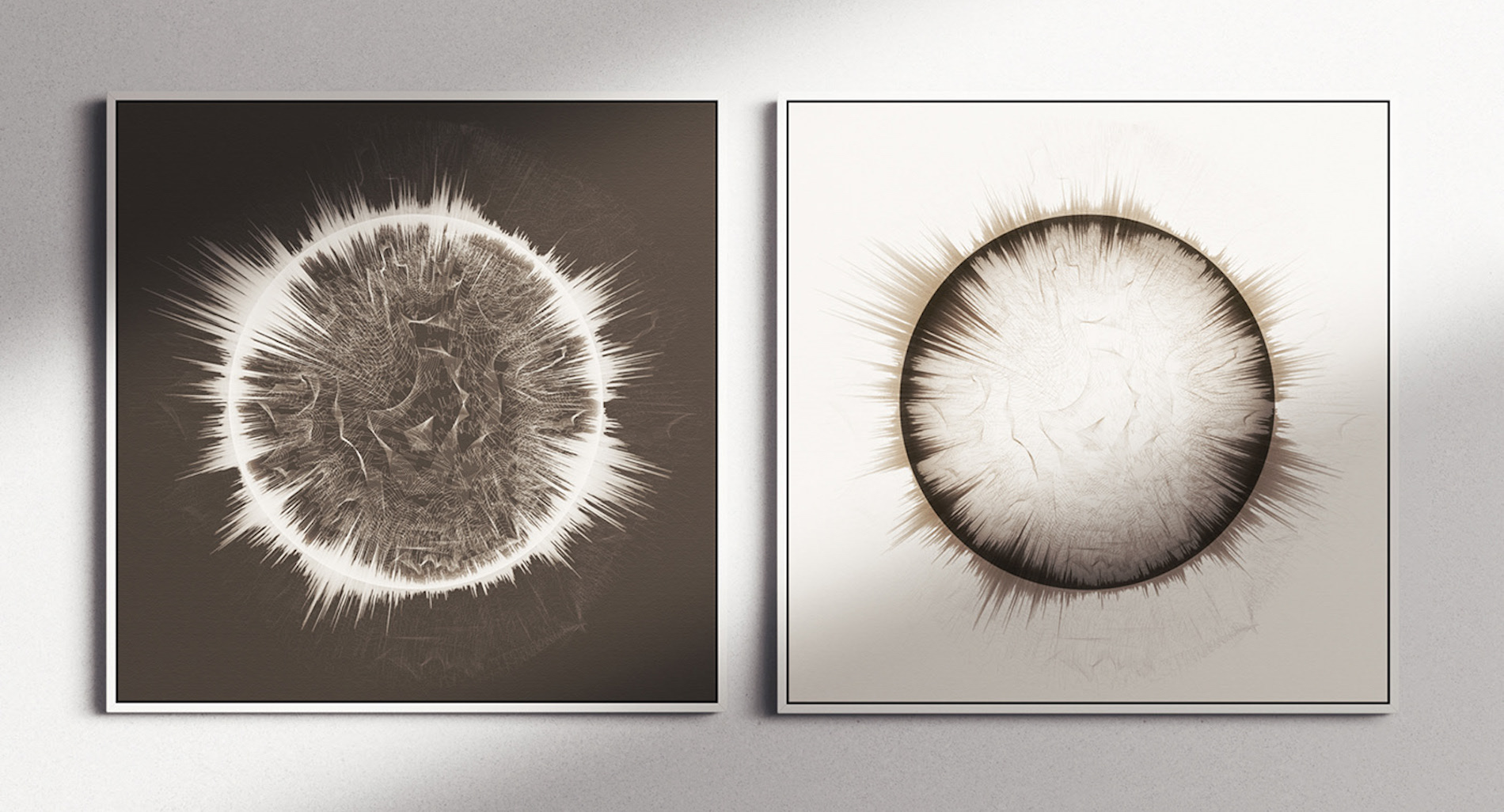
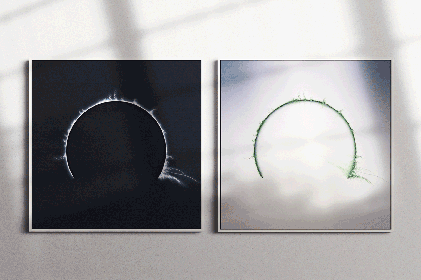
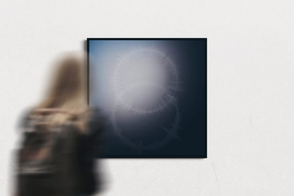
That’s right, it seems like playing with sound and data has become my new obsession. I have worked as an information designer for over 10 years, and I am fascinated by everything to do with data. Still, I have always tried to push the boundaries and experiment with something new. Three years ago, I started a collaboration with a Berlin-based record label; the founders, two international DJs, were fascinated by my style, so we started playing on the concept of visualizing the music and making it tangible. From there, 12 data-driven album covers were born: unique images where a track emerges as an image. This collaboration has led me to dedicate time and research to this topic, and I can’t stop now!

Let’s talk about data-driven sonification. What does that mean?
Data sonification literally is the “use of non-speech audio to convey information or perceptualize data” – thanks, Wikipedia. I must admit that I have reappropriated the term in my practice. For example, traditional data sonification starts from data (numbers, any dataset) and transforms it into sound. This is applied a lot in my job as a data visualization designer, mainly because being specialized in data visualization for digital products (that’s how I pay the bills!) opens up many possibilities when it comes to the accessibility of content.
Then there is the part related to data artworks focusing on translating sound into an image. For the works like Necessity collection, I use sounds related to my life that I record at different times – an activity that I have always done to record data, sounds, and numbers – that is linked to the quantified self-movement of which I have always been a great supporter and the way my mind works.
If designers from our community would like to get started with information design & data art, where would you recommend them to start from?
I always suggest starting from your own curiosity. It sounds a bit cliché, but the vast majority of ideas related to a personal or commissioned project always arise from my curiosity – or that of the client. Trying new techniques can be daunting at first, but there are no faults in creating, you can make mistakes, but they are the ones that help us improve and maybe lead to something new!

What inspired you to get into this career?
Strange but true, I discovered data visualization by accident in 2008, writing in a traditional graphic design online forum. At that time, I was very focused on print and editorial design, a passion that has remained since, after 10 years, I co-founded an independent magazine. Long story short, after that moment of serendipity, I enrolled in the MSc in Communication Design at the Politecnico di Milano where I spent two years working on data visualization with a multidisciplinary approach. From there, I could not do without it! A week after graduation, I moved to London, where I started working as an information designer for several studios and agencies, until 2018, when I went freelance and started teaching data visualization in the Master in Data Visualization at the London College of Communication. I continue to teach and work as a freelance data visualization designer from my studio in East London.
A data story in stop motion: How’s the Caesarean section delivery reported?
What sectors or industries can this type of information design benefit? How?
Data visualization is industry agnostic, meaning that you can work in almost any industry, as long there’s data. I find it fascinating and above all one of the main reasons I never get bored doing this job! Especially by working directly with clients and brands, I can choose the most exciting and creative projects, and above all, I can select the industries with which I have the most pleasure in working. This gives me an incredible feeling of freedom and always pushes me towards new adventures.
Tiziana will give a talk at the design conference Design Matters’ 22, where she’ll showcase her work, guide the audience through her process, and discuss what it takes to create beautiful data art. The talk, titled “Necessity, the transference of sound data into visuality”, will explore new ways to communicate information using sound: from data-driven album covers to art installations; this will be a personal take on the exciting world of data sonification. Get a ticket here.
Cover image: Victoria, by Tiziana Alocci.