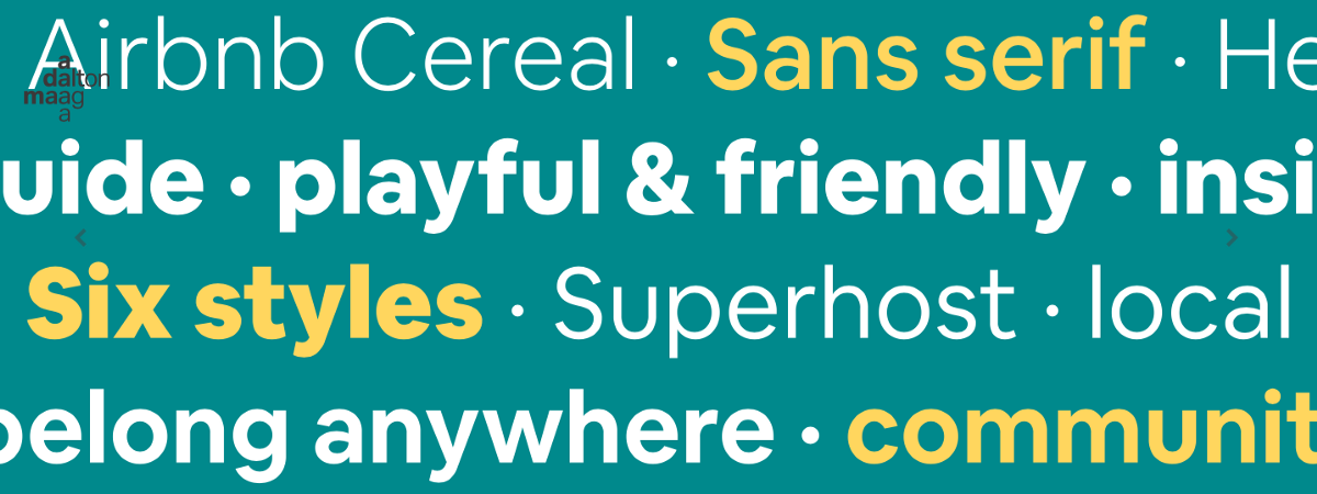

Bruno Maag is a renowned Swiss typeface designer based in London. He and the team at Dalton Maag specialize in creating finely-crafted typefaces for brands, including Airbnb, Facebook, and the BBC. Bruno and Dalton Maag regularly host typography workshops and speak around the world at conferences to share their knowledge.
Last year, at Design Matters 18, you talked about variable fonts. Is it something you are still working on?
Yes, we are. It’s one of the latest innovations in the type industry, so we are investing in it. Variable fonts have great potential, but their future is dependent on how people use them.
Variable fonts are a smart evolution of an old technology, but I don’t think they can be successfully applied across all media and environments. I think to make the most of the possibilities and opportunities we need to find completely new solutions, different to what we have now that match the challenges of, for example, virtual reality, augmented reality, and mixed reality.
A variable font is a single font that behaves like multiple fonts. It is a single binary with greatly-reduced comparable file size and, hence, smaller disc footprint and webfont bandwidth. [Wikipedia]

Do you see any other interesting trends or tendencies within typography?
Yes. More advanced digital typography has now reached places where non-Latin writing systems are used, and in most places are finally being favoured over Latin.
While Gutenberg’s invention of industrially mass-produced movable type made books affordable for common people, increased literacy, and broke the monopoly of the rich on education, his innovation didn’t initially spread outside of Europe. The whole concept of typography and commercial printing
has really only been around for a few hundred years, while writing has obviously been around for a lot longer than that. Outside of Europe and the Americas, there are languages with complex writing systems. These regions would utilize printing equipment imported from the West, which was not always designed to support the complex structures or expressiveness of local scripts. As a result, characters were stripped back to hyper-simplified forms which fit the system but only loosely followed the simplest styles used to write the script. Only in the last 20 years, with the introduction of OpenType font technology, has better quality digital typography been possible in those regions.
This attention on multi-script fonts is also gaining momentum as brands from China and India are breaking into Western markets. Established brands with a Western style are becoming strong competitors in the West through good branding and lower prices. The West can’t just watch and wait, it needs to be proactive and engage with global audiences.
UI and UX designers need to start thinking more globally. They need to conceptualize their UIs with non-Western audiences in mind.
There is also demand for more fonts which support languages like Tamil, Thai, Khmer, Lao, etc especially for device interfaces. Imagine having a UI designed only with Latin in mind, and then trying to find a font to fit into these limited, pre-defined spaces, for a writing system like Thai, which runs
really tall. You can either make the type much smaller, creating your own accessibility issue, or mutilate the writing system, which is inconsistent and disrespectful, so obviously unacceptable. Designers need to rethink their own work and approach design from a more global perspective.

Speaking of accessibility, what is your take on design and typography?
It only takes a few small changes to make a design more sustainable and accessible. It’s about audience and purpose. But first, we need to acknowledge that we will never be able to create a single solution that covers everyone’s needs.
By making slight tweaks that give typography longevity and make products more accessible, we can increase an audience’s use and enjoyment of a product. But we need to educate designers on what they should and should not do, so that they can make an informed decision on how to progress and
build their design.
For typography there are three types of accessibility to be aware of: physical accessibility, emotional accessibility, and technical accessibility. While it’s probably clear how accessibility can be improved for people with, say, visual or hearing impairments, the needs of other impairments are less obvious. For example, there are developmental disorders where people struggle to cope with the intensity of their emotions or the everyday situations they’re in. For these readers something as innocuous as funky or unusual letter shapes can become a distraction. Good typography and typeface selection can make a huge difference in these situations. An accessible typeface enables everyone to access and process information to the maximum of their ability, without even noticing that there is a typeface. But in advertising, reading often becomes secondary to emotional captivation. Here, the accessibility target is to purposefully distract the reader and draw their attention to the message of the ad.
Every type of accessibility has different requirements, so we need to keep the audience in mind when we design.
So, how does a designer pick the right font?
Good designers always put themselves in the shoes of their audience. If you’re a UI designer with an audience of over-65 year olds, you need to consider that their eyesight will likely be impaired. Therefore, you wouldn’t use a light or small font because it will be harder for them to see. So in this case heavier, bigger fonts, with an open rhythm are likely the best solution.
You always need to think about your audience, and how to help them to process the information you’re putting across.
The choices designers make can now be validated by science. Those practicing typography have gathered experience and observed a lot since Gutenberg, but they haven’t been able to validate or argue their point objectively until recent times. But today, we can back up every argument for good typography with scientific evidence. For example, the optimal line length is between 55 and 65
characters, and there is a reason for that. It’s because of the way our eyes and brain work.
When we read, the brain moves the eyes in a saccadic rhythm rather than smooth movements. In one saccade we capture roughly 8 characters, and the physical constraints of fast and comfortable eye motion when reading limit us to about 7 to 8 saccades. Multiplying together you get roughly 55 to 65 characters. So what we established through trial and refinement over the last 500 years, science can now explain why. A good book I recommend is “Reading in the Brain”, by neuroscientist Professor S. Dehaene, which is about how humans process numbers.