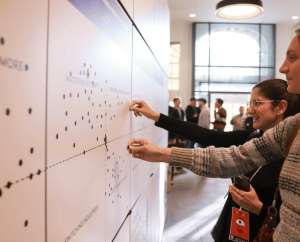
Back in 2017, Bojana shared her experience with conversational UI’s in the talk “A Tale of Conversational Data Collection”. Since then, Typeform has rolled out a rebrand of Typeform and launched a 2.0 version of the product. We met up with Lead UX Designer at Typeform, Bojana Jamborcic and Chief Design Officer, Chris Linnett, in Barcelona to get an update on conversational UI’s and where Typeform is heading in the future.
In 2017, you talked about how to design conversational interfaces. Is that still something you are working on at Typeform?
Bojana: Yes. We still know that conversational forms are better than regular forms because conversation creates a better user experience and thereby more results.

Chris: And recently we started questioning what we really know about ‘conversations’. So, we began working with Elizabeth Stokoe who is Professor of Social Interaction at Loughborough University specializing in conversation analysis. When she first took a look at typeforms she said, “They’re more form-like than conversational”. So right now, we’re working on integrating Professor Stokoe’s insights about what “conversational” means, for us, into the product.

By understanding how our customers write typeforms, we can help them to improve their forms. This means that we could help them understand how to phrase questions in a more conversational way.
Basically, there are two reasons why we do this: Emotions and data. Our relationship with our customers is important and our customers feel that we help them look good to their customers. And people use Typeform to collect data. So, we keep working on this emotion and data duality to make it better and more fun.
We are also questioning whether or not people want to answer typeforms in other ways such as using voice and how to translate typeforms into speech. This is still a very early stage, but it is an additional route for leveraging conversationality.
Typeform recently did a rebrand. What were your thoughts behind that?

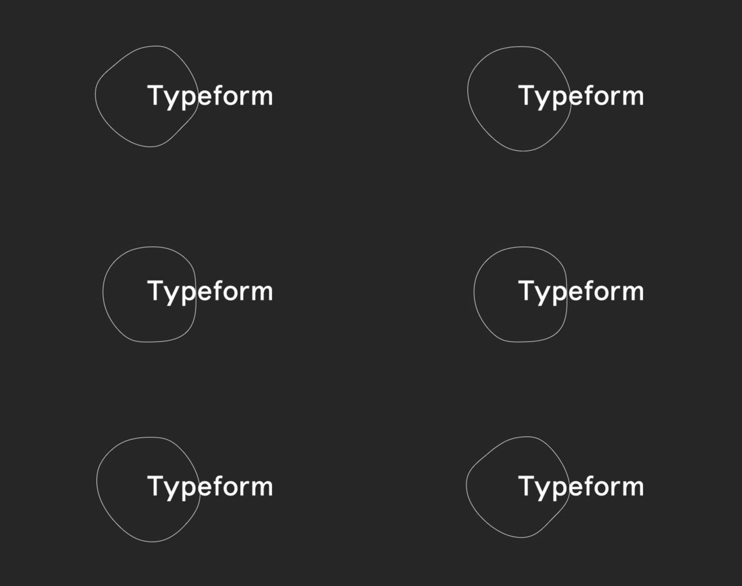
Chris: We really wanted to represent, what Typeform is — both a unique way for our customers to express themselves to their customers, and collect the info they need.
The core of the product is the exchange of information, which is also the core of what humans do. So enabling an emotional connection is important for gathering more and better information. We help our customers create a connection with their customers like when a customer comes into a shop. As a result, our customers collect useful information and their customers have a great experience with a typeform.
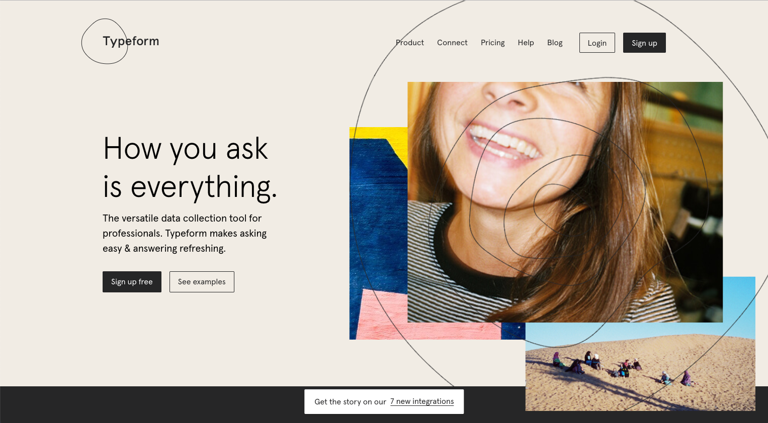
For us, people are at the center of everything we do. And people are unique; they aren’t perfect circles. So, the rebrand is capturing that. And what it also does… it moves. Just like human life moves and information flows.
You also redesigned the product. What were the thoughts behind the new 2.0 version of the product design?
Bojana: This started with that design-itch, where you think that your design doesn’t look as good anymore. So, we worked to improve the look and experience of the product. And, there was a lot of stuff we got right, and stuff we got wrong.
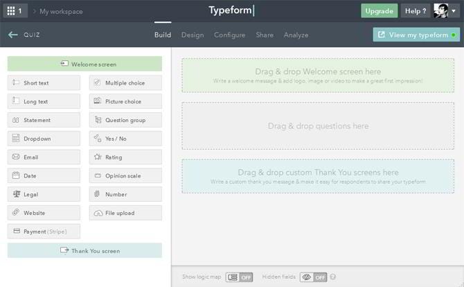
One of the things we changed was the Typeform builder, where our customers actually create their typeforms. Instead of seeing one question at a time when making a form, we showed all the questions at once. We based this decision on our user insight. But now we’re dealing with the converse of that, with some first-time users having a harder time understanding a more complex UI.
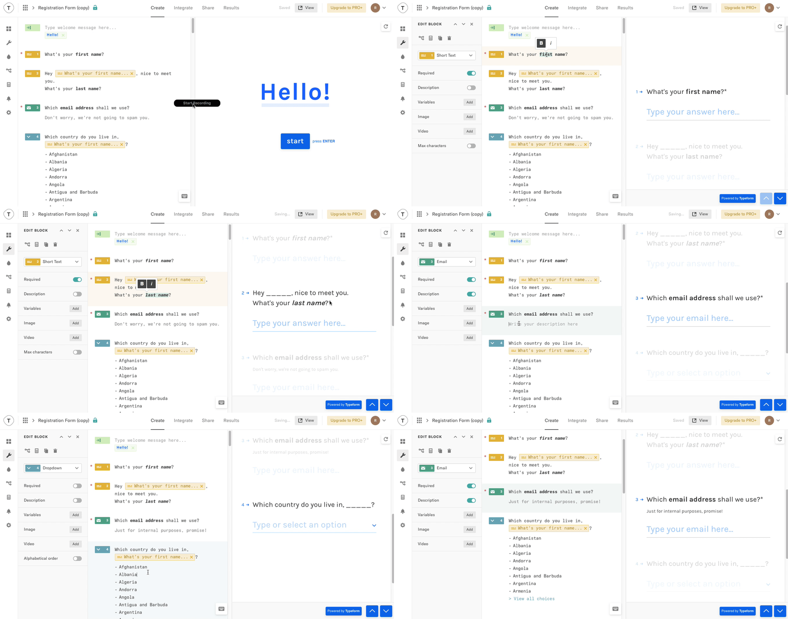
The way we approach this opposing feedback is by improving flexibility and giving the users functionality when and where they need it. In that way, we’re layering on complexity depending on the context and the stage of the customer journey.
Chris: We see our customer journey as building a relationship. So it’s just like when you meet a new person, you don’t ask them to get married, but you start off by saying “Hi, what’s your name”. We focus on the customer journey and try to understand the learning curve of the customers. This is because we want to bridge the gap between what they know and what is possible in the product. On the one hand, we have the flexibility to give the users one simple action and on the other, all the complex actions are available at the same time.
Bojana: We learned a lot of things about our product and customers by doing a complete redesign, so now we are bringing all those learnings in for the best of both worlds.
What new methods are you using, to understand the users’ needs and to build this relationship?
Chris: At Typeform we try to aggregate all the data we have on users from marketing, design, product, data, and customer success. So, what’s new is bringing all this together in cross-functional teams to get a more holistic and in-depth understanding of the customer journey which we can then use as our framework.
The way we work with our research findings is that we have various levels of fidelity in the customer journey. Some of our views of our customer journey are very simple and some are more complex. For example, we researched the users by following the “Jobs to be done” framework. This resulted in user stories about the emotional job that we are helping our customers to achieve. We found out how important it is to our customers that we allow them to put their best foot forward with their own customers. And now, this is an insight we use in our daily work.

Bojana: It sounds more organized than it sometimes feels in practice, and things always change, but the point is that the customer is central to everything we do and our product vision!
What other new tendencies are you inspired by?
Bojana: Thinking of visual design trends, if you look at our brand it is a bit odd and perhaps unfinished-looking. It was meant to be this way because we want it to look more honest and to express human nature as we had talked about above. Is that a nod to the brutalism trends in UI?
Honestly, I feel like people in general care about usability — is the text easy to read? Can I accomplish the task I’ve set out to do? Is this UI pleasing to look at overall? — but designers are the ones who notice all the small details in the design.
However, what sparks my curiosity most are the novel uses of technology. At first, there’s a lot of buzz and excitement, about things like smart devices, Augmented Reality or voice, but then there’s the work of figuring out how to fulfill practical customer needs. Alexa, in a way, became more popular than expected and all of the design industry learned something about the way people use voice interactions. I find this challenge of leveraging new technology in a useful, perhaps unexpected way, fascinating.
Interested in more? Watch Bojana’s talk “A Tale of Conversational Data Collection” from Design Matters 17.


