
SPONSORED CONTENT
Article by McKinsey Digital
McKinsey Design is a global community of designers, strategists, engineers, and researchers focused on helping organisations innovate and thrive in the digital age. Nick Whiting leads design for complex manufacturing and industries where digital transformation and advanced analytics are central to the challenge. Tey Bannerman is an Associate Partner with over 15 years experience as a UX designer and creative director, focused on digital sales designing for positive change.
In December 2019, McKinsey Digital kicked off a piece of research to understand how citizens in 20 countries around the world used digital products and services in their day to day lives. The plan was a simple one — survey hundreds of people in each country on their digital habits, and then check in every 6 months to see if, where and how things had changed. But less than 100 days later, the world as we knew it had changed. As Covid-19 transformed into a generation-defining global pandemic, the lives of hundreds of millions of people around the world were thrown into turmoil as nationally-mandated “stay at home” rules and lockdowns took hold.
What began as an interesting research initiative to measure digital sentiment suddenly presented itself as a once-in-a-lifetime opportunity to chart the impact of a global pandemic in spurring behavior-change — all while gathering insights that could help improve people’s live for the better.
Over the next 14 months as pandemic responses and guidance evolved, the Digital Sentiment team surveyed 50,000 people across 24 countries — collecting millions of data-points, stories, and even videos. A rich and detailed picture began to emerge of how people around the world shop, learn, play and communicate change when communities are forced indoors and digital is the only choice. We learnt how trends across industries and demographics shift, and which habits “stick” once life begins to return to normal.
Digital adoption in Europe from 2019-2021 (Courtesy of McKinsey Digital)
When data and design come together
As designers helping some of the world’s largest and most complex organisations craft new products and services, data is a crucial part of the McKinsey Design toolkit. From visualising new ways to navigate vast pools of information in ways that bring about brilliant user experiences, to exploiting consumer insight and feedback data to inform a deeper understanding of customers and citizens — data can be rocket-fuel for designers to formulate hypotheses, draw conclusions, and identify new opportunities.

As we tracked the results of the Digital Sentiment survey, we were amazed by the breadth and depth of insight that emerged, and struck by the immense opportunities this presented us as designers to create meaningful and lasting change. We saw connections in everything from the public sector to social initiatives to sustainability, and challenged ourselves to find ways to get this data in the hands of designers all over the world.
Post-pandemic design
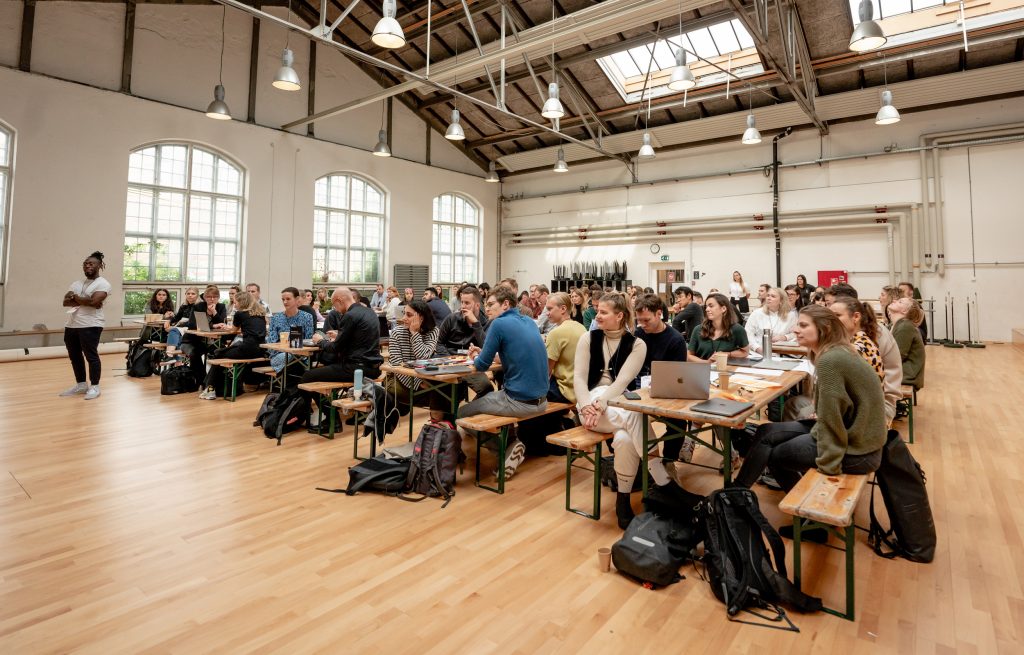
When Design Matters, one of Europe’s top design conferences, announced their themes for the 2021 edition, we knew it was a match made in heaven. “Post-pandemic design” promised to show designers how to embrace the ‘new normal’ and explore the opportunities, dangers and pitfalls of being remote and digital-first.
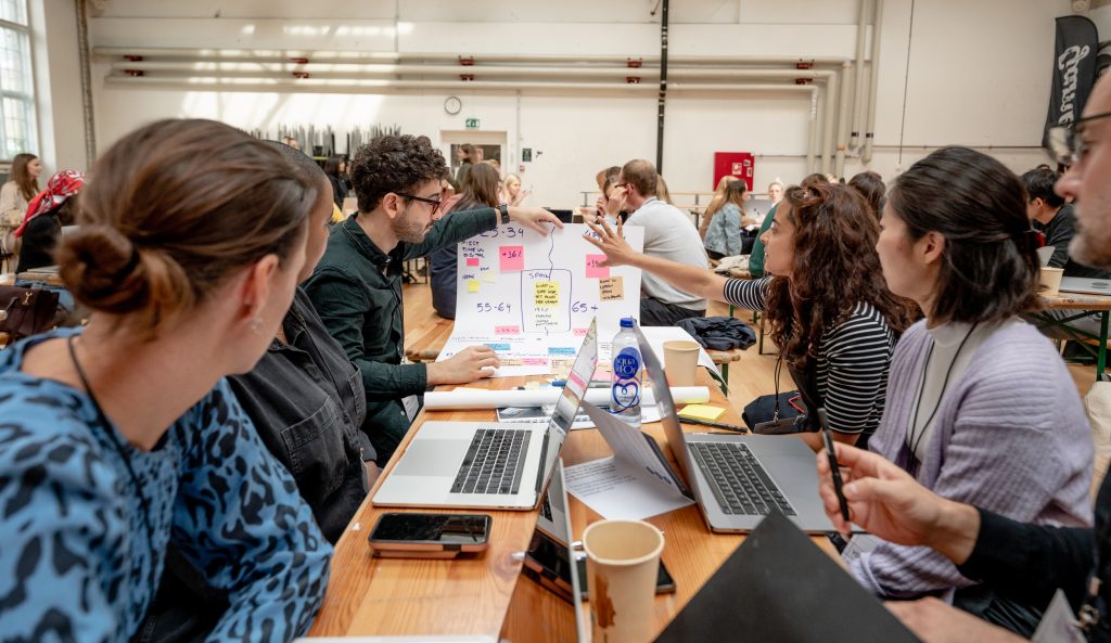
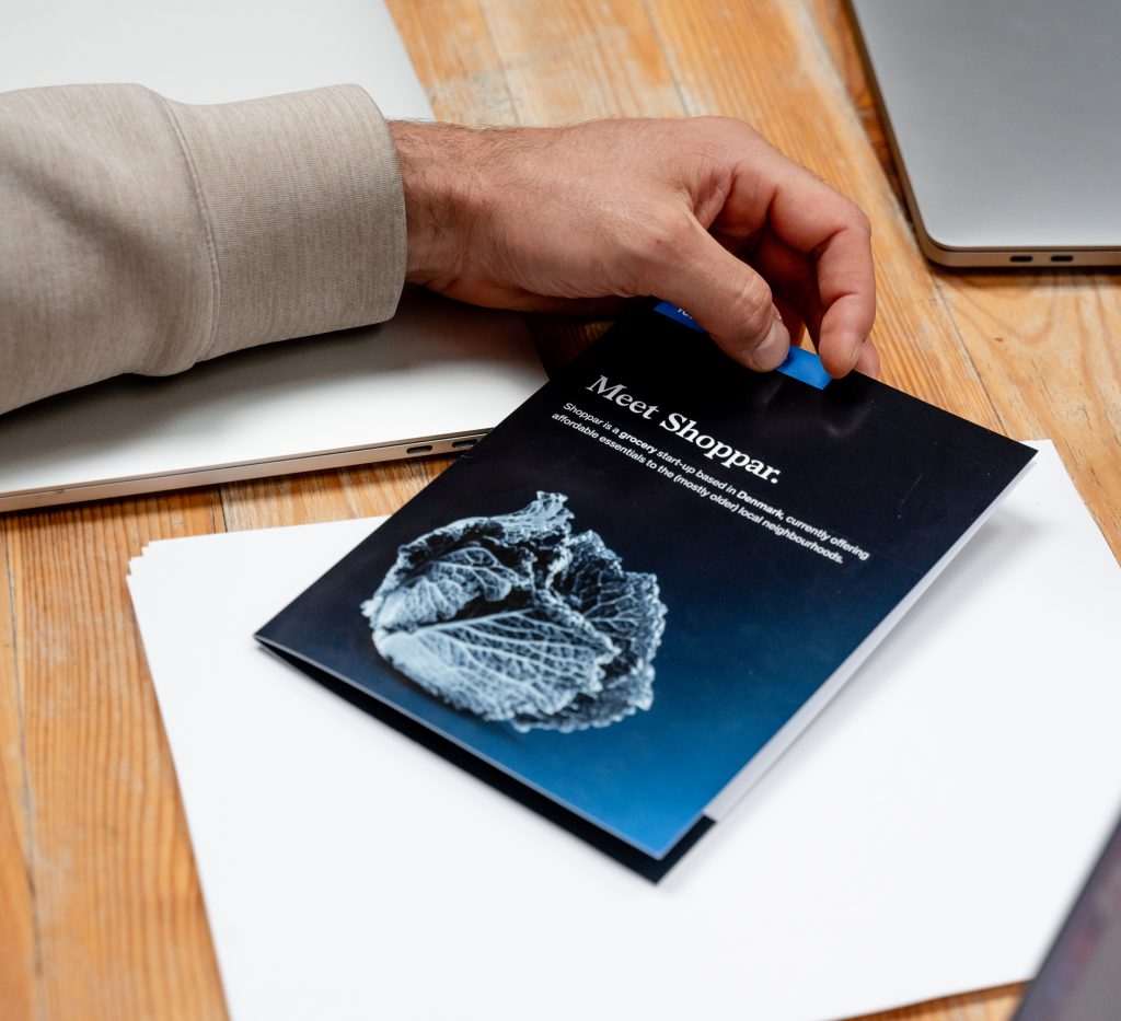
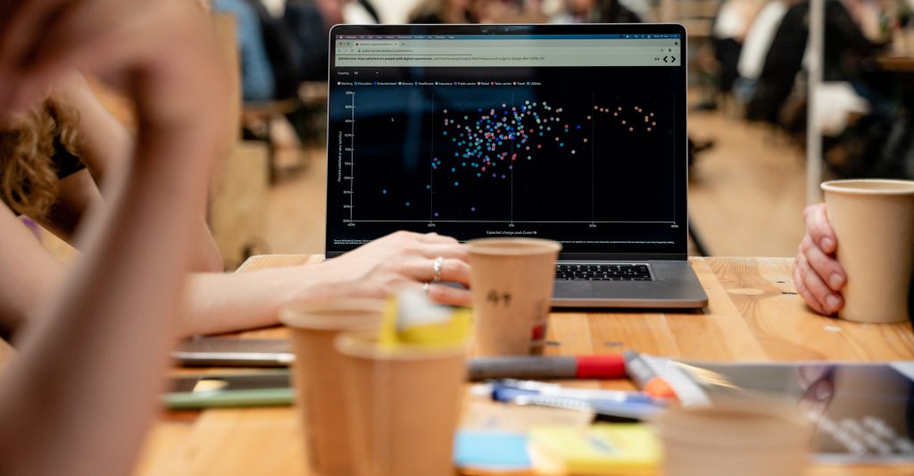
We ultimately wanted attendees to be able to see, touch and manipulate the data and insight we’d gathered, and created an immersive 90-minute experience that challenged participants to imagine innovative solutions based on qualitative and quantitative data. Working with data can be challenging though, and in a world of ever-increasing quantities of information, disciplines like data visualisation and digital storytelling are an asset unto their own. Knowing just how important it would be for participants to make sense of the numbers and draw meaningful insight, we worked with our internal data visualisation team to create an interactive ‘Data Hub’ that literally put insight at their fingertips. The workshop itself put attendees in the shoes of the ‘Chief Digital Officer’ of a fictitious new post-pandemic company with the clock ticking before a make-or-break pitch meeting. How could the data set help them to pivot? Who were the new target users? Where should they focus, and which industries could provide inspiration?
Shaping the new normal
As designers, we love the qualitative aspects of our work; the why, the underlying needs, and the emotional drivers behind human behavior. Which is why we were blown away to see how many designers were keen to join a quant-focused workshop, the diversity and energy, and the eagerness
to get their hands dirty in the data. We loved seeing how the pseudo title of “Chief Digital Officer” empowered people to think bigger and more boldly about the impact they can have as design practitioners, making decisions about the potential target audience, value proposition, and ‘phygital’
touch points across the consumer journey. This is how we work at McKinsey Design, and we hope to see many more fellow designers operating boldly within this space.
Learn more about what we’re doing with data visualization.