
By Erin Weigel
Author of “Design for Impact: Your Guide to Designing Effective Product Experiments”
Sometimes I think that my job as a designer would be so much easier if I’d just proclaim myself an expert and just push my ideas through. But I was raised in the designer school of “hard knocks.” I learned too much over too many years about how painfully wrong many things I believed in were. Those things were “best practices” and “design patterns.”
That school of hard knocks was taught by near constant product experimentation for the better part of eight years. Every design change I made was released in an A/B test when I worked as Principal Designer at Booking.com. At that school of “hard knocks” I had to actually prove the value of the designs I delivered—day in and day out.
I couldn’t just say I’d made something better. I had to show strong evidence to prove that I had. And oh what a ride that was!
Most designers operate on the bottom two rungs of the hierarchy of evidence as shown in Figure 1.
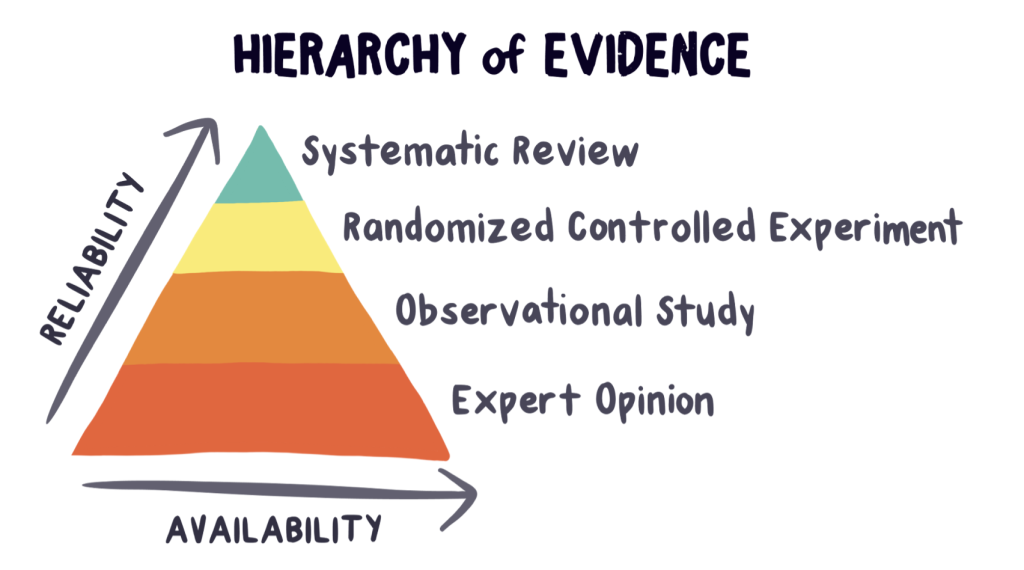
Figure 1: The hierarchy of evidence is used in science. But it should be used in design, too.
The hierarchy of evidence is a scientific model that compares the reliability of different types of evidence. It compares reliability to how available the evidence typically is.
The bottom two rungs of the hierarchy are “expert opinion” and “observational studies.” Though both of these forms of evidence are a good place to start, they’re very prone to bias. A less biased form of evidence, which is higher on the hierarchy, are randomized controlled experiments. The most common type of randomized controlled experiment is an A/B test. Well-designed and properly analyzed A/B tests are the gold-standard of high-quality evidence.
Learning from the evidence
During my years at Booking.com I put my “expert opinion” and observational studies to the test. The main thing I learned from that experience is that good design is highly contextual. It’s virtually impossible to generalize and predict when a design change is measurably better or not. Even if an idea is based on sound logic, how people use things is mostly irrational. All thought and logic go out the window when designing valuable solutions for people that are unpredictable.
What’s “in” then? The humble act of service, discovery, and value creation. All of which can be achieved by combining the practice of design with science and business in Conversion Design (Figure 2).
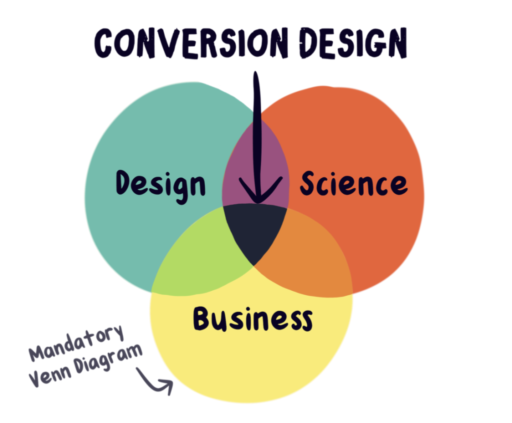
Figure 2: We can design true improvements when we combine design with science and business.
In this article, I share two of my most embarrassing fuck-ups. These “oh shit” moments taught me that design is an act of humble discovery in service of others. Analyzing data uncovers impactful moments of learning that I’d never discover had I taken the “easy” path and just assumed that my expert opinion was right.
When logic led me astray
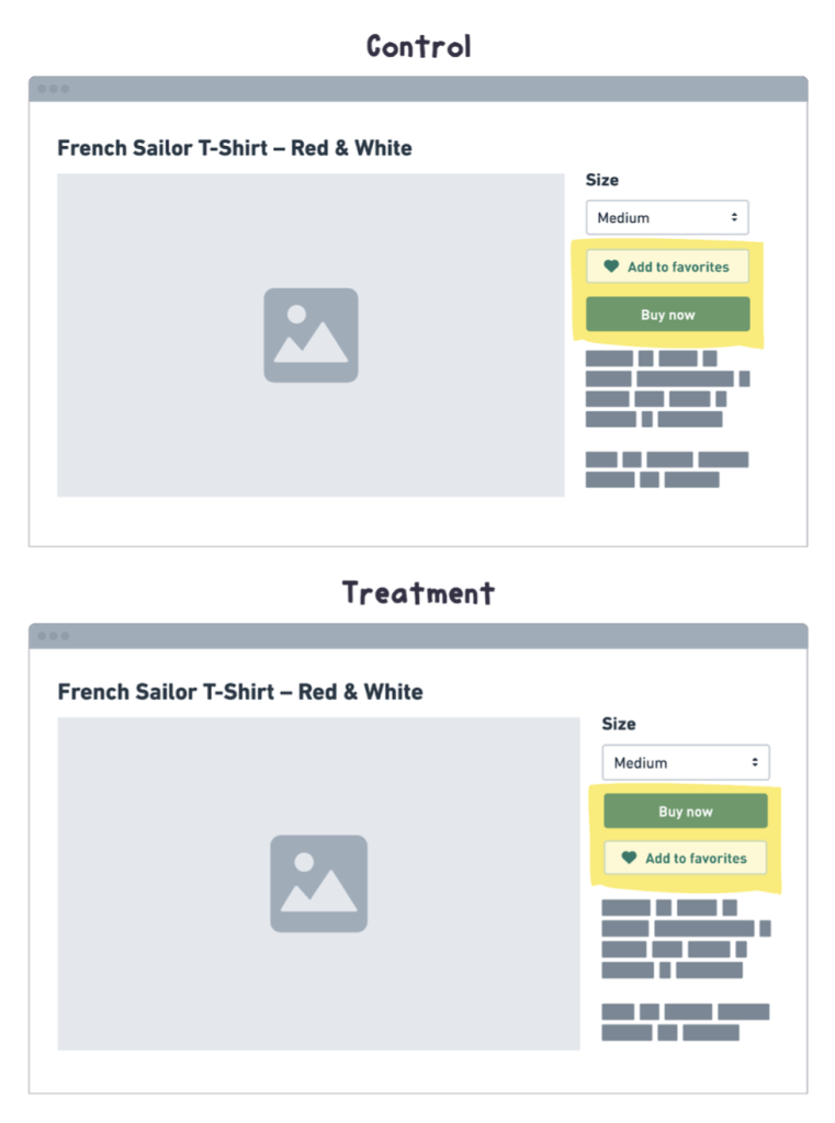
One morning I noticed a “non-inferiority bug fix” performing horribly. I made a simple change in the order of the “Favorite” and the “Add to cart” buttons as shown in Figure 3.
Figure 3: In the control (top) the “Add to favorites,” which was a secondary action was presented before the primary action, “Buy now.” In the treatment (bottom) I swapped the button order so the primary action was first and the secondary option was second.
My designer logic was that main calls-to-action should be presented before secondary calls-to-action. But when I looked at how my “logical” change was doing, it was a straight red line down.
I assumed this “bug fix” would have no significant impact. But I’d never seen an experiment look that bad before. It had been running for less than 24 hours, so I shrugged it off and chalked it up to randomness. Surely it would even out in a few hours. But it got worse. So, I tested it on a few different devices and browsers to see if there was a bug in my “bug fix.” Everything seemed fine. At this point, I cried out to my coworkers for help: “Does anyone know why this bug fix looks so bad?”
A few minutes later, my boss, Stuart, stopped by my desk. “That’s not a bug,” he said. “Andrew (another designer) put that button there in a very positive experiment. Moving it changes something that matters.”
I ran to Andrew’s desk where he confirmed Stuart’s suspicion.
“Oh yeah,” he confirmed. “Don’t move that button—not even a little. I tested it in a few different spots. Every time it’s moved, conversion tanks.”
I looked through Andrew’s experiment data to learn the hypothesis behind what I considered “illogical” placement. What I thought was a bug was a useful feature that I could never imagine. When I realized that the effect was real, and more importantly—that it wasn’t a bug—I turned the experiment off.
“Well, that decision just passed another round of validation!” I exclaimed.
I now realize that good UX and the concept of “UX bugs” are relative to who experiences them. And things that seem “logical” may in fact be illogical based on how people actually use your product.
After many surprising experiments like this, I’ve been humbled. The point is: Never assume a “quick bug fix” is a “no-brainer.” People use things in unimaginable ways.
Luckily, I tested my “bug fix.” I had lots of reliable evidence to reverse course and make a better decision than had I not tested it.
When crystal clear images led to a sharp decline
My first job at Booking.com was to design and develop the company’s tablet website. One day during a usability test, I noticed a man zoom in on an image. He wanted to see more detail—but what he got was an eye full of pixels. He looked disappointed when he zoomed back out. Then, he just kept scrolling down the page.
That seemingly insignificant flick of his fingers could easily have been ignored. But his behavior and body language told me exactly what I needed to know: make the photos better.
When I went back to my desk, I looked at the code to see how the photos were chosen, cropped, and served from the website’s backend. Then, I dug around the database to see what other photo dimensions, resolutions, and crop options I had to work with. Luckily, a number of options were available. When I understood how the original design was built and what I had to work with—I could find ways to improve it.
Developing the Test Variant
Figure 4 shows how the photos were presented in the original version.
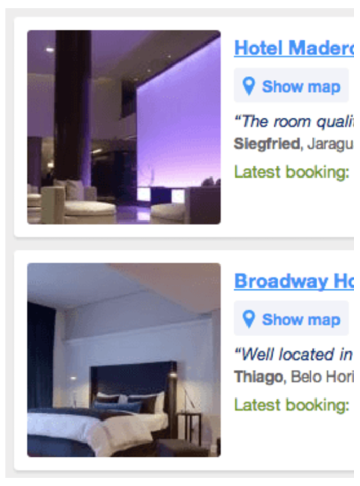
Figure 4: The images that the participant tried to zoom in on.
I noticed these issues with the current implementation:
- They were low resolution. The images were 150 pixels by 150 pixels wide, and they were displayed at that same size. This means they had low pixel density, which is what caused the pixelation upon zooming.
- They wasted space. Search result pages are typically information-dense screens where every pixel matters. The photos had 20px of white space around them. In some cases, because the photos were a static size, but the content to the right of it could grow, white space expanded beneath it.
- They were poorly cropped. A lot of important visual information was cut off in a place where first impressions got made.
This was around the time when screen quality on mobile devices made major gains. Retina-screens, which are known for their high pixel density and sharp images, were becoming popular. I was excited about the possibilities that come with hardware improvements. To future-proof the website for high-quality screens, I decided to increase the photo resolution. This would not only keep photos from getting pixelated when zoomed, but it would also dazzle customers when they upgraded their devices.
Design tip 💡
Provide your designers and engineers with at least two external monitors. One should be large and super high-res and the other should be cheap and common. Same for mobile devices—give them access to a range of devices with varying degrees of quality. When you design, code, and test on devices that are the best and the worst, the middle ground sorts itself out between the extremes.
My options to increase the resolution (shown in Figure 5), were 200 pixel by 200 pixel cropped square photos, photos that had a maximum width of 300 pixels, and photos with a maximum width of 500 pixels.
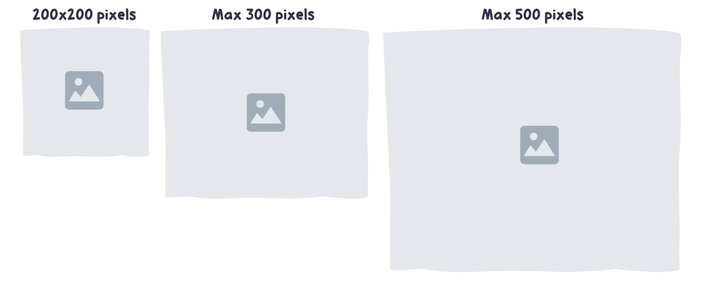
Figure 5: The image sizes and dimensions available to choose from.
The heights of the max-width images varied minimally, so they were mostly rectangles. This meant I could crop them however I wanted. As I coded, I played around with the max-width images, I tried various ways of cropping them. It was the early 2010’s, and CSS3 was all the rage—especially a CSS3 property called “background-size: cover”. At that point, the property had a decade to get the kinks worked out. It rendered reliably on modern tablets, smartphones, and browsers. That meant I had an alternative to the old-fashioned “background-size: contain”.
Figure 6 illustrates how the two properties behave differently.
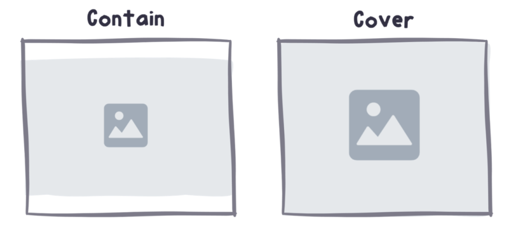
Figure 6: How “background-size: contain” behaves differently than “background-size: cover.”
Using “cover” meant that the image would grow to fit the size of its container, regardless of its shape. “Contain” kept the whole image in view but that excess space could grow around it. I coded it up so that the size of the photo container would grow in proportion to the card that contained it as shown in Figure 7.
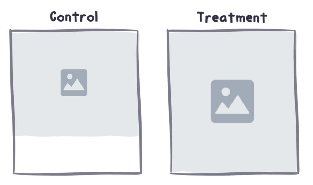
Figure 7: In the control (left), white space would be below the image even if the content to the right grew to be much taller than the image. In the treatment (right), if the content on the right was tall, the image grew to become taller, too.
It was the perfect solution to the wasted-space problem. Then, I took the new design for a test ride and popped in the max-300px wide pictures. At first glance, they looked brilliant. Because the images were 300px wide, but they were shrunk down to be 170px wide, they were higher resolution than the original. But, when you zoomed in, they got grainy. “Meh,” I thought to myself.
Then, I popped in the pictures that were max-500px wide. They were stunning. Not only were they sharp at first glance, but they also showed detail when you zoomed in. “Eureka!” I thought. This would be my test version. The final design is compared to the original in Figure 8.
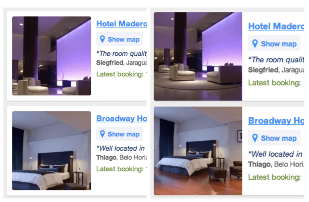
Figure 8: The original is on the left and the variant is on the right.
After thorough quality assurance (QA), I started the experiment and waited for the results. To my surprise, the data was flatter than my singing attempts on karaoke night. How could something I thought was so much better be so unimpactful? I dug into the data to find out.
Design tip 💡
Learn the basics of data analysis. As the designer of an experiment, you might make a connection between a design decision you made and an impact on a metric that others miss. Quantitative A/B test data is just another form of user feedback. And because of this, it’s just a different way of listening to what customers have to tell you.
Quickly, I found some impact in the result. And it was not good. The variant had a huge increase in page load time. It took a whopping second or two longer to load than the original. It was a face-palm moment. I hadn’t noticed the speed issue because my internet connection was lightning fast and my device was brand new.
Then, I thought to myself, “Wait a second—this result is flat, but it’s done a ton of damage to load time. This should be incredibly negative!”
I saw that even though more people bounced because it took too long to load, the people that stayed finished their purchase at a much higher rate. If I could improve the load time to decrease the bounces, the other benefits might then increase sales overall as I had intended.
To do this, I simply swallowed my designer pride. I personally thought the 500-pixel wide images looked better than the 300-pixel wide ones. But privileged preference excluded many people from enjoying the improved photo-viewing experience. I swapped out the 500-pixel wide photos for the 300-pixel wide ones and restarted the experience. “Here goes nothing…” I thought to myself.
When I analyzed the results this time, it was clear—-I’d made the photos better. I decreased the page load time increase to decrease bounces, yet I made the image-viewing experience measurably better. Excitedly, I raced over to my coworkers on mobile web and apps.
“Hey y’all! Check this out… wanna try this out on your search results page, too?” Excitedly the designers and engineers on those teams picked up the idea and ran with it. The concept succeeded on iOS and Android apps, but it failed on mobile web.
“What in the world? How can that be?” I thought. I went over to the person who coded it, and I asked to see what they tested. They showed me their implementation. Though it was much better in terms of how the image was cropped, they used a slightly different CSS property for how they handled the background-size. The image didn’t grow with the size of its container in the same way as I’d coded it.
“Ughhhhhhh. That’s why it failed,” I thought in dismay to myself. When I asked the person to fix the code to my implementation method, they said they were too busy.
Being the impatient, curious person I am—I hacked my way into their experiment, made the fix, and I restarted it. (With their permission of course!)
Sure enough, when I analyzed the result, the experiment showed a similar positive result to what we saw on tablet, iOS, and Android.
I learned two things from this experiment:
- What’s actually better is usually somewhere between the problematic experience I identified and what I believe is the ideal solution. Designers have a different idea of what “quality” is than the typical user.
- How an experiment is coded can be the difference between success and failure. There are far more ways to fail at making something better than there are to succeed.
From embarrassing stories to effective experiments
If you found either of these stories interesting, you might like my new book, “Design for Impact: Your Guide to Designing Effective Product Experiments.”
It’s published by the amazing folks over at Rosenfeld Media, and you can buy it online wherever awesome design books are sold.
If you live in Europe 🇪🇺
Buy the paperback version of Design for Impact directly from me at www.erindoesthings.com and get a FREE “Make things better not just different” sticker.
The sticker was designed by the talented and witty hand-lettering artist, Alissandra.
If you live anywhere else in the world 🌎
Order “Design for Impact” directly through Rosenfeld Media. Each paperback purchase comes with the free ebook version.
Get “Design for Impact” on Rosenfeld Media here.
If you’d like to make Jeff Bezos even more rich 👹
Jeff Bezos said, “success at Amazon is a function of how many experiments we do per year, per month, per week, per day.”
And although Bezos is too rich for anyone’s good, Amazon does provide a very easy ordering experience—precisely because they experiment so much!
You can get “Design for Impact” on Amazon.com here
Do you want to hear more from Erin? She will give a talk at the digital design conference Design Matters 24, which will take place in Copenhagen & Online, on Oct 23–25, 2024. Get your ticket here! Connect with Erin Weigel on LinkedIn.