Article by Lauren Shapiro, Design Partner, Work & Co
Design systems have shifted from a buzzword to a serious investment across all industries in the last couple of years. We’ve seen companies create dedicated design system teams, design operation roles, and invest heavily in tools to power them.
This is happening in a landscape where user behaviors and touchpoints are rapidly changing, companies are charged with finding efficiencies, and new design and development tools are merging closer.
With so many competing priorities, creating Figma components can feel like the easiest part of our job. However, designers, and other design system champions, are now, more than ever, tasked with championing delivering complex and nuanced work that straddles craft, leadership, and organizational change.
At Work & Co, a digital product agency, we see these changes first-hand when we partner with clients like IKEA, Airbnb, Vistaprint, PGA Tour, GoFundMe, and H&R Block to create, launch, and structure governance models for future-facing design systems.
From our experience, a design system creates a lasting impact when a shared language —including the vision, mindset, and process— is established from the beginning, then evolved with the input of a cross-disciplinary group of stakeholders.
Aligning on a collective vision
When clients come to us to create design systems, we first focus on bringing in diverse stakeholder perspectives, including the user, to align on the design system north star.
Success relies on building relationships instead of silos. By collaborating early, you can prevent the system from being seen as a limitation and, instead, something that has the potential to transform the business. From our experience, every design system is developed with a unique goal in mind. Still, there are underlying, consistent, and crucial values (even KPIs) around which we rally stakeholders:
• Connected culture: Design systems help connect and reshape collaboration between product teams, especially between design and development. The best design systems reflect the people who use them, having a centralized and single source of truth representing the organizations they power.
• Enduring investments: Changing how people work is costly and time-consuming. As organizations evolve their product lifecycle, the governance process helps to foster inclusive collaboration and shared terminology across teams. Creating a process the team loves results in better services for the customers; everyone wins.
• Better business: By standardizing the underlying structure, design systems help organizations scale more effectively, save money, and drive innovation faster. Teams can act faster on improvements or experimentation by having modular and reusable systems.
At its core, design systems create a model to repeatedly create and ship efficient, meaningful, and sustainable products at scale.
Setting an iterative mindset
Like a digital product, a design system should be treated as a living-and-breathing product, where the output, tools, and processes are rooted in a shared mindset. Here are some that have been successful:
- Place the customer at the core: Priorities for the design system should evolve with input from the user as a counter-balance to business priorities.
A healthy feedback loop means that components and patterns should be designed and tested in the product context. During our work with IKEA, this meant that most UX patterns needed to be tested at home and in the physical retail store before being considered on the product roadmap. - Mandate and help define collaboration: Design system users will be less likely to follow best practices if the system feels too overwhelming or complex.
While working with GoFundMe, we created dedicated sections for each discipline (product design, engineering, marketing, data, etc.) to personalize onboarding, contributions, and best practices for cross-disciplinary collaboration. From each section, design system users could contextualize the Figma and React components – directly contributing to ownership and increased adoption. - Reduce and simplify to guarantee success: Having fewer typefaces, font sizes, colors, and elements make it easier to maintain, helps users establish consistent patterns, and increases the quality of accessible experiences. We often say that a design system should solve 80% of the basics and give guidance on how to build new patterns.
- Be true to the most fundamental aspects of your brand. From the beginning, define the elements that make your brand unique. As you evolve the system over 2, 5, or 10 years, keep these essential elements to help guide decision-making and product iteration.
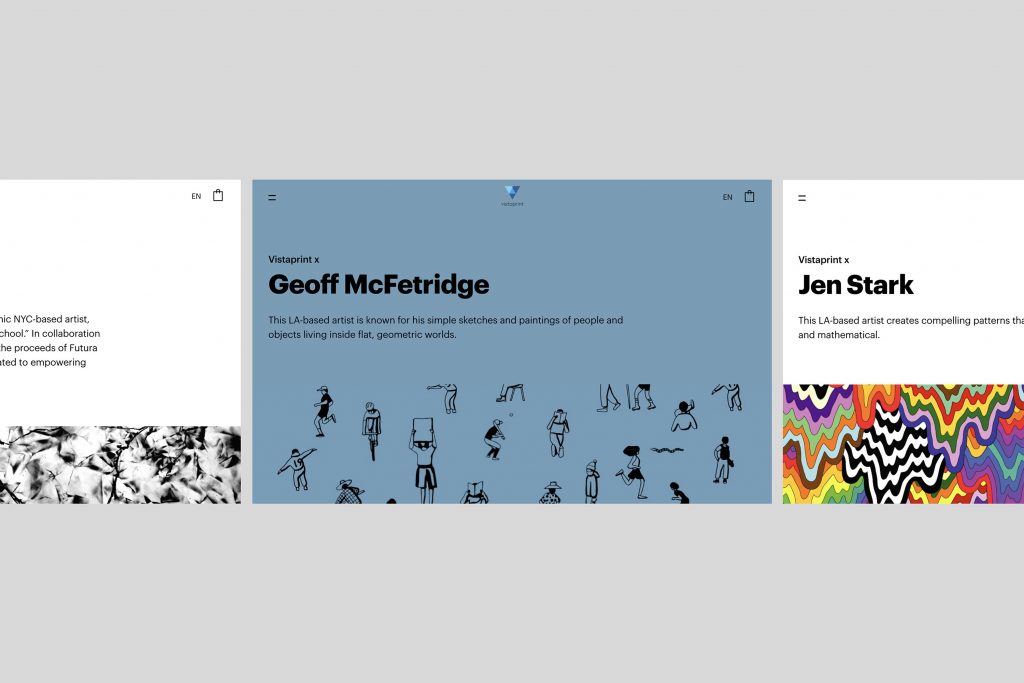
Every brand is unique: For Vistaprint, it was important to create moments of delight to the digital experience that mimic the experience of receiving their print products at home. We worked with their team to bring these delightful moments into every component and pattern through visual, UX, content, tone of voice, and motion. This brand principle also serves as a critical lens for updates to the design system.
- Efficiency is critical. Approach the design system with the same rigor as a digital product focusing on way-finding, UX tasks, and digestible documentation. Every stakeholder will appreciate the productivity impact, especially if they can create better solutions and ship faster. Having transparent governance and processes (discussed next!) can also help this.
Establishing governance from the outset
As technology and user behaviors evolve, design systems must be flexible to accommodate more complex and emerging organizational challenges.
The correct method for governance (the workflows, internal processes, and organizational structure) is as unique as the organization itself. It is often influenced by factors like product scale, number of design team members, and product roadmap.
From our experience, having a team responsible for the design system is crucial to the business’s long-term success. In practice, this can take many forms.
• Centralized: For IKEA, the scale of the product ecosystem was the primary driver of the centralized governance model. We worked with them to build and hire a dedicated design systems team. This dedicated team collaborated with designers on each product, pulling in product-level contributions to the global design system when applicable and making it available to the entire organization.
• Federated: We worked with one global financial institution whose consumer service products were too complex and nuanced for a single dedicated team. Instead, we established a Design Systems Council with representation from each product team. Updates to the foundational system were discussed, prioritized, and implemented based on bandwidth from council members.
Both a centralized and federated model work to empower team members by encouraging contribution, adopting collective decision-making, and establishing relevance across multiple platforms.


Design systems as a catalyst for change
As champions of effective design systems, we can embrace diverse opinions and reframe collaboration to make our products more user-focused, accessible, and inclusive.
We’ve seen first-hand how design systems can impact how digital experiences are brought to life while also helping to transform companies — making them more collaborative and culturally connected. Though not easy, we’ve seen how designers can spark enterprise-level change, disrupting the status quo one conversation at a time.
Finally, we’re curious: How are you creating a shared language in your design system? Our perspective is formed by our experience with driven clients, their talented product teams, and our industry peers. Like many in the Design Matters community, Work & Co loves to expand our design system thinking and practices by hearing from others. Feel free to connect with us (newbiz@work.co) to share your perspective with us or for a deeper look into how you can build a roadmap for change.
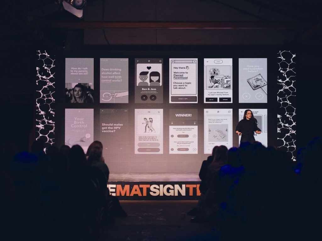
This article was written by Lauren Shapiro, who gave a talk at Design Matters 22. Watch her talk “Digital Health Tools: Meeting People Where They Are” here.


